How to Take Photos for AI Room Design (So the AI Actually Nails It)
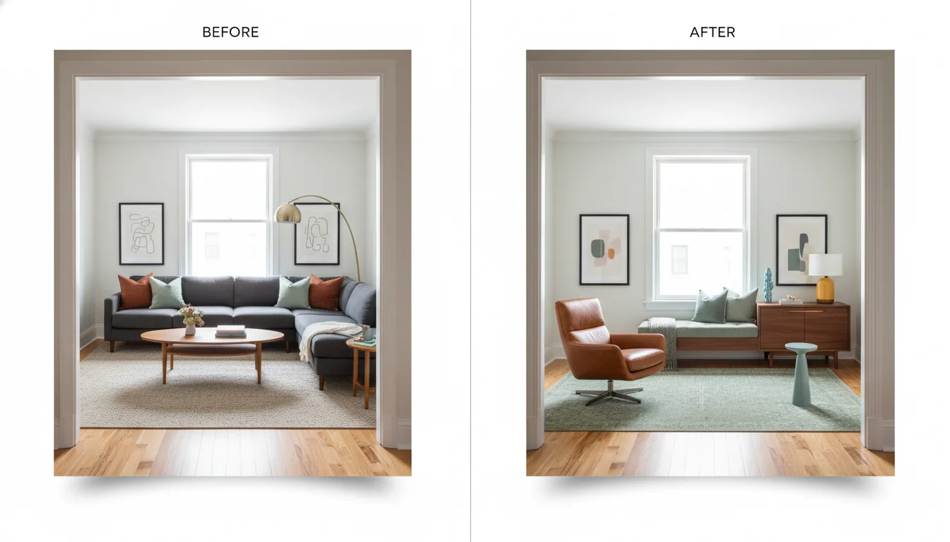
You opened the app, snapped a quick photo of your living room, picked a style, and waited. The render came back wrong. The sofa is floating where the doorway should be, the rug is bleeding into the wall, the lamp grew an extra arm, and the whole thing looks like a slightly drunk version of your apartment. You blame the AI. The AI is partly to blame. The other part — the part you can fix in thirty seconds — is the photo.
Knowing how to take photos for AI room design is the single highest-leverage skill in the modern redesign workflow. The same room, photographed two different ways, will produce two completely different render quality tiers. A casual snap from the couch produces casual-snap renders. A deliberate, framed shot from the doorway, in good light, with the floor visible — produces clean, photoreal redesigns that actually match your room. This guide is the working playbook: the angles that win, the lighting windows that matter, what to tidy and what to leave, when multi-photo uploads help, and the seven mistakes that account for most “the AI got it wrong” complaints.
What’s the best way to take photos for AI room design? Stand in the doorway, frame the room in one-point perspective with both walls and the floor visible, hold the phone at chest height with the lens parallel to the floor, shoot in soft daylight (mid-morning or late afternoon), and clear loose clutter without over-staging. One sharp, well-framed photo at native resolution beats five mediocre ones. Most AI room design tools — including RoomGenius — use the photo’s perspective lines, light direction, and visible surfaces as the structural skeleton for the redesign, so a confused photo produces a confused render. The fix takes thirty seconds and changes the output category entirely.
Why photo quality makes or breaks the render
AI room design tools, in plain language: they read your photo as a 3D scene description, identify the floor, walls, ceiling, windows, and existing furniture, then generate a new image that keeps the room’s geometry and replaces the contents with something in the style you picked. The new image is only as good as the scene description the AI managed to extract. A photo where the floor is mostly hidden or the walls converge at strange angles gives the AI almost nothing to anchor against — and you get the floating-sofa, melting-lamp output as a result.
The variables that move the render quality needle, ranked roughly by impact:
Perspective and framing carry the most weight. The AI needs to see where the floor meets the walls and where the walls meet the ceiling. That’s the geometric skeleton. Photos taken from inside the room — sitting on the couch, standing in the middle — hide enough of those edges that the AI has to guess, and guesses look like guesses.
Lighting comes second. Even, diffuse light reveals every surface; harsh direct light blows out half the room and crushes the rest into shadow. The render preserves whatever lighting condition it sees.
Resolution and sharpness come third. A 12 MP photo taken with steady hands beats a 48 MP photo with hand-shake every time.
Clutter is fourth, and it matters less than people think. The AI is good at editing out magazines on the coffee table; it’s not good at reconstructing a wall behind a 90-inch sectional that fills the frame. Clear the visual noise; don’t stage like a magazine shoot.
For the broader category overview, our AI interior design app guide covers the consumer-facing toolset.
The golden angle: one-point perspective from the doorway
If you remember one rule from this entire post, this is the one. Stand in the doorway of the room you want to redesign. Frame the photo so the back wall is roughly parallel to the bottom of your phone screen, with both side walls visible and the floor receding away from you toward the back wall. This is “one-point perspective” — the same composition photographers, architects, and real estate agents use when they want a single image to describe a whole room.
It works because it gives the AI the maximum amount of structural information in a single frame. The camera sees:
The full floor — the AI’s most important reference for scale, rug placement, furniture footprint, and depth.
Both side walls converging toward a vanishing point — clean perspective lines that lock the rest of the redesign into place.
A complete back wall — usually where the focal furniture goes (sofa, bed, fireplace, TV unit), and where the AI does its most visible work.
The ceiling line — gives the AI a height reference for lighting, art placement, and tall furniture.
The mechanics are unfussy. Stand fully inside the doorway, not in the hallway leaning in. Shoot horizontally unless the room is much taller than it is wide. Center yourself laterally so both side walls show roughly equal area in the frame. Hold the phone at chest height — around 1.4 meters or 4.5 feet off the floor — and keep the lens parallel to the floor, not tilted up toward the ceiling. A slight tilt is forgivable; 15 degrees is not.
Most phone cameras have a built-in level grid you can enable in settings; turn it on, line the horizon up with the horizontal guideline, and shoot. The visual cue, no level required: the back wall should appear roughly rectangular in your frame, not as a trapezoid. A trapezoid means you’re tilted.
For rooms without a clear single doorway — open-plan living-dining, studio apartments, alcoves — pick the longest sight line in the space and stand at one end of it.
Lighting: natural vs artificial, time of day
Light is the second variable, and the cheapest one to fix. The room itself doesn’t change between 2 PM and 8 PM, but the photo of the room does — and the render that comes out the other side does too.
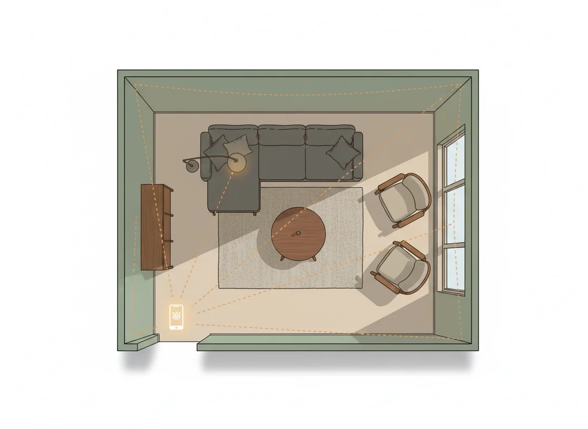
The single best window for AI room design photos is mid-morning to early afternoon on an overcast day. Overcast skies are an enormous, free softbox; the light bounces around the room evenly, fills the shadows, and reveals every surface without blowing out the windows. The second-best window is late afternoon (roughly 90 minutes before sunset) on a clear day, with the sunlight indirect rather than streaming straight through the window onto your floor. Direct sun stripes are a render killer; the AI preserves them and the redesign comes back with a stripe of sunlight burning across the new sofa.
The windows to avoid: midday on a clear bright day with sun blowing out the windows (the phone exposes for the bright rectangle and the rest of the room goes dark); twilight or after dark with only a single warm overhead source; and mixed lighting (afternoon sun plus a tungsten table lamp), which throws the phone’s auto-white-balance off and produces color casts the AI cannot reason about.
The practical rule: if you can wait, wait until the room looks evenly lit to your eye. If it never looks evenly lit, open every blind and turn on every light, then shoot. Our real estate photography tips post goes deeper on lighting fundamentals — the same techniques that produce sellable listing photos produce render-friendly AI photos.
What to tidy vs what to leave alone
There’s a folk theory that AI room design tools work best on a perfectly empty room. The folk theory is wrong. The right tidying level is “lived-in but not chaotic.” Leave the major furniture in place — the AI uses it to understand scale, layout, and what kind of room it’s looking at. Remove visual noise that confuses the structural read.
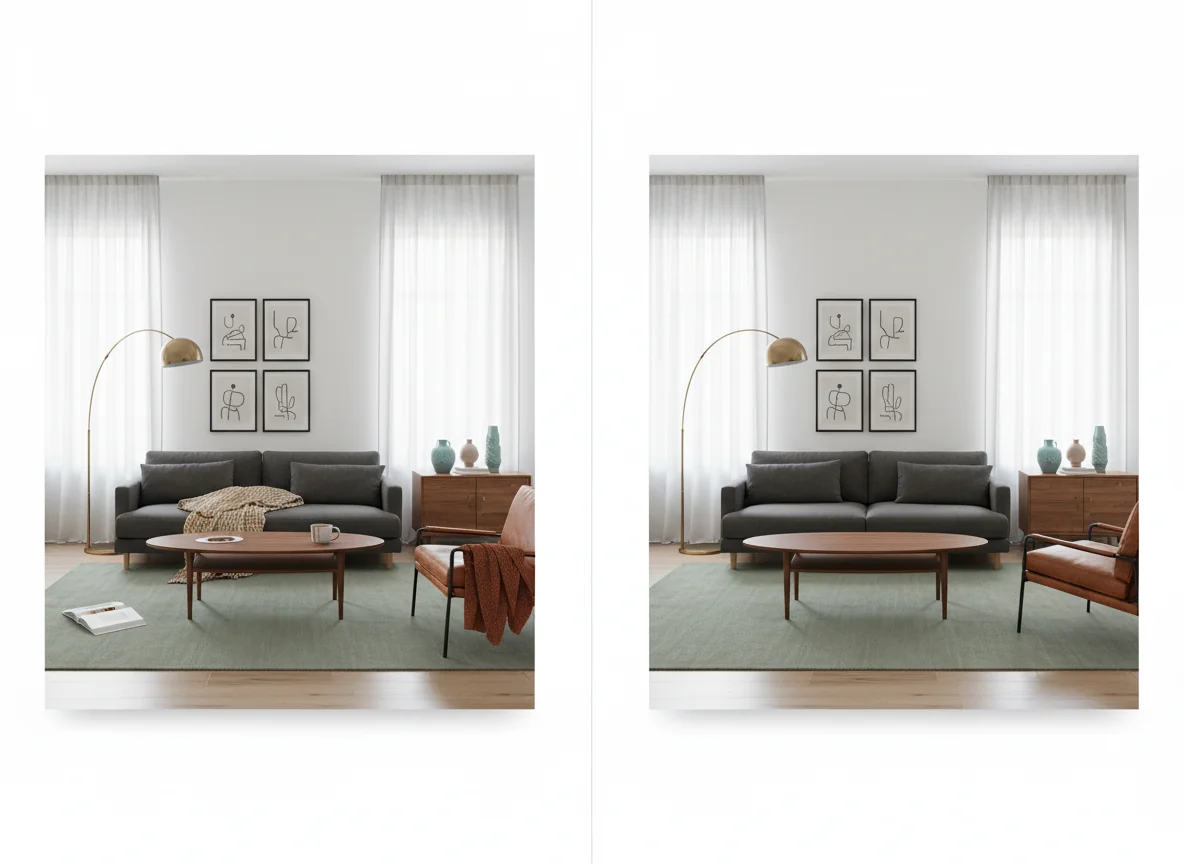
What to clear before shooting: loose clutter on horizontal surfaces (magazines, mail, mugs, water bottles); anything stacked at unusual heights (a sweater on a chair, a backpack against a wall, a laundry pile on the floor) that the AI may misread as furniture; people and pets, who tend to come back as melting silhouettes in the render; and anything blocking the floor edges, since the corners where floor meets wall are the AI’s most important reference.
What to leave in place: the major furniture, especially anything against a wall — the AI uses it as a footprint reference, and removing the sofa leaves the AI with no scale anchor. Existing rugs, curtains, and large art stay; they give the AI scale references for the replacements. Lamps, switch plates, vents, radiators, and baseboards stay; the architectural elements anchor the room while the decor flexes around them. A slightly imperfect, lived-in room is what most AI room design tools were trained on. A vacant, empty box is the harder edge case, not the easier one.
Our AI interior design overview covers the broader workflow that begins with a photo.
Multi-photo uploads: when they help
Most AI room design tools accept a single photo per render, but a growing number — RoomGenius among them — let you upload two or more photos of the same room. The feature is genuinely useful in some scenarios and wasted effort in others.
Multi-photo uploads help when the room has unusual geometry (an L-shape, a sloped ceiling, a bay window, a partial wall) that a single doorway photo can’t capture; when you want to redesign a specific corner the doorway shot only partially shows (establishing wide shot plus a closer detail shot); when the room is large (over 250 sq ft) and the doorway shot compresses the back third of the room into a fraction of the frame; or when built-in features like a fireplace, a window seat, or a built-in shelf need a closer look than the wide shot provides.
Multi-photo uploads do NOT help when the room is straightforward and the doorway shot already captures everything; when the photos are taken in different lighting conditions (one in afternoon sun, one at night), which forces the AI to reconcile lighting that won’t reconcile; or when the photos are at different scales (one wide-angle, one zoomed-in close-up). Match the framing strategy across the set so the AI reads them as views of one room.
Practical rule: if you can’t articulate what the second photo is adding that the first doesn’t, don’t upload it. One sharp doorway shot is the floor of every good AI redesign — additional photos are the ceiling, not the foundation.
Common mistakes and fixes
The seven photo mistakes that account for most failed AI room design renders:
Shooting from inside the room, sitting on the couch. Lens too low, angle too narrow, most of the floor cropped out. Fix: stand in the doorway and shoot the room from the outside in.
Tilting the phone up toward the ceiling. The walls bow outward and the AI’s perspective lines break. Fix: step back further into the doorway; if the ceiling truly won’t fit, shoot without it.
Direct sunlight stripes across the room. The render preserves every stripe. Fix: close the blinds, wait until later in the day, or shoot on an overcast day.
Over-staging into a magazine shoot. Three throw pillows fanned diagonally, a coffee table styled with art books and a single tulip — the AI reads this as decor to preserve and the redesign comes back over-styled. Fix: tidy, don’t stage.
Portrait mode or a heavy filter. Portrait mode blurs the background, which is exactly the geometric data the AI needs. Fix: shoot in regular photo mode with no filters.
A 90-inch sectional filling the frame. The room reads as “couch with walls.” Fix: stand further back, or accept a slight angle from the corner of the doorway in exchange for more context.
Hand-shake blur. Common in low light. Fix: brace the phone against the doorframe or use the 2-second self-timer so your tap doesn’t introduce shake.
| Mistake | What the render looks like | Thirty-second fix |
|---|---|---|
| Shot from inside the room | Floating furniture, missing walls | Stand in the doorway |
| Phone tilted up | Bowed walls, warped perspective | Lens parallel to floor, chest height |
| Direct sun stripes | Stripes preserved in the redesign | Wait, close blinds, or overcast day |
| Over-staged scene | Strange, over-styled redesign | Tidy, don’t stage |
| Portrait mode | Blurry background, broken geometry | Use regular photo mode |
| Wide-angle lens distortion | Curved horizon, fisheye corners | Use 1x lens, not 0.5x |
| Hand-shake blur | Soft, blurry render | Brace phone, use self-timer |
A note on lenses: the 1x main lens is the right choice in almost every case — it has the least distortion and matches how the AI was trained to read scenes. The 0.5x ultra-wide is tempting because it fits more in, but it produces fisheye distortion at the edges that breaks the perspective read. Use 0.5x only if the doorway truly won’t give you enough distance, and accept the lower render quality as a tradeoff.
Our AI sketch-to-rendering post covers how the AI bridges your input image and the output render.
A thirty-second pre-shoot checklist
Before you press the shutter, run the seven boxes:
Standing in the doorway, fully inside the frame line. Phone at chest height, lens parallel to the floor, level grid confirming. Using the 1x main lens, not the 0.5x ultra-wide. Lighting is even — no sun stripes, no dark corners, no mixed lamp-and-daylight cast. Floor edges visible at all four corners where they meet the walls. Major furniture in place, loose clutter cleared. Phone held with both hands, braced against the doorframe, or on a 2-second timer.
Tick all seven and the photo will produce a clean render in nearly every modern AI room design tool. Tick five and the render will be usable. Tick three or fewer and expect to re-shoot.
FAQ
What resolution should I use for AI room design photos?
Most tools accept photos between 1024 × 768 and 4032 × 3024 pixels and downsample internally. Shoot at your phone’s native default resolution and don’t compress the image before uploading. Avoid screenshotting an existing photo — the screenshot loses information the original retains. JPEG and HEIC both work; the AI cares about the visible content, not the file format.
Should I use a wide-angle lens or my phone’s regular lens?
Use the regular 1x main lens in nearly every case. The 0.5x ultra-wide fits more of the room in but distorts the corners and bows the perspective lines, breaking the AI’s read of the room’s geometry. Only reach for the ultra-wide if the doorway literally cannot give you enough distance with the 1x lens — and expect a lower-quality render as the tradeoff.
Can I use photos taken at night with only artificial light?
You can, but the render quality will lag behind a daytime shot of the same room. The AI preserves the lighting it sees, so a single-lamp scene at 9 PM produces a single-lamp render. If you must shoot at night, turn on every fixture — overhead, lamps, accent — to flatten the lighting. Daytime overcast remains the gold standard.
How does AI room design handle empty rooms versus furnished ones?
Furnished rooms produce more accurate renders because the AI uses the existing furniture as a scale and layout reference. Empty rooms work, but the AI has to guess at the room’s size, and the redesign can come back at the wrong scale. If the room is empty, place at least one large object — a chair, a step ladder, a plant — to give the AI a scale anchor. Our AI furniture matching app post covers how the AI sources the furniture you see in the redesign.
Why does the AI keep changing parts of my room I didn’t want changed?
Almost always a photo issue, not a model issue. If a wall is hidden behind furniture, the AI assumes the wall continues and may render it differently than it actually is. If the floor edge isn’t visible at a corner, the AI guesses where the corner is and places furniture against the guess. Re-shoot from the doorway with clearer floor edges; the unwanted changes usually disappear.
Better photos in, better rooms out
The whole post collapses to a single insight: the AI is not the bottleneck for most “the AI got it wrong” complaints. The photo is. Stand in the doorway. Hold the phone at chest height with the lens parallel to the floor. Shoot in soft daylight. Tidy the loose clutter without staging the room into a vignette. Use the 1x lens. Brace the phone. Press the shutter.
Thirty seconds of discipline at the photo stage saves five minutes of re-rolling renders at the redesign stage, and the redesigns that come out of a well-shot photo are categorically better than the ones that come out of a sit-on-the-couch snap. Better photos in, better rooms out. Try it now.