AI Scandinavian Interior Design: Hygge, Generated
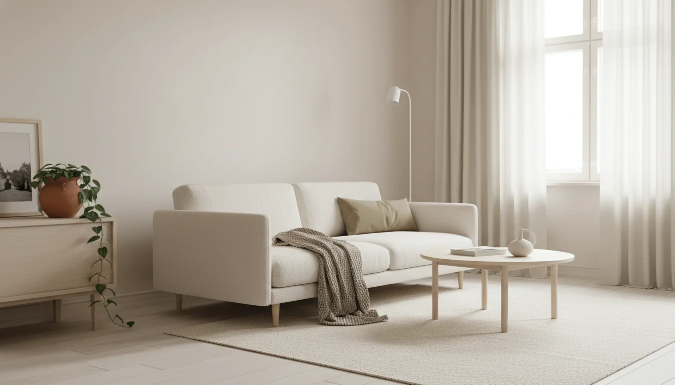
Scandinavian design has been quietly winning the interiors conversation for seventy years — the white walls, the blonde wood, the chunky wool, the single trailing plant — and it remains the style most people describe when asked what “calm and modern” looks like. It also happens to be one of the styles consumer AI tools render with almost embarrassing confidence. AI Scandinavian design is a case where the model’s defaults and the style’s defaults are pointed in the same direction, and the result is a render that feels honest to the look — generated from a single phone photo of the room you already have.
This guide is the working tour: how Scandinavian differs from Japandi, the three-ingredient palette that makes the style AI-native, the room-by-room moves that decide whether a render reads as authentic Scandi or generic minimalism, the hygge accents that keep it from feeling cold, and the rendering mistakes that show up most often.
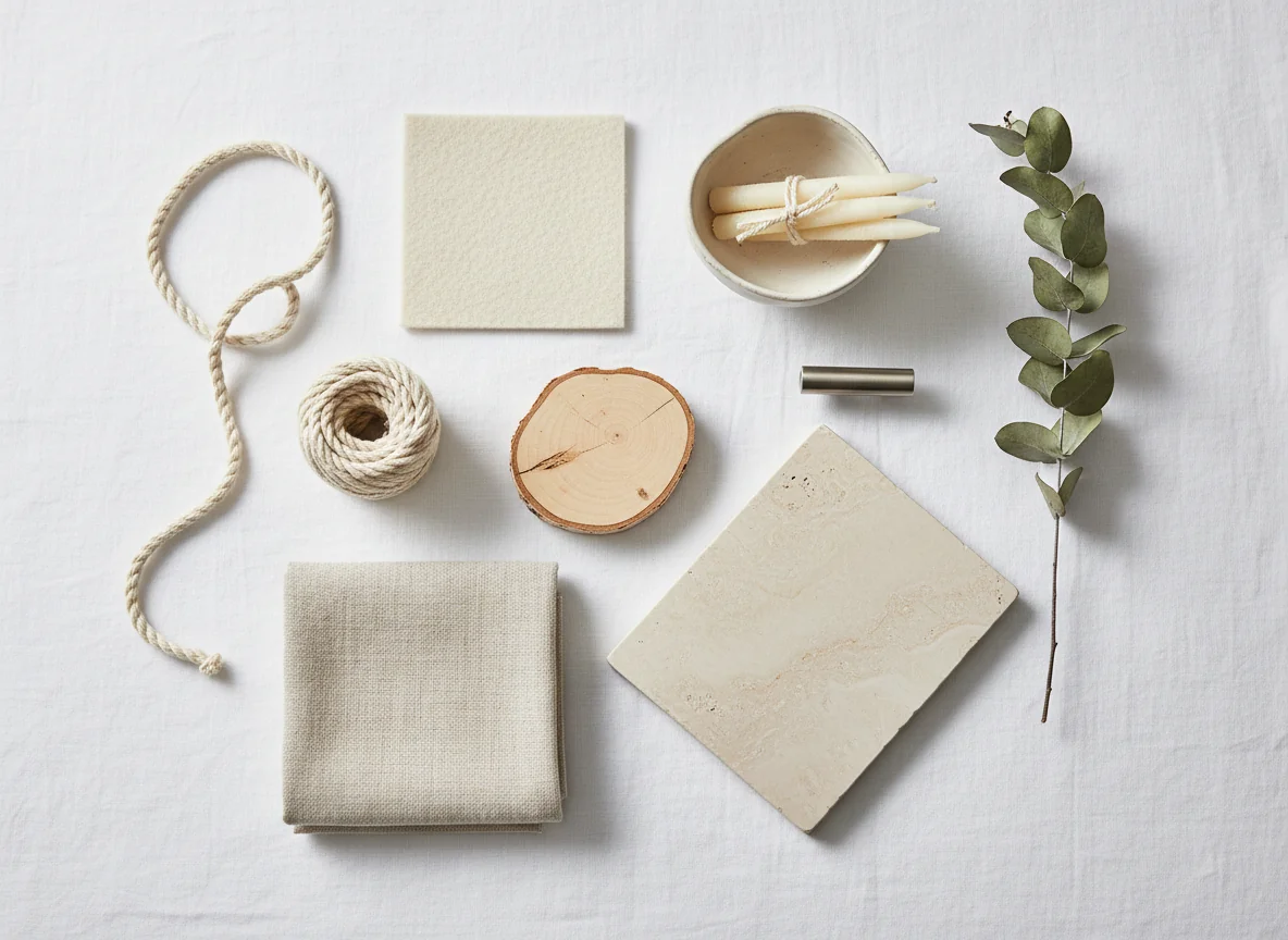
What is AI Scandinavian interior design? AI Scandinavian interior design is the use of an AI room-rendering tool to transform a photo of an existing room into a Scandinavian-styled version — light, airy, functional, and warmed by carefully chosen accents. The render preserves the room’s architecture (walls, windows, ceiling) and replaces the decor layer with Scandi hallmarks: bright white or off-white walls; pale woods like birch, beech, ash, and white oak; soft natural textiles in cream, oatmeal, and pale gray; bright diffuse light; a small handful of plants; and one or two hygge accents — a chunky wool throw, a beeswax candle, a sheepskin — that introduce warmth without crowding. AI handles Scandinavian unusually well because the style’s narrow palette and bright, even lighting align with how diffusion models render most confidently.
Scandinavian vs Japandi: the meaningful differences
Scandinavian and Japandi share a lot of furniture silhouettes and most of their underlying ethos: restraint, natural material, functional honesty, the embrace of negative space. They sit close enough that a casual viewer will sometimes call a Scandinavian room “Japandi” and not be entirely wrong. But they pull in different directions on three axes that change how a room actually feels — and how an AI renders it.
The first is brightness. Scandinavian rooms are bright: pure white walls, pale floors, light streaming in. The style was born in countries where winter days are short and rooms work hard to reflect every photon. Japandi is darker on contrast and warmer on neutrals — off-white walls, deeper wood tones, more matte black. A Japandi room feels grounded; a Scandinavian room feels airy.
The second is decor density. Scandinavian allows more objects — a small gallery wall, a row of cookbooks on an open shelf, three plants instead of one. The style isn’t maximalist, but it isn’t ascetic either. Japandi pushes harder toward one-object-per-surface restraint. A Scandinavian shelf has things on it. A Japandi shelf has one thing on it.
The third is mood. Scandinavian leans cheerful and functional. There’s color — a soft sage cushion, a mustard throw, a pale blue ceramic — used sparingly but unapologetically. Hygge is a real part of the language: candles, throws, the quiet companion-able feeling of a long winter evening. Japandi leans meditative — almost no color, darker accents, closer to a tea room than a family kitchen. Neither is better; they’re optimized for different feelings.
For broader context on where both styles sit in the named-aesthetics landscape, our different types of home interior design styles guide places them alongside modern minimalist, mid-century modern, and warm contemporary — their nearest neighbors. And if Japandi’s quieter palette is calling, the companion piece is AI Japandi interior design.
| Axis | Scandinavian | Japandi |
|---|---|---|
| Wall color | Pure white, near-white, soft cream | Warm white, pale plaster, off-white |
| Primary wood | Birch, beech, ash, pale oak | White oak, walnut, paulownia |
| Contrast tone | None or a soft pale gray | Matte black, blackened steel |
| Color accents | Permitted — sage, mustard, pale blue | Almost none — clay or forest occasionally |
| Decor density | Light but not bare; small gallery walls okay | One object per surface; negative space honored |
| Mood | Cheerful, functional, hygge-warm | Meditative, grounded, wabi-sabi-quiet |
| Lighting | Bright, diffuse, multi-source where needed | Soft, single-source, often a paper lantern |
| Best at | Daylit rooms with windows | Lower-light rooms that need warmth |
If you can imagine your favorite IKEA showroom on its best day, you’ve got a working mental image of Scandinavian. If you can imagine that same showroom dimmed by half and stripped to one third of its objects, you’re closer to Japandi.
Light, wood, and white walls — the AI-native trio
Diffusion-based AI models render with the most confidence when the style’s visual vocabulary is narrow, the lighting is even, and the materials are familiar. Scandinavian satisfies all three at once, which is why a one-word “Scandinavian” prompt in a consumer AI room app reliably returns a render that needs almost no follow-up.
Light. Scandinavian rooms are bright and evenly lit. Harsh shadows are some of the hardest things for a diffusion model to render convincingly — they’re where the model “guesses” at geometry and gets it wrong. Soft, diffuse light off a pale wall is some of the easiest. A Scandinavian render almost always starts with the room flooded by tall-window daylight, and that single condition removes a category of rendering errors before the model has even chosen the sofa.
Wood. The Scandi wood palette is short and familiar: birch, beech, ash, pale oak. These are some of the most-photographed materials in the world — every flat-pack catalog from the last forty years has documented them — which means diffusion models have seen them in millions of training images and render their grain accurately. Compare to a heavily figured burl, where the model has fewer references and tends to produce wood that doesn’t quite read as wood.
White walls. A pure white or near-white wall is the easiest surface in the world for a model to render. It absorbs light gradients cleanly, reflects warmth from any wood or textile placed near it, and gives the AI a quiet backdrop against which to place the actual decisions of the render. A heavily textured wallpaper or deep accent wall, by contrast, asks the model to invent a pattern it then has to keep consistent across the frame.
The compounding effect is that the three fundamentals each remove a class of rendering error, and when they stack you get a render that looks almost photographic. The same room photo run through “Scandinavian” and “Victorian eclectic” prompts will return a Scandinavian render that looks like a real apartment and a Victorian render that looks like the model is doing its best.
The same principle is the throughline of our how to prompt AI interior design post: narrow your visual vocabulary and the model’s job gets easier. Scandinavian narrows it for you automatically.
Scandinavian by room
The style adapts cleanly to every room in a home, but each room has a small set of moves that decide whether the result reads as authentically Scandinavian or as generic light-and-bright. Generate a render for each room with the moves in mind and a coherent whole-home look usually arrives on the first or second pass.
Living room. A Scandinavian living room is anchored by a low-slung sofa in cream, oatmeal, or soft pale gray — bouclé, linen, or wool, with visible pale-wood legs. The coffee table is round or oval in pale oak or birch, never a glass pedestal. A wool or sheepskin throw drapes one arm. A round paper or linen floor lamp provides a secondary light source for the long Nordic winter. A tall plant — a fiddle-leaf fig, a monstera, a trailing pothos — adds the organic note. Art is sparse but present: one or two framed prints in pale-wood frames. A cream or pale-gray wool rug grounds the seating.
Bedroom. Scandinavian bedrooms double down on bright and quiet. A low-profile platform bed in birch or pale oak sits at the center, dressed in layered white and cream linen with a chunky-knit throw at the foot. Nightstands match the bed’s wood, kept low. Lighting is either a pair of small table lamps with linen shades or a single round paper pendant — never a multi-bulb fixture. A sheepskin draped over a chair adds the hygge note. A jute or wool rug softens hard floors. The dresser is low, in pale wood, with simple brushed-metal pulls.
Kitchen. Scandi kitchens follow a reliable formula. Cabinetry is slab-front, painted white or in pale wood, with simple brushed-metal pulls or no pulls at all. Countertops are pale honed stone or butcher-block pale oak. Open shelving displays a small, curated set of ceramics and cookbooks rather than the contents of an entire cabinet. A pendant or two in matte white hangs over an island or table. A wool runner warms the floor. Plants on the windowsill — basil, mint, a small olive — reinforce the bright-and-living mood.
Dining room. Scandinavian dining is anchored by a rectangular or oval table in pale oak, ash, or birch with simple straight or tapered legs. Chairs are wood-framed with cane, paper-cord, or cream-wool seats — the Wegner Wishbone is the archetype, and dozens of mid-market alternatives exist. A round paper pendant hangs low over the table. A small vase of dried grass or eucalyptus replaces a more ornate centerpiece. The sideboard, if there is one, is a low slab credenza in pale wood.
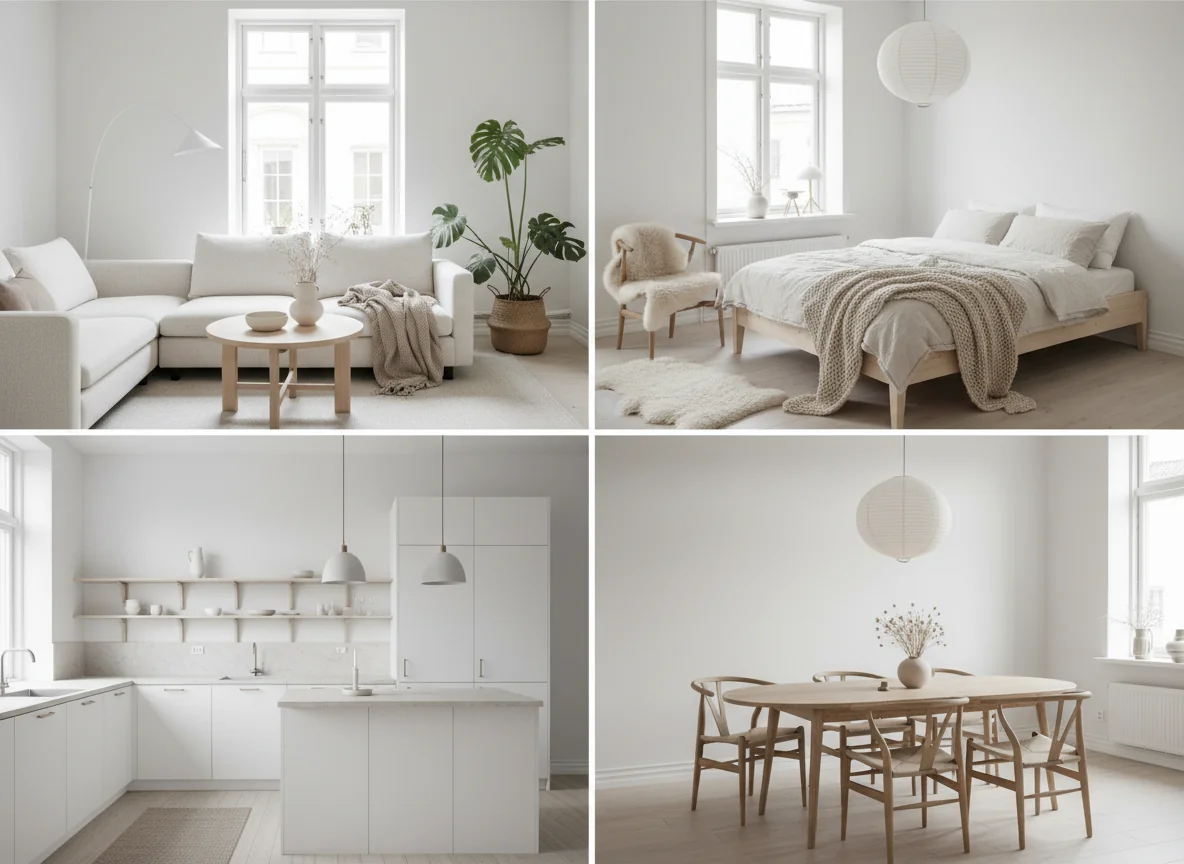
A consistent through-line across all four rooms: bright, even lighting; pale wood as the dominant warm material; pure white or near-white walls; cream or oatmeal soft goods; one organic element (plant or dried) per room; and a single hygge accent (sheepskin, wool throw, or beeswax candle) that keeps the room from reading clinical. Hold those constants across a multi-room render and the home reads as one continuous space.
Hygge-forward accents
The risk with Scandinavian is that it tips into clinical. Pure white walls and pale wood without warming accents can read like a dentist’s reception. Hygge — the Danish word for the cozy, sheltered, candle-lit feeling of a winter night indoors — is the antidote, and it lives in a small set of accent categories that every Scandinavian room should include at least one of.
The first is wool, in volume. A chunky-knit throw, a sheepskin, a wool rug with visible weave. Wool reads as warm in a way polyester throws never quite manage, and a single chunky throw over a chair carries an outsized share of the cozy-mood work. Include “chunky knit throw” or “sheepskin” in the prompt explicitly; without the cue, the model often defaults to a flatter blanket that doesn’t carry the same weight.
The second is candles, casually placed. Beeswax tapers on a dining table, a pillar candle on a coffee table, tea lights on a windowsill. Candles are the easiest Scandi accent to include in real life and one of the most reliable to include in a prompt — the model renders them accurately and they introduce a soft point of warmth that prevents the white-on-pale-wood palette from going flat. If you pick only one hygge cue, pick candles.
The third is a plant or two. A fiddle-leaf fig, a monstera, a trailing pothos, a small olive in a terracotta pot, or a tied bundle of dried grasses in a stoneware vessel. The organic note introduces irregular living shape against the room’s clean geometry and cues “warm” without using a warm color. The best Scandi rooms have two or three plants at meaningfully different scales.
The fourth is books, in small visible quantities. A short stack on a coffee table, a row on an open shelf, a single book face-down on the arm of a chair. Books cue “lived-in” the way nothing else does in a quick render. They also distinguish a Scandinavian render from a Japandi one — Japandi tends toward bare surfaces; Scandinavian tends toward small visible signs of life.
The fifth, if the room calls for it, is a single soft color accent — a sage cushion, a mustard throw, a pale dusty-blue ceramic vase. Scandinavian permits one per room, never several. Used sparingly, it lifts the palette out of all-neutral. Used in volume, it stops being Scandinavian.
If you’ve spent time in the broader minimalist conversation, our modern minimalist home decor guide goes deeper on the discipline of restraint that the hygge layer plays against. For an outside source, the Architectural Digest primer on Scandinavian design is a reasonable mainstream introduction, and Dezeen’s ongoing Scandinavian coverage is the best source for high-end projects that show how the style scales beyond an IKEA reference.
Common Scandinavian rendering mistakes
Even with the AI’s natural advantage on the style, a few specific mistakes show up often enough to be worth naming. Most are easy to correct on the second or third render once you know what you’re looking for.
The first is cool white instead of warm white. The default white in a lot of AI renders skews slightly cool — a gallery-wall white, not the cream-leaning warm white that real Scandinavian rooms use. The render reads sterile rather than cozy. The fix is to specify “warm white walls, soft cream undertone” or “off-white limewash walls” in the prompt.
The second is wood that’s too dark. The model occasionally interprets “Scandinavian” as a generic wood-and-white instruction and produces a render with medium walnut or dark stained oak. Specify “birch,” “pale white oak,” or “blonde ash” by name and the render returns to the correct lighter range.
The third is over-decorating. Scandinavian permits more objects than Japandi but is still restrained; the AI sometimes over-fills surfaces. If a render comes back too busy, add “minimal accessories, generous negative space” and the model dials decor density back.
The fourth is missing the hygge layer. A Scandi render without a throw, a candle, or a plant reads correct but cold. If the first render looks technically right but emotionally flat, add “chunky wool throw on sofa,” “beeswax candles on coffee table,” or “trailing pothos in stoneware pot.” The render warms up immediately.
The fifth is harsh overhead lighting. The AI sometimes defaults to a bright multi-bulb ceiling fixture that’s not really part of the Scandi language. Specify “soft diffuse daylight, single paper pendant” or “two small table lamps with linen shades” and the lighting returns to the right register.
For broader rendering technique that applies across styles, our AI interior design app walkthrough covers the prompt-and-iterate workflow that catches these issues fastest.
FAQ
Is Scandinavian design just IKEA?
IKEA is the most visible interpretation of Scandinavian, but the style is much older and broader than the catalog. The named tradition goes back to mid-20th-century Danish, Swedish, and Finnish modernism — Wegner, Aalto, Jacobsen, Klint — and the high-end version sits at the architectural-design level (Vipp, Carl Hansen, Fritz Hansen, &Tradition). IKEA brought the language to mid-market price points and made it globally legible, but a fully realized Scandinavian room is more disciplined and more material-specific than a showroom.
What rooms is AI Scandinavian design worst at?
Dim, low-windowed spaces — basement living rooms, north-facing bedrooms, interior hallways. Scandinavian is fundamentally a daylit style, and a render of a dim room sometimes looks like the model is fighting the source light. The workaround is to prompt for “bright diffuse daylight” explicitly, or to consider whether Japandi suits a low-light room better — its warmer palette tolerates lower light gracefully.
Can Scandinavian work in a small apartment?
It’s one of the best styles for small apartments. The bright palette, low-profile furniture, and visual restraint all make small rooms read larger than they are. Most Scandi anchor pieces are available in apartment-scale sizes from mid-market retailers. A 500-square-foot studio rendered in full Scandinavian almost always feels larger after the render than the source photo did before.
What’s a realistic budget for a whole-home Scandinavian conversion?
At U.S. mid-market prices, between $3,500 and $7,500 depending on whether you’re replacing wholesale or swapping room by room. The style has a price-point advantage over most named aesthetics: the anchor pieces (low-profile sofas, pale-wood case goods, linen bedding, paper lanterns) are all in stock at major flat-pack retailers. Bedroom and living-room conversions are usually the cheapest; kitchen renovations push the upper end.
How long does an AI Scandinavian render take from a phone photo?
Between 30 and 90 seconds in a modern consumer app. Scandinavian prompts converge fast because the style’s narrow palette and bright, even lighting give the model less variance to resolve. Plan to generate three to five variants per room; one is almost always a clear keeper.
Generate Scandi. Live Scandi. Or at least preview Scandi.
Scandinavian is the rare style where a single phone photo and a one-word prompt produce a render you could actually live with. Shoot a doorway photo of your living room, run it through a “Scandinavian” prompt, and you’ll have a credible preview in under two minutes — and another in your bedroom thirty seconds after that.
RoomGenius is the AI room design app that handles Scandinavian natively, with the bright palette, pale-wood vocabulary, and hygge accent layer baked into how the style renders. The free tier covers your first few rooms, and the furniture-matching layer ties each rendered piece — the cream bouclé sofa, the pale-oak credenza, the chunky wool throw — to something you can actually order. Try it on the App Store or Google Play. Generate Scandi. Live Scandi. Or at least preview Scandi before you commit.