AI Japandi Interior Design: The Style AI Renders Best
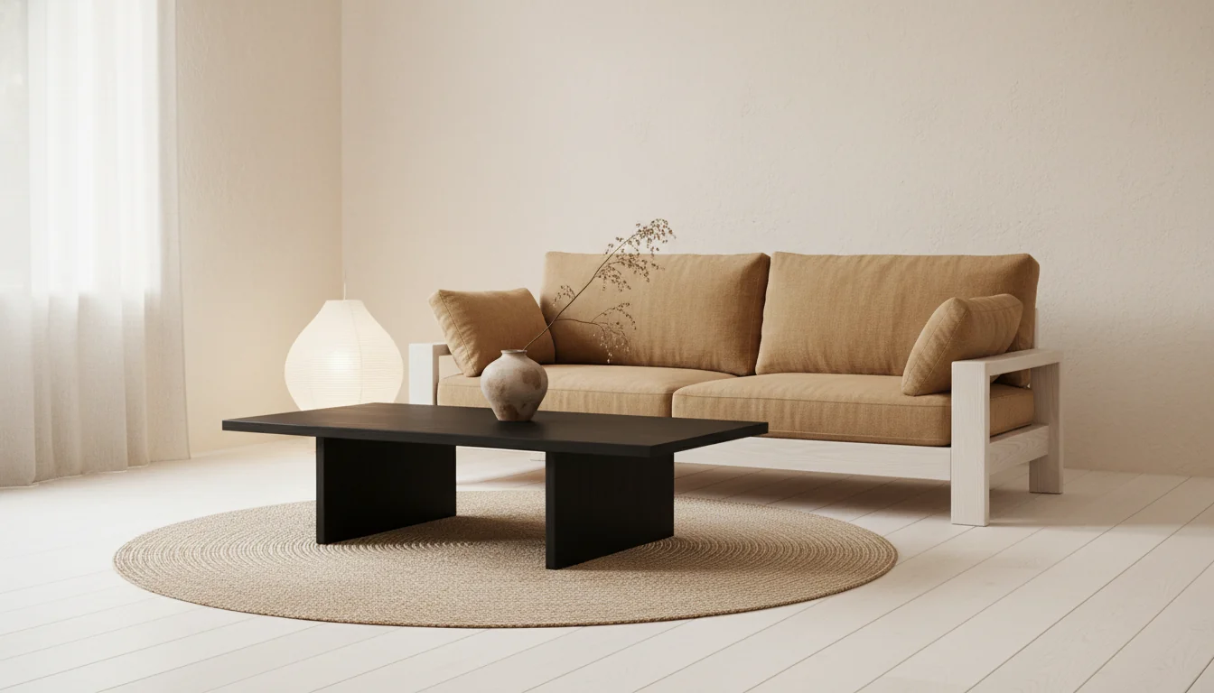
Japandi is the style every design feed has been quietly converging on for three years — the warm wood, the off-white plaster, the low-slung furniture, the single ceramic vase doing the work of a whole wall of art. It looks intentional in a way most styles don’t. It also happens to be the style consumer AI tools render most convincingly. AI Japandi design is one of those rare cases where the model’s defaults and the style’s defaults are pulling in the same direction, and the result is a render you’d actually live with — generated from a single phone photo of the room you already have.
This guide is the working tour: what Japandi actually is (and isn’t), why AI handles it better than louder styles, the narrow color and material palette that defines it, how it adapts room by room, and the furniture-matching layer that turns a render into a buying plan. If you’ve been watching the style from the outside and wondering whether to commit, the fastest way to find out is to see your own living room in it.
What is AI Japandi interior design? AI Japandi interior design is the use of an AI room-rendering tool to transform a photo of an existing room into a Japandi-styled version — a hybrid of Japanese wabi-sabi minimalism and Scandinavian functional warmth. The render preserves the room’s architecture (walls, windows, ceiling) and replaces the decor layer with Japandi hallmarks: a narrow neutral palette of warm whites, pale woods, and matte blacks; low-profile furniture in oak, ash, or walnut; layered natural fibers (linen, wool, paper); negative space treated as a design element; and a small number of handmade objects standing in for a wall of decor. AI handles Japandi unusually well because the style’s narrow palette and consistent material language align with how diffusion models render confidently.
What Japandi actually is
Japandi is the marriage of two minimalist traditions that turn out to share more than they differ. Japanese interiors descend from centuries of wabi-sabi — the embrace of imperfect, handmade, weathered objects, with negative space treated as honored material in its own right. Scandinavian interiors descend from a parallel tradition of hygge and functionalism — warmth, light, simple lines, and a refusal to clutter. Both reject ornament. Both privilege wood. Both treat empty space as restful rather than unfinished. Bolt them together and you get Japandi: warmer than pure Japanese minimalism, more disciplined than pure Scandinavian, and unmistakably its own thing.
The style emerged as a named movement around 2017 in design press and crystallized during the 2020 work-from-home rethink, when people who suddenly spent twelve hours a day inside their own living rooms wanted spaces that felt calm without feeling cold. It has since become one of the most-searched aesthetics on home-design platforms — partly because it photographs well, partly because it’s achievable on a mid-market budget, and partly because it’s the rare style that works for both a city apartment and a family suburban home.
What Japandi is not is “Asian-inspired minimalism” with shoji screens and a sake set. The style isn’t a costume. It pulls a small handful of organizing principles from each tradition — restraint, natural material, negative space, the honored object — and applies them to whatever room you actually have. A Japandi kitchen in a 1970s American ranch doesn’t look like a tea house. It looks like a quiet, warm kitchen with oak cabinetry, matte black hardware, and one beautiful ceramic on the counter. That’s the move.
For broader context on where Japandi sits among today’s named aesthetics, our different types of home interior design styles guide places it alongside Scandinavian, modern minimalist, and warm contemporary — its closest cousins.
Why AI nails Japandi better than maximalist styles
Diffusion-based AI models render with the most confidence when the style they’re producing has a narrow visual vocabulary. Japandi has one of the narrowest in interior design. The palette is six or seven colors. The materials are five or six. The furniture shapes are low, rectilinear, and few. The decor objects are countable — one vase, one bowl, one branch — instead of the dozen tchotchkes a maximalist render has to invent.
This matters because every variable a model has to render is a variable it can render wrong. A heavily eclectic style — bohemian, grandmillennial, dopamine decor — asks the AI to produce a unique pattern on every pillow, a different finish on every lamp, a layered collection of mismatched art. Some of those decisions will land; many will look like AI’s recognizable pattern-soup. Japandi asks the AI to produce three pillows in three tones of the same off-white linen, one paper lantern, and a single dried branch in a ceramic vessel. That’s a constraint a model can satisfy cleanly.
Geometry helps too. Japandi furniture sits low and reads as simple boxes — platform beds, slab-front cabinetry, low-profile sofas with visible wood legs. Simple geometry photographs predictably in real life and renders predictably in synthetic image space. Compare to the failure modes on, say, a heavily carved English country chair: the AI guesses at the carving pattern, and you can see it guess. A Japandi oak nightstand has no carving to guess at.
Lighting is the third reason. Japandi defaults to soft, diffuse, single-source light — a paper lantern, an arc floor lamp, a linen-shaded sconce — which is exactly the lighting condition AI models render most photoreal. Harsh shadows are hard. Diffuse warm light off a pale wall is easy.
The practical upshot: if you run the same phone photo through six named styles in a consumer AI room-rendering app, the Japandi render is usually the most convincing of the set. That’s not a coincidence. It’s the style and the tool meeting in the middle. For more on how to write prompts that lean into this, our how to prompt AI interior design post is the working playbook.
Color palette and material rules
The reason Japandi looks coherent across rooms is the same reason an AI renders it well: the palette is narrow and the materials are disciplined. Internalize the rules below and you can both spot a real Japandi room and write a prompt that returns one.
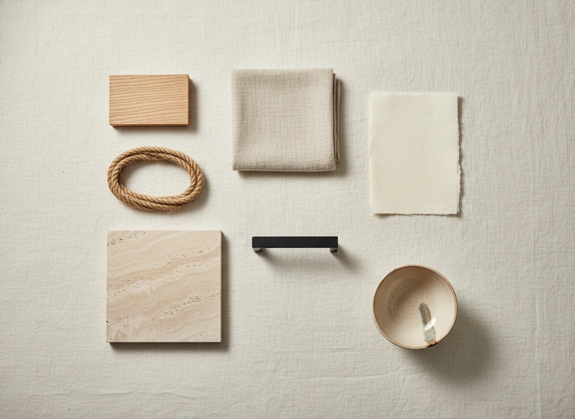
The color palette runs warm-neutral with a single grounding dark. Walls are warm white, pale plaster, or the lightest off-white — never cool gray, never pure white. Floors and primary woods sit in the pale-to-medium range: white oak, ash, light maple. Soft furnishings layer in oatmeal, undyed linen, soft camel, putty, and warm gray. The single contrast is matte black — a black-stained oak coffee table, blackened steel hardware, a charcoal wool throw — used sparingly, always matte, never glossy. One accent color, if any, comes from a clay-toned ceramic or a deep forest pillow. The whole palette is six or seven entries deep. Anything beyond that breaks the style.
Materials cluster around a similarly short list. Wood is the dominant material — oak, ash, walnut, or paulownia — in matte or oil finish, never high-gloss. Stone shows up in raw or honed forms (travertine, soapstone, limestone), never polished marble. Textiles are natural fibers: linen, wool, cotton, jute, paper. Metals are blackened steel, brushed brass used sparingly, or matte black. Ceramics are handmade, slightly imperfect, often with a visible glaze drip. Plastic, chrome, and high-gloss lacquer do not appear in a true Japandi room — those finishes break the wabi-sabi principle the style is rooted in.
| Element | Japandi default | What to avoid |
|---|---|---|
| Wall color | Warm white, pale plaster, off-white | Cool gray, pure white, accent walls in jewel tones |
| Flooring | White oak, ash, light maple — matte finish | High-gloss hardwood, dark walnut, patterned tile |
| Primary wood | Oak, ash, paulownia in oil or matte | Glossy lacquer, painted furniture, MDF veneer |
| Contrast tone | Matte black, blackened steel, charcoal | Chrome, polished brass, mirror finishes |
| Textiles | Linen, wool, cotton, jute, paper | Polyester velvet, sequins, faux fur |
| Decor density | One object per surface, negative space honored | Cluttered shelves, gallery walls, layered tchotchkes |
| Lighting | Paper lanterns, linen shades, single warm source | Multi-bulb chandeliers, cool LEDs, recessed grids |
| Pattern | Almost none — quiet texture instead | Bold geometric prints, large florals, stripes |
The rules feel restrictive on paper. In practice they’re freeing — there are fewer decisions to make, and the small number of decisions you do make matter more. If you’ve spent time in the broader minimalist conversation, our modern minimalist home decor guide goes deeper on the philosophy behind treating negative space as material. And for readers drawn to the disciplined color side, the achromatic color scheme explainer covers the warm-neutral logic that Japandi inherits from its Japanese half.
Japandi by room
The style adapts cleanly to every room in a home, but each room has a small handful of moves that decide whether the result reads as Japandi or as generic minimalism. Generate a render for each room with the moves in mind and you’ll get a coherent whole-home look on the first or second pass.
Living room. The defining Japandi move in a living room is the low horizon. Sofas sit low — 30 to 32 inches at the back — with a visible wood frame and linen or wool upholstery in oatmeal or warm gray. The coffee table is a low slab in oak or black-stained ash, not a glass-topped pedestal. One floor lamp, ideally a paper lantern or a linen shade on a slim wood stand, replaces an overhead fixture wherever possible. The TV, if it stays, sits on a low slab credenza rather than a tall console. Art is one or two pieces, framed in pale wood with wide mats, never a gallery wall. A jute or wool rug grounds the seating. The room reads quiet, low, and warm.
Bedroom. A Japandi bedroom is the easiest room to convert because the existing furniture is usually already low and rectilinear — a queen bed is a queen bed. Swap the upholstered headboard for a low-profile platform bed in oak or walnut. Match the nightstands in the same wood. Replace polyester bedding with layered linen in oatmeal, soft black, and warm white. The overhead light becomes a paper pendant or disappears entirely in favor of a pair of low table lamps with linen shades. A woven floor rug — wool or jute — softens hard floors. The dresser, if there is one, sits low and slab-fronted. The room should read as if every object in it was chosen on purpose.
Dining room. Japandi dining is anchored by the table, which is the single most visible piece in the room. A solid wood table in oak or ash — rectangular, with simple straight or tapered legs — sits at the center. Chairs match the wood, often with woven paper-cord or rush seats, never upholstered in patterned fabric. One pendant hangs low over the table, ideally paper or matte black. The sideboard, if there is one, is a low slab credenza. A single ceramic centerpiece replaces a tablecloth or runner. The room avoids the formal-dining instinct toward symmetry and ornament; Japandi dining looks like a tea ceremony’s distant cousin — quiet, anchored, intentional.
Bathroom. Japandi bathrooms lean hard on natural material and a deliberately small palette. Vanities are oak or walnut with matte black or blackened-brass hardware. Counters are honed stone (travertine, soapstone, or warm limestone), never polished marble. The mirror is a single round or rectangular piece with a thin matte black frame. Tile, if any, is large-format and warm — terracotta, sand, or pale travertine — never small mosaic. A linen shower curtain replaces vinyl. One ceramic vessel on the counter holds a single bar of soap. The room should feel like an onsen-adjacent ritual space, not a hotel bathroom trying to be neutral.
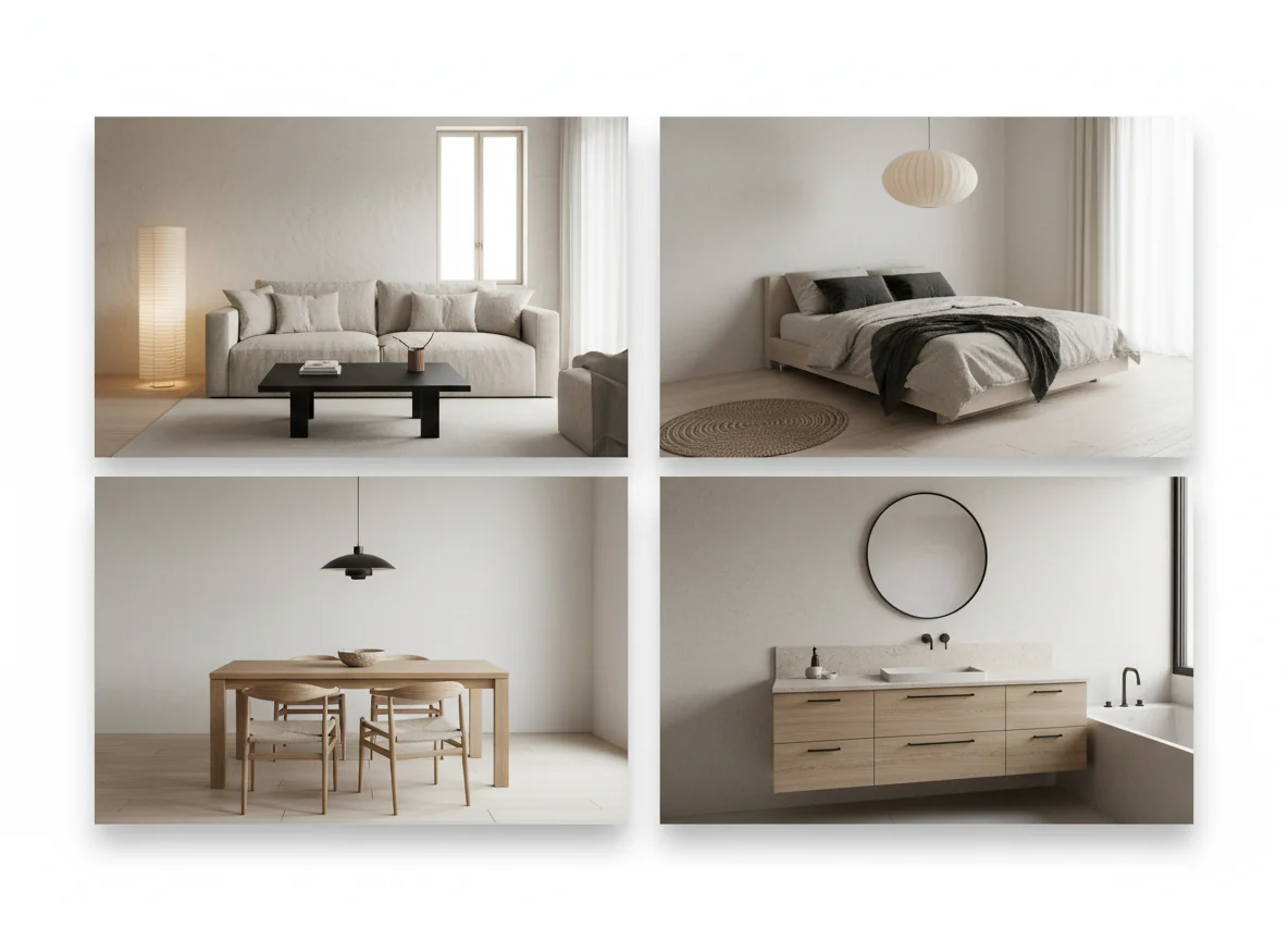
A consistent through-line across all four rooms: one statement object per surface, generous negative space, warm neutral walls, and a single matte black moment that grounds the warmth. Hold those four constants across a multi-room render and the home reads as one continuous space rather than four disconnected ones.
Japandi-friendly furniture matching
A Japandi render is only as useful as the furniture you can actually buy to execute it. This is the second half of the AI workflow — the layer that turns each rendered piece into a real product with a price, a retailer, and a delivery window. Japandi has an advantage here too: the style’s narrow material vocabulary maps cleanly onto categories that already exist at mid-market retailers, which means the furniture-matching layer in a consumer AI app has an easier time finding real matches than it would for a more idiosyncratic style.
Sofas and beds in the Japandi look are produced by mainstream brands under names like “low-profile,” “platform,” or “Japandi” outright — the category is established enough that you can filter for it. Pale oak case goods sit at the center of every major flat-pack retailer’s catalog. Linen bedding and oatmeal upholstery are in stock everywhere. Paper lanterns and the Noguchi-style standing lamps have been mass-produced for decades. The hard-to-find pieces are usually the handmade ceramics and the one or two artisan items — but those are the pieces you’d want to source slowly anyway, often from a local maker or a small-batch shop.
The mental model for shopping a Japandi render: anchor pieces (sofa, bed, table, dresser) from mid-market retailers in the right wood and finish; soft goods (bedding, rugs, throws) in undyed natural fibers; and one or two handmade objects that carry the wabi-sabi note. That sequencing keeps the budget reasonable. A whole-home Japandi conversion at U.S. mid-market prices typically lands between $4,500 and $9,000 depending on whether you’re replacing wholesale or swapping room by room.
For more on how the furniture-matching layer works in practice — what good matching looks like, what to ignore — our AI furniture matching app post covers the mechanics. Outside the AI workflow, the Architectural Digest primer on Japandi is a reasonable mainstream introduction, and Dezeen’s ongoing Japandi coverage is the best source for high-end projects that show how far the style scales.
FAQ
Is Japandi just another minimalism trend that will date quickly?
Probably not in the way most trends date. The two source traditions — Japanese wabi-sabi and Scandinavian functionalism — have been continuously fashionable for forty and seventy years respectively. Japandi as a named hybrid is newer (about a decade old in design press), but the underlying language is durable. A Japandi room from 2026 will read as quiet and intentional in 2036, the way a Scandinavian room from 1990 still does today. The pieces themselves — oak case goods, linen sofas, ceramic vessels — are timeless on a furnishings horizon, even if the label evolves.
What rooms is AI Japandi design worst at?
The hardest rooms are heavily ornamented existing spaces — carved Victorian moldings, ornate fireplace surrounds, formal dining millwork — because Japandi’s clean lines fight the existing architecture in the render, and the AI sometimes splits the difference into something that’s neither. The fix is to write the prompt with explicit instructions to “ignore existing ornament” or to focus the render on the furniture and decor layer only. Heavily patterned tile floors are also hard; if the existing floor is busy, the AI will often quietly re-render it to match the style.
Can I do partial Japandi without committing to the whole house?
Yes, and it’s actually the most common entry point. A single Japandi bedroom or a Japandi-styled reading corner reads as intentional without requiring whole-home commitment. The style is forgiving as a fragment because its visual language is quiet — a Japandi bedroom next door to a transitional living room doesn’t fight. The combination most people land on long-term is Japandi in bedrooms and bathrooms (the rooms that benefit most from calm) and warm contemporary in shared living spaces.
What’s the difference between Japandi and Scandinavian?
Scandinavian leans whiter, brighter, and lighter — more pure white walls, more blonde wood, more visible texture. Japandi pulls darker on contrast (the matte black, the deeper wood tones), warmer on neutrals (off-white instead of cool white), and quieter on objects (fewer, more deliberate, often handmade). A Scandinavian room can feel airy and cheerful; a Japandi room feels grounded and meditative. The two share furniture silhouettes — both love low platform beds and slab credenzas — but the mood is meaningfully different.
How long does an AI Japandi render take from a phone photo?
Between 30 and 90 seconds from upload to finished render in a modern consumer app. The Japandi prompt converges faster than most styles because the model has less variance to resolve. Plan to generate three to five variants; one is usually a keeper.
Generate Japandi versions of every room in your home
Japandi is the rare style where a single phone photo and a one-word prompt produce a render you could actually live with. Shoot a doorway photo of your living room, run it through a “Japandi” prompt, and you’ll have a credible preview in under two minutes — and probably another in your bedroom thirty seconds after that.
RoomGenius is the AI room design app that handles Japandi natively, with the narrow palette and material rules baked into how the style renders. The free tier covers the first few rooms, and the furniture-matching layer ties each rendered piece — the linen sofa, the oak credenza, the paper lantern — to something you can actually order. Try it on the App Store or Google Play. The fastest way to know whether the style is for you is to see your own rooms in it.