Awkward Living Room Layout Fixes: Solve the Unsolvable Room
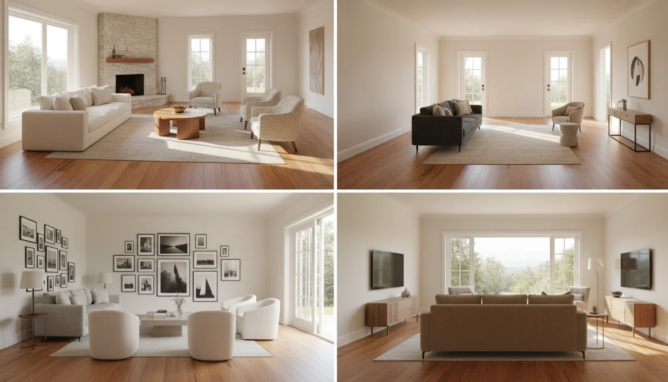
Some living rooms don’t just feel off — they feel genuinely unsolvable. A corner fireplace that eats the only usable wall. Three doorways in a room that’s barely 12 feet wide. A wall of windows that leaves no surface for the TV. An open-plan space where the living area has no edges at all. If you’ve ever stood in a living room, sighed, and thought “there is literally no way to arrange this,” you’re not alone — and you’re probably right that the standard layout advice doesn’t apply. Awkward living room layout fixes are a different category from normal room planning. They start with the constraint, not with the furniture you want to buy.
This guide is organized around the five most common awkward-room culprits that search and reader data consistently show: the corner fireplace room, the too-many-doorways room, the no-focal-wall room, the TV-vs-window conflict room, and the open-plan room with no edges. Each section names the problem, gives the fix that works, and shows how to test it before you commit. The last section covers the general AI preview workflow that ties all five together — because the single best tool for an awkward room is the ability to see three layouts instantly without moving a single piece of furniture.
What is an awkward living room layout? An awkward living room layout is one where the standard interior-design rules — anchor the sofa to the longest wall, place the TV on the focal wall, arrange seating around a coffee table — don’t cleanly apply. The room has a structural constraint (corner fireplace, too many doors, too many windows, no solid wall, irregular shape) that forces a non-standard furniture arrangement. The fix usually involves working with the constraint rather than fighting it: floating furniture, creating artificial focal points, or rethinking what each zone is for.
Why some living rooms feel unsolvable
The feeling that a room is unsolvable has a specific cause: the room violates the unspoken rule that every living room needs one clear focal wall. The focal wall is the wall the sofa faces. It’s the wall that holds the TV, the fireplace, the art piece, or the built-in shelving. It’s the visual anchor the whole room arranges itself around. When no wall can serve that role — because of a fireplace in a corner, a door punching through the middle, windows covering the whole surface, or an open plan with no walls at all — the room has no organizing principle, and every arrangement feels like a compromise.
The instinct when no wall works is to try to force one. Push the sofa against the one short wall, hoping it becomes the anchor. Put the TV in the corner and angle the seating, hoping the eye adjusts. Shove everything to the perimeter and leave the center empty, hoping it reads as intentional. None of these work because they’re fighting the constraint instead of using it.
The shift that fixes awkward rooms is simple to state and hard to adopt: stop looking for the focal wall. Build the focal point in the middle of the room instead. The awkward room’s best move is almost always the float — pulling the anchor piece into the center of the footprint and building the room around it, independent of the walls. This is the same principle that fixes long narrow rooms, but it applies more broadly here because the wall is the problem.
For the full look at how the standard focal-wall approach works when you do have a good room to work with, our how to arrange living room furniture guide covers the baseline. The fixes below are the exceptions that override the baseline.
Fix: the corner fireplace
The corner fireplace is the most common awkward-room complaint in the data. The room is a normal rectangle, but the fireplace is tucked into one corner, often on a 45-degree angled hearth. The sofa can’t face it cleanly without pointing into the corner. The TV can’t go above it because the chimney breast is too narrow or angled. The fireplace itself is a strong visual anchor — it’s brick, stone, or tile, it draws the eye — but it’s in the wrong place for a standard arrangement.
The fix: treat the fireplace as the room’s secondary anchor, not its primary one. The primary anchor — the sofa — faces across the room’s short axis, not toward the fireplace. The seating cluster is arranged as a conversation grouping parallel to the longest wall, with the sofa’s back to the fireplace or at a 90-degree angle to it. The fireplace becomes a side feature: an accent chair pulled up next to it, a pair of armchairs flanking the hearth at an angle, a small side table or drink ledge on the hearth itself. The fireplace is visible and usable without being the thing every seat faces.
| Element | Typical approach (doesn’t work) | Awkward-room fix (works) |
|---|---|---|
| Sofa position | Facing the fireplace, pointing into the corner | Parallel to the long wall, fireplace to the side |
| Seating | All chairs facing the fireplace | Open conversation square; one chair optionally near the hearth |
| TV placement | Above the fireplace (too high) | On an adjacent wall, or on a slim console perpendicular to the hearth |
| Fireplace role | The room’s single focal point | A warm accent zone, not the main event |
| Coffee table | Aligned with the hearth angle | Centered on the conversation square, parallel to the sofa |
The visual trick that sells this arrangement: a large rug that defines the main seating zone independently of the fireplace. The rug sits under the sofa and coffee table, not extending to the hearth. The fireplace has its own smaller rug or bare floor. This separation tells the eye that the room has two distinct areas — a conversation zone and a fireplace zone — instead of one room confused about what it’s facing.
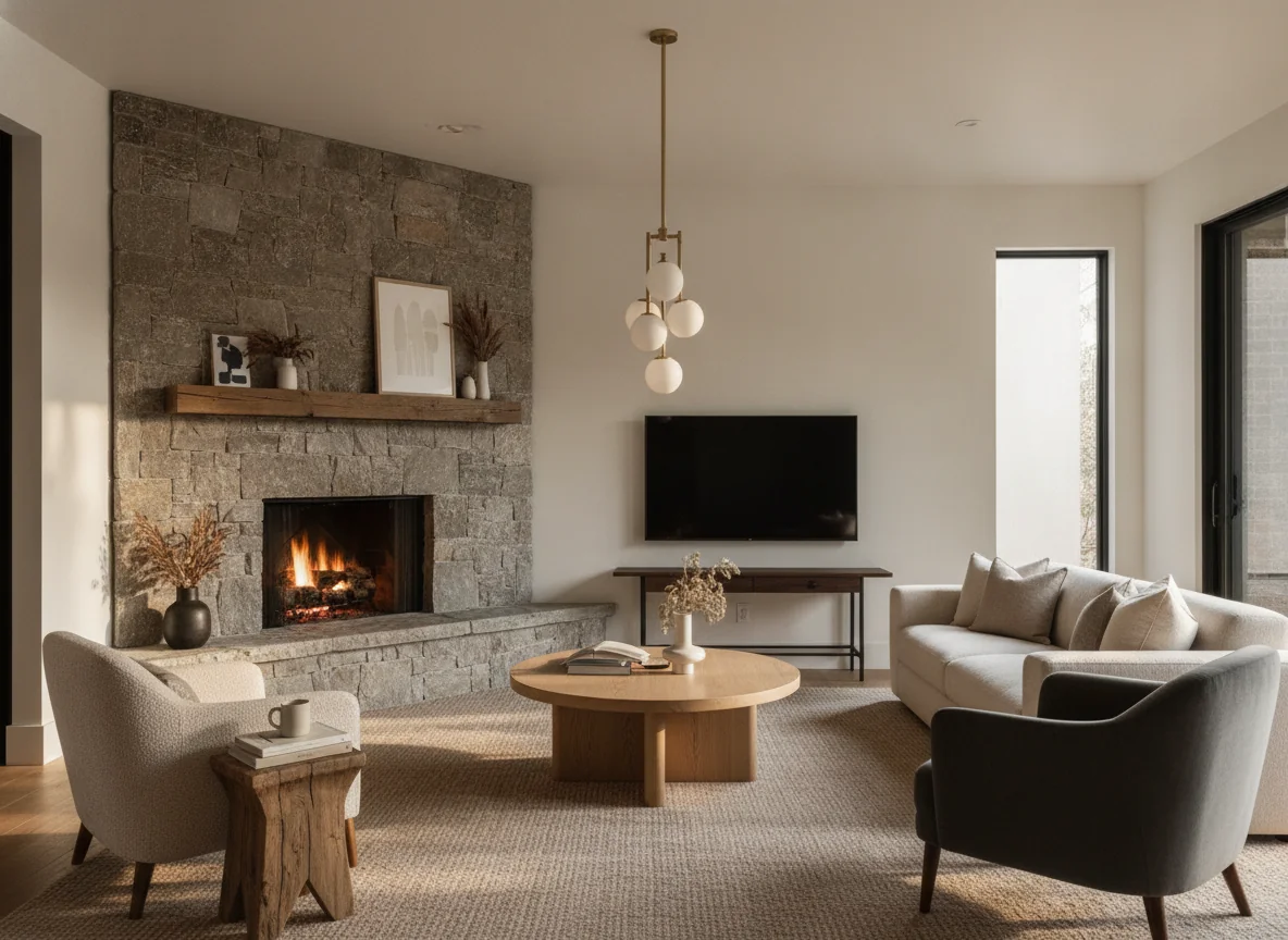
The TV placement deserves its own note. If the adjacent wall is long enough for a slim console, the TV goes there, at a comfortable viewing height. If the only TV position is above the fireplace, use a full-motion mount that pulls down and centered — but even then, the sofa should face the room, not the TV. The room is a living room, not a theater, and the awkward room fix prioritizes conversation over screen alignment.
Fix: too many doorways and traffic paths
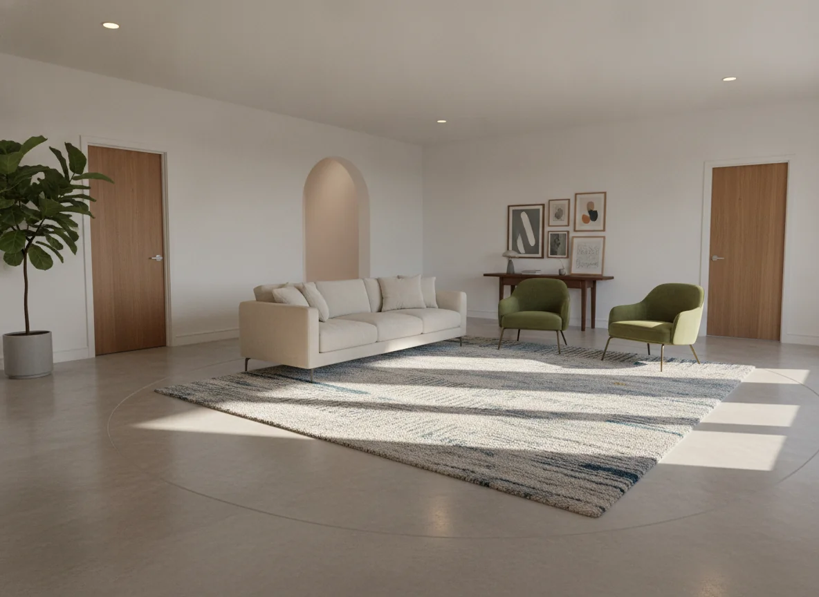
Three doors in one living room — or two doors plus a wide archway — is the second most common awkward-room complaint. The room becomes a hub people walk through, and every wall that could hold a sofa is broken by a door. The natural reflex is to push everything into the one remaining solid wall, which creates a furniture island with a traffic river running through the middle.
The fix: design around the traffic path instead of trying to hide it. Map the actual routes people take between the doors. The path is not optional — it’s the room’s organizing spine. Everything else arranges itself to one side or the other. The key is making the path feel intentional rather than accidental.
Start by identifying the two most-used entries into the room. In a three-door room, one path is almost always dominant — say, from the hallway to the kitchen. That’s the spine. Place the seating cluster entirely on one side of that spine, with the sofa’s back to the path or at a slight angle that creates a visual barrier. The second side of the room becomes a secondary zone — a console, a reading chair, a plant cluster, or a narrow bookshelf.
The rug choice is critical here. Do not use a room-size rug. Use a zone-size rug that sits under the seating cluster only, stopping well short of the traffic path. The bare floor between the rug and the doorways is the circulation zone, and it reads as intentional when the rug edges are cleanly defined.
| Doorway count | Circulation strategy | Seating position | Secondary zone |
|---|---|---|---|
| Two doors on opposite walls | Path runs straight through; place seating to one side | Sofa parallel to the path, back to the closer wall | Console or shelves on the opposite side |
| Two doors on adjacent walls | Corner path; place seating in the opposite corner | Sofa floated at 45 degrees or parallel to the longer wall | Reading nook or desk in the far corner |
| Three doors (one dominant path) | Spine path; seating entirely on one side | Sofa perpendicular to the path, back creating a boundary | Narrow bookcase or plant corner on the far side |
| Archway + one door | Archway is the main entry; path runs from there to the door | Sofa facing away from the archway, toward the solid wall | Hall table or art behind the sofa |
The most common mistake in a three-door room is buying a too-large sectional that blocks one door entirely. A sectional that extends past the doorway edge creates a furniture wall that people have to walk around, which makes the room feel smaller. Two smaller sofas, or a sofa plus two armchairs, leave more natural circulation channels.
For the deeper thinking on how traffic lanes interact with furniture placement, our room layout ideas guide covers the same circulation-first logic across a wider range of room shapes.
Fix: no obvious focal wall
Some living rooms have good dimensions, good light, and no structural obstacles — and still feel unsolvable because every wall is identical. A room with four clean walls, no fireplace, no architectural feature, and no built-in shelving has no obvious place to put the focal point. The sofa could go anywhere. The TV could go anywhere. The result is paralysis: nothing feels right, so nothing gets committed.
The fix: create a focal wall where none exists. This is the one awkward-room fix that is 100 percent decor rather than layout. You choose which wall becomes the anchor — preferably the wall the room faces when you enter — and then you give it visual weight.
Options for creating a focal wall, ranked by impact:
- Gallery wall. A dense, salon-style arrangement of 9–15 frames in matching or complementary frames creates a visual mass that functions like a fireplace. The sofa faces it. The coffee table centers on it. The room reads as anchored.
- Large-scale art. A single oversized piece, 48×60 inches or larger, instantaneously becomes the room’s anchor. It doesn’t need to be expensive — a canvas print, a textile wall hanging, or a large framed poster works.
- Built-in shelving. Floor-to-ceiling open shelving on one wall, even if it’s a simple IKEA system, creates a focal wall the room can orient around. The combination of vertical lines, objects, and negative space draws the eye.
- Accent wall with color or texture. A deep navy, charcoal, or olive wall, or a wall with vertical shiplap, board-and-batten, or wallpapered treatment, becomes the room’s natural anchor. The sofa faces it.
- Statement light fixture. A large pendant or chandelier centered over the seating area creates a ceiling-level focal point that works when the walls are all neutral. The room arranges around the light drop.
The key rule: pick one wall and commit. The worst outcome in a no-focal-wall room is spreading the visual weight evenly across all four walls — a small piece of art here, a small mirror there, a plant in the corner — which leaves the room feeling diffuse. Concentrate the weight on one wall, arrange the furniture to face it, and let the other three walls recede. The room will feel solved.
For the companion thinking on how color and wall treatment create atmosphere, our interior design for small rooms guide covers the paint-and-proportion decisions that work here too.
Fix: the TV-vs-window conflict
The TV-vs-window conflict is the most common awkward-room complaint that people don’t realize has a name. The room has one great wall for the TV, and it’s also the wall with the best natural light. Putting the TV there means the window is blocked or the TV is backlit by glare. Putting the TV on a different wall means the sofa faces away from the natural light, which makes the room feel dark and wrong.
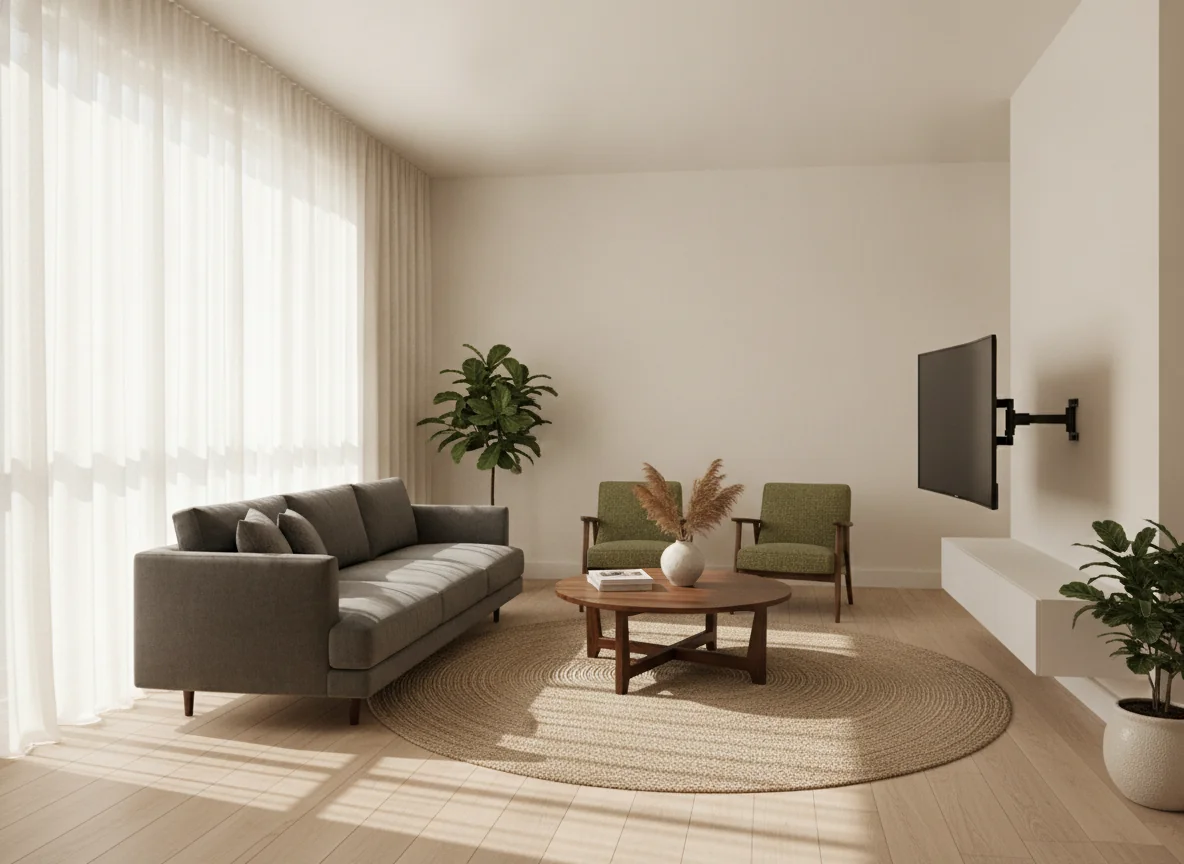
The fix: separate the seating anchor from the TV anchor. The sofa does not need to face the TV. The sofa faces the room’s center; the TV is on a slim console or a full-motion mount that angles toward the seating. This is the single most important furniture rule for the TV-vs-window room, and it’s the one most people miss.
| Scenario | What doesn’t work | What does work |
|---|---|---|
| Window on the long wall, TV must go there | Sofa facing the window, TV above it — glare and neck strain | Sofa floated parallel to the window, TV on a slim console perpendicular to the wall, angled toward seating |
| Windows on two adjacent walls | TV in the corner between them — too small a surface, bad viewing angle | Sofa floated into the center of the room facing the longer solid wall, TV on that wall, windows become side light |
| One large window, one solid wall | TV on the solid wall, sofa facing it — room is dark and faces away from light | Sofa at a 45-degree angle to the window, TV on a slim low console on the solid wall, angled mount |
| Floor-to-ceiling windows on one wall | No wall space for TV at all | TV on a low-profile console that sits in front of the window, with a sheer curtain that drops behind it; the TV reads as a floating element rather than a wall obstruction |
The mechanical solution that makes many of these configurations work: a full-motion TV mount that pulls the screen 12–18 inches from the wall and swivels up to 90 degrees. It allows the TV to sit on a short wall or beside a window and still face the seating directly. The mount is not visible from the front, so the TV reads as a freestanding element rather than an awkward wall attachment.
The sofa position in a TV-vs-window room should prioritize the view and the light over the screen. The TV is a secondary viewing position; the room’s primary orientation is toward the window. The sofa faces the window, and the TV is on a side wall or a console perpendicular to the window wall, angled toward the seating. This gives you the light and the view as the main experience, with the TV as an available option rather than the ruling feature.
For the design philosophy that treats the room’s architecture as the primary consideration and the furniture as the secondary layer, our ai living room design guide covers how to prompt AI tools to respect the room’s constraints while still producing a finished layout.
Fix: open-plan rooms with no edges
Open-plan rooms are the most paradoxical awkward room. They have more space than almost any other layout, and they’re the hardest to furnish. A large open-plan living-dining-kitchen area with no walls, no columns, no change in flooring, and no architectural differentiation has no edges to anchor against. The furniture floats in a sea of square footage, and every arrangement feels temporary.
The fix: build the edges with furniture. In an open plan, the furniture itself must create the walls the room doesn’t have. The sofa backs up to the dining area to create a visual partition. A large rug defines the living zone’s boundary. A console table behind the sofa reinforces the separation. A pendant cluster over the dining table creates a ceiling-level edge.
The most effective open-plan fix is the sofa-as-divider. Place the sofa with its back to the dining area, perpendicular to the flow of the open plan. The sofa’s back becomes the wall between living and dining. A slim console table behind the sofa — 12 inches deep, at the same height as the sofa back — completes the boundary. The console holds lamps, trays, books, or plants, and it gives the dining side a visual surface to look at instead of the sofa’s back fabric.
| Open-plan challenge | Furniture fix | Visual cue |
|---|---|---|
| No distinction between living and dining | Sofa-as-divider with console table behind it | Different rug under each zone; different pendant styles |
| Living area feels like it’s in the middle of a larger room | Full perimeter arrangement: sofa, two chairs, and a sideboard all facing inward | One large rug defining the entire living zone; room doesn’t touch the actual walls |
| Kitchen island flows into the living area with no break | A tall plant, a floor screen, or a narrow bookcase perpendicular to the island | The break doesn’t need to be full-height; a 36-inch visual screen is enough |
| Furniture clusters in the center and leaves empty edges | Push the sofa toward one edge of the open plan, anchor the dining on the opposite edge | Leave a clear circulation path between zones; the edges are the walls you built |
The lighting strategy matters more in open-plan rooms than in any other awkward configuration. Without ceiling differentiation, the space is one big volume. Use at least two distinct lighting zones — a pendant or chandelier over the dining table, a cluster of pendants or a track light over the living area, and floor lamps in the corners. The ceiling-level variation tells the eye where one zone ends and the next begins, even when the floor is an open whole.
Previewing layout fixes before you commit
Every awkward-room fix in this guide shares one characteristic: it’s a positional decision, not a purchasing decision. The corner fireplace fix is about where the sofa sits, not which sofa you buy. The doorway fix is about where the rug goes, not which rug. The open-plan fix is about the sofa’s orientation, not its fabric. Positional decisions are the cheapest thing in the world to test digitally and the most expensive to reverse with real furniture.
This is where AI room design tools earn their keep for awkward rooms more than for any other use case. A standard room you can imagine well enough to buy furniture for. An awkward room you cannot — you need to see it. The workflow:
- Photograph the room from the most common entry point. Include all four walls, the floor, and the ceiling. Natural light is best; avoid flash.
- Render the current state as a baseline. This gives you a reference you can compare against.
- Render three layout variants. Each variant tests one fix from this guide: corner fireplace with the sofa parallel to the wall, corner fireplace with the sofa at 90 degrees, corner fireplace with the seating cluster floating and the fireplace as a secondary zone.
- Compare side by side. The variant that feels right — the one where the room reads as a finished space rather than a compromise — is the layout to commit to.
- Save the winning render and use it as a shopping guide. The furniture that matches the winner is the furniture that fits the room.
The advantage of the AI workflow for awkward rooms specifically is that it lets you test the non-obvious fix. Most people’s first instinct for a corner fireplace is to face the sofa toward it. Seeing the render with the sofa parallel to the wall and the fireplace as a side feature is often the moment the layout clicks.
For the broader AI design workflow that covers how to get the best renders from a room photo, including lighting, angle, and prompt techniques, our ai living room design guide is the companion piece. And for the general principle of testing layouts before committing to furniture, how to arrange living room furniture covers the pre-commitment logic that applies to every room, not just the awkward ones.
FAQ
What is the most common awkward living room layout problem?
The most common is the corner fireplace room, followed by the too-many-doorways room and the TV-vs-window conflict. Together these three account for roughly two-thirds of “unsolvable living room” search queries. All three share the same root cause: the room’s architectural features prevent a standard focal-wall arrangement.
How do you arrange furniture in a living room with a corner fireplace?
Float the sofa parallel to the longest wall rather than facing the fireplace. The fireplace becomes a secondary accent zone — an armchair pulled up next to it, a small side table on the hearth — while the main seating cluster forms a conversation square independent of the hearth. A rug under the sofa and coffee table, separate from the fireplace area, reinforces the visual separation.
What do you do with a living room that has too many doors?
Map the dominant traffic path between the most-used doors, then place the seating cluster entirely on one side of that path. The path becomes the room’s organizing spine rather than an obstacle. Use a zone-size rug under the seating only, and leave the bare floor around the doorways as intentional circulation space.
How do you create a focal point in a living room with no fireplace?
Create one. The most effective options are a dense gallery wall (9–15 frames), a single oversized art piece, floor-to-ceiling open shelving, an accent wall in a deep color, or a statement pendant light over the seating area. The rule is to concentrate visual weight on one wall and arrange the furniture to face it, letting the other three walls recede.
Where should the TV go when the only good wall has windows?
Separate the seating anchor from the TV anchor. The sofa faces the room’s center with the window as the primary orientation; the TV goes on a slim console perpendicular to the window wall, or on a full-motion mount that angles toward the seating. The TV is a secondary viewing position, not the room’s ruling feature.
How do you furnish an open-plan living room with no walls?
Use the furniture to create the walls the room doesn’t have. The sofa-as-divider — with its back to the dining area and a slim console table behind it — is the most effective fix. Different rugs under each zone, distinct lighting pendants, and a clear circulation path between zones complete the definition. The room should never feel like all the furniture is floating in the middle of a larger space.
Can AI really help with awkward living room layouts?
Yes — more than with any other room type, because awkward-room fixes are positional, not purchasable. An AI render lets you test the corner fireplace with the sofa parallel to the wall, the doorway room with the seating on one side of the path, the open plan with the sofa as a divider — all in minutes, before you move a single piece of furniture. The non-obvious fix is usually the one that works, and seeing it rendered is faster than guessing.
What’s the one rule that fixes most awkward rooms?
Stop looking for the focal wall and build the focal point in the middle of the room instead. Every awkward-room fix in this guide is a variation of that principle: float the anchor, design around the constraint, and let the furniture define the room’s structure rather than the walls.
Snap the awkward room and preview three layouts that actually work.
An awkward living room is not a sign that you lack design sense. It’s a room with a structural constraint that standard layout advice doesn’t account for. The fix is not a different sofa or a different rug — it’s a different position. Float the anchor, build around the constraint, and let the room’s architecture be the starting point rather than the obstacle.
RoomGenius is the AI room design app that turns a photo of your awkward living room into three distinct layout options in seconds. Corner fireplace? It shows you the sofa parallel to the wall, the fireplace as a side zone, and the TV on a perpendicular console. Too many doors? It renders the seating cluster on one side of the dominant path, with the circulation zone clearly defined. Open plan with no edges? It builds the walls with furniture. The free tier covers your first few rooms, and every render ties to real, shoppable furniture. Try it on the App Store or Google Play. Snap the awkward room and preview three layouts that actually work.