What Are Muted Colors? Discover Their Uses in Design
When you hear the term “muted colors,” what comes to mind? For many, it’s the sophisticated, earthy tones that make a room feel instantly calming and put-together. But what exactly are they?
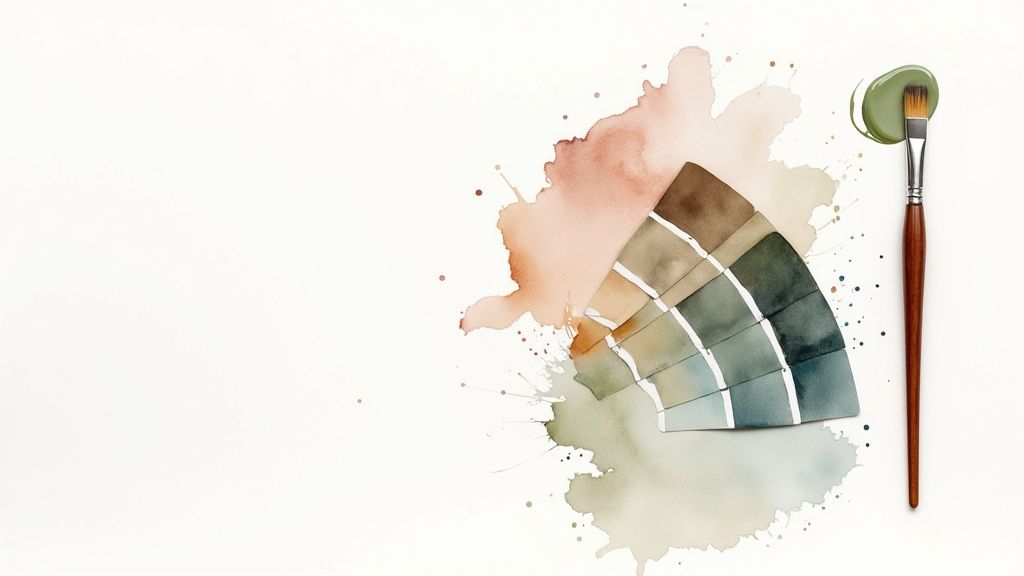
Put simply, muted colors are just pure hues with their intensity dialed down. Imagine taking a brilliant, vibrant red and mixing in a touch of its opposite on the color wheel (green), or adding a bit of gray, black, or white. The result is a softer, more complex shade like a warm terracotta or a gentle dusty rose. They aren’t dull; they’re deep.
The Foundation of Muted Colors
Think of it like adjusting the volume on a speaker. A pure, bright color—like a fire-engine red or a sunny yellow—is at full blast. A muted color is that same hue with the volume turned way down. This process adds a layer of subtlety and sophistication. To really get a handle on how this works, it helps to know a little fundamental color theory for artists.
This infographic perfectly illustrates how you can take a pure color and mute it.
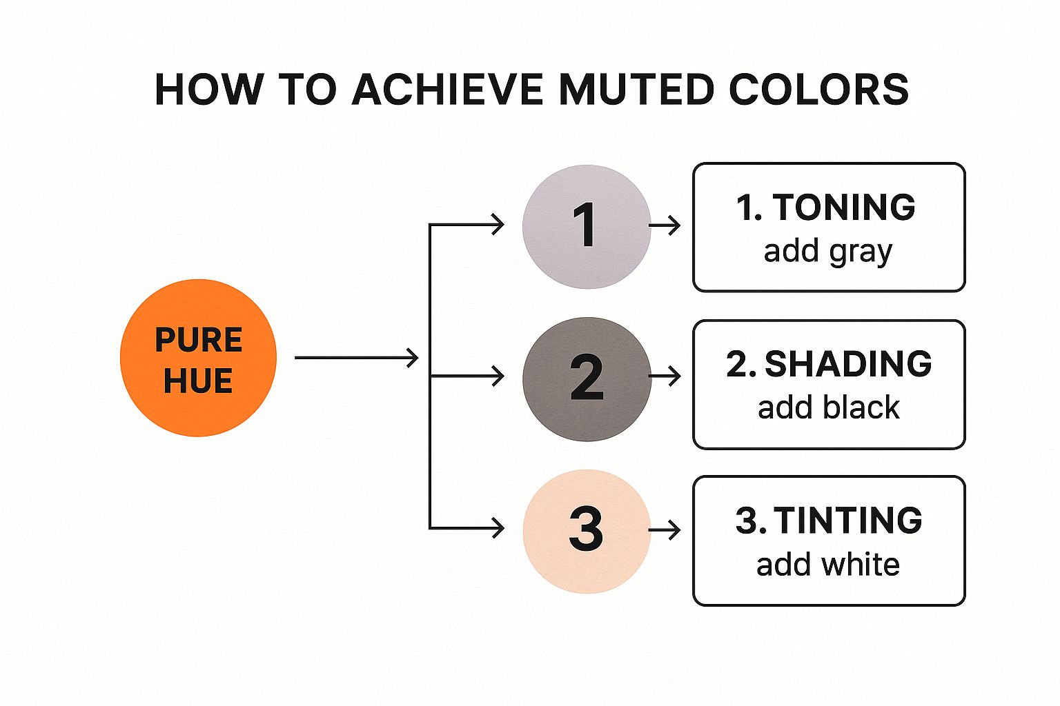
As you can see, the secret is in the mix. By adding gray (creating a tone), white (a tint), or black (a shade), you create a far more nuanced version of the original color.
The Rise of Sophisticated Palettes
The move toward muted colors in design isn’t just a fleeting trend—it’s a real shift in our collective taste. A quick look at Pantone’s Color of the Year selections since the early 2000s shows a clear preference for more understated, complex tones. Remember when Serenity and Rose Quartz were everywhere? That was a major signal that muted palettes had arrived in the mainstream.
In a world that’s constantly buzzing with bright lights and digital noise, these colors offer a much-needed visual break. Unlike vibrant shades that scream for your attention, muted colors have a quiet confidence. They create a sense of calm and stability, which is why we’re so drawn to them for our homes, especially in cozy living rooms and serene bedrooms.
A muted color palette feels grounded and authentic. It doesn’t demand your focus but rather invites you in, creating a backdrop that is both stylish and easy to live with. This makes them incredibly versatile for any design project.
To see the difference clearly, here’s a quick comparison of muted and vibrant colors.
Muted Colors vs Vibrant Colors At a Glance
| Characteristic | Muted Colors | Vibrant Colors |
|---|---|---|
| Saturation | Low (Toned down with gray, black, or white) | High (Pure, bright, and intense) |
| Psychological Effect | Calming, sophisticated, relaxing, grounding | Energetic, exciting, bold, attention-grabbing |
| Common Uses | Main wall colors, furniture, web backgrounds | Accent pieces, call-to-action buttons, branding |
| Best For | Creating a serene and cohesive atmosphere | Making a statement or drawing focus |
Ultimately, the choice between them comes down to the mood you want to create. While vibrant colors have their place for high-energy accents, muted tones are the undisputed champions of creating peaceful, sophisticated, and livable spaces.
The Simple Art of Creating Muted Colors

You might think creating muted colors involves some complex, secret formula, but it’s actually incredibly straightforward. It really just boils down to simple addition.
Picture a pure, vibrant color—like a fire engine red or a canary yellow. That’s your starting point. To mute it, all you have to do is dial down that intensity. The process, known in the design world as desaturation, is what turns a bright, loud color into something softer and more sophisticated.
Three Paths to Subtlety
So, how do you actually do it? You just need to mix in a neutral. There are three classic ways to achieve this, and each one gives you a completely different feel.
-
Toning (Adding Gray): Mixing gray into a pure hue creates what’s called a tone. This is how you get those wonderfully complex, earthy colors. Think of a rich olive green or a moody slate blue—they feel grounded and sophisticated because of that touch of gray.
-
Shading (Adding Black): When you add black to a color, you get a shade. This method deepens the original hue, making it darker and more dramatic. It’s how you turn a bright, cherry red into a deep, luxurious burgundy.
-
Tinting (Adding White): Adding white creates a tint, which results in a lighter, airier version of the original color. This is how we get pastels. That soft mint green or pale powder blue? They’re just pure colors with a healthy dose of white mixed in.
Here’s a little trick of the trade: one of the best ways to mute a color is to add a tiny drop of its complementary color (the one directly opposite it on the color wheel). For example, mixing a bit of orange into a bright blue instantly neutralizes it, creating a much more organic and complex feel.
These simple techniques are the key to unlocking the entire world of muted colors. By learning how to tone, shade, or tint a hue, you can create an endless variety of beautiful, subtle shades that give you complete control over the atmosphere of your space.
Why Our Brains Are So Drawn to Muted Palettes
Have you ever walked into a room painted in a soft, dusty rose or a gentle sage green and just felt your shoulders relax? There’s a real psychological reason for that feeling. Our love for muted colors isn’t just a fleeting trend; it’s deeply connected to how our brains are wired.
We live in a world that’s constantly yelling for our attention—bright screens, pinging notifications, and a non-stop flood of information. It’s a lot to take in. Bright, super-saturated colors are the visual equivalent of a loud alarm, demanding your focus and sometimes even creating a subtle sense of stress.
Muted colors do the exact opposite. They’re like a quiet whisper in a noisy room. They don’t demand anything from you, offering a much-needed place for your eyes, and your mind, to rest.
This is why they are so fantastic for creating spaces that feel safe, stable, and grounding. Just think about the colors you see in nature: the soft grays of an overcast sky, the earthy tones of a forest path, or the gentle blues of the ocean on a calm day. Our brains instinctively link these kinds of palettes with peace and tranquility.
Building Trust and a Sense of Authenticity
That calming effect does more than just make us feel good—it can actually build trust. It’s no accident that so many modern brands have shifted toward muted color schemes.
Studies show that muted tones feel less visually aggressive than their saturated counterparts, which helps foster a stronger emotional connection with an audience. This is huge for brands trying to build a loyal following. In fact, market leaders know that 70% or more of consumers gravitate toward brands that feel authentic and approachable, and a muted palette nails that vibe perfectly.
By ditching the loud, flashy hues, designers and brands project a kind of quiet confidence. The color choice itself sends a message: “We are grounded, reliable, and we have nothing to prove.”
Choosing the right colors is everything when it comes to setting the mood of a space. If you’re inspired to bring this feeling into your own home, our guide on how to choose color schemes is a great place to start. It breaks down the practical steps for creating a look that’s both beautiful and emotionally resonant.
Ultimately, muted colors give us a sophisticated way to speak to our deep-seated need for a little peace and quiet in a very busy world.
Using Muted Colors in Your Home
Alright, this is where the fun really starts—taking these ideas off the page and putting them into practice in your own space. Using a muted color palette can completely transform your home, creating that sophisticated and calm atmosphere you crave. It can turn any room into a true retreat from the chaos of the outside world.
The first step is always to consider the feeling you want to create. Think about how you use each room.
A bedroom, for instance, is the perfect place to create a serene backdrop. Soft, dusty lavenders, gentle blues, and warm grays are fantastic for promoting rest and relaxation. A good guide to styling a neutral bedroom will often show how these kinds of shades build that sanctuary-like vibe.
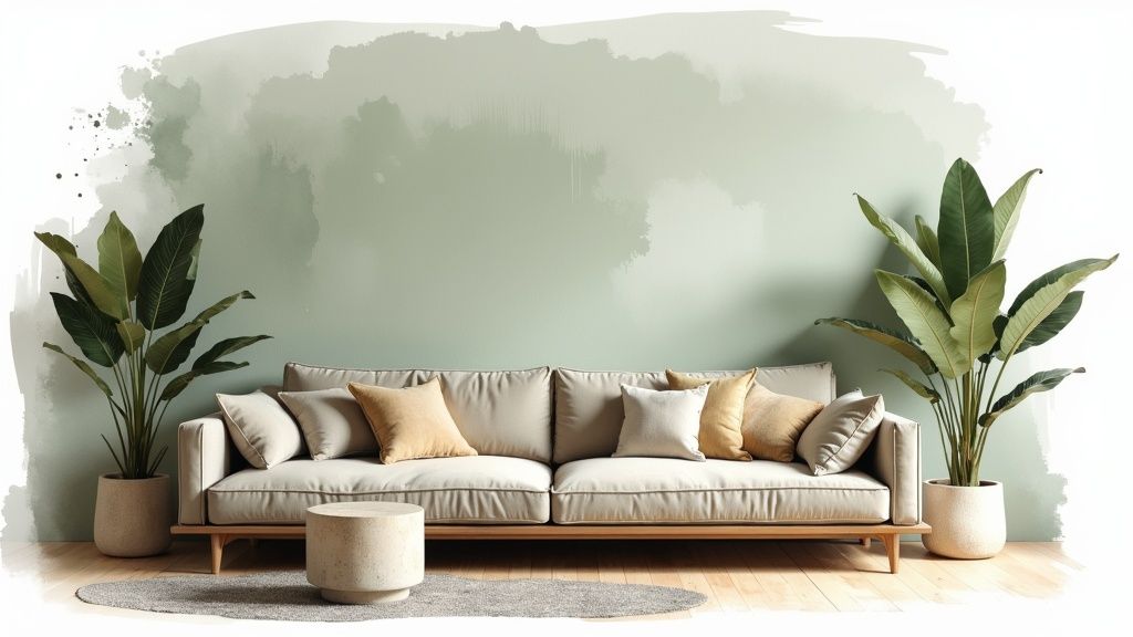
For more social areas like the living room, you might lean into warmer muted tones. Pairing a soft sage green with a cozy taupe or a muted terracotta can feel incredibly welcoming and grounded. These colors make a space feel inviting for family and guests without being overwhelming.
Layering Tones and Textures
So, what’s the catch? One of the biggest mistakes people make with muted palettes is letting the room fall flat. When everything is desaturated, you risk creating a space that feels one-dimensional. The secret to avoiding this is all in the layering and texture.
Don’t just pick one color and run with it. Instead, build a palette of several related tones to create depth. A monochromatic scheme works wonders here—try using light, medium, and dark shades of the same muted hue. Imagine pairing light greige walls with a deep charcoal sofa and cushions in a soft, stony gray.
The real magic happens when you start bringing in a variety of textures. Mixing different materials and finishes is what makes a muted palette feel rich, organic, and visually interesting.
To bring your muted color scheme to life, try incorporating elements like these:
- Natural Woods: A warm oak coffee table or walnut shelves can ground the space and add a touch of nature.
- Soft Textiles: Think linen curtains, a chunky wool throw blanket, or plush velvet pillows to introduce tactile softness.
- Stone and Ceramics: A cool marble accent or a simple ceramic vase provides a smooth, elegant contrast to softer materials.
This thoughtful blend of textures is what elevates a simple color choice into a truly sophisticated design. If you need a little more inspiration, digging into some specific interior paint colors for living rooms is a great way to spark ideas for your project.
Designing for the Web with Muted Colors

When we’re talking about web and app design, muted colors are much more than just a trendy aesthetic. They’re a secret weapon for creating genuinely better experiences for users. The best designers know this, and they lean on these palettes for reasons that are deeply practical.
The most immediate benefit? Visual comfort. Let’s be honest, staring at a glaringly bright screen is exhausting. It leads to eye strain, and people click away. A muted background—think a soft beige, a light taupe, or a gentle gray—is like a calm canvas, making it easy for users to read, browse, and engage for longer without feeling fatigued. It’s a foundational piece of user-centric design.
This comfort isn’t just about feeling good; it directly boosts functionality and helps users focus on what really matters.
Enhancing Usability and Accessibility
When your background is calm and doesn’t scream for attention, the important parts of the page can take center stage. Muted colors create the perfect backdrop for vibrant call-to-action (CTA) buttons, critical notifications, or key text to pop without being obnoxious.
This simple technique is a masterclass in visual hierarchy, naturally guiding a user’s eye where it needs to go. A bright green “Sign Up” button, for instance, is impossible to miss against a muted gray backdrop.
In user interface (UI) design, think of muted colors as the quiet supporting cast. They allow the stars of the show—your interactive elements—to truly shine. This subtle direction makes a site easier to navigate and keeps people engaged.
But it goes deeper than that. Muted palettes are also a huge win for digital accessibility. Their softer contrast ratios often make it easier to meet the official Web Content Accessibility Guidelines (WCAG). This helps ensure that your content is readable for people with various forms of color vision deficiencies. You can learn more about how designers are using these palettes to improve accessibility.
The end result is a clean, professional interface that feels both sophisticated and welcoming to everyone. And if you’re curious about how technology is shaking up design in other fields, check out our piece on the new wave of AI interior design tools.
Answering Your Questions About Muted Colors
Once you start exploring the world of muted colors, a few questions almost always pop up. Getting a handle on these is the secret to using them confidently, whether you’re tackling a weekend paint job or just putting together an outfit. Let’s clear up some of the most common ones.
Are Muted Colors the Same as Pastels?
This is probably the biggest point of confusion, and it’s a great question. The short answer is no, but they’re definitely related.
Here’s an easy way to think about it: all pastels are muted, but not all muted colors are pastels. A pastel is what you get when you add a lot of white to a pure color, giving you that light, airy feel. Muted colors have a much wider range. You can mute a color by adding gray (creating a tone) or even a little black (creating a shade). This is how you get those rich, complex colors like olive green, dusty rose, or a deep slate blue—none of which are pastels.
How Do I Keep a Muted Room from Looking Boring?
This is a valid concern. When you pull back on color saturation, you risk creating a space that feels flat or just… blah.
The key to a dynamic muted color scheme isn’t adding more color—it’s adding more life. This comes from layering different textures and finishes to create visual interest and depth, preventing the room from feeling flat or one-dimensional.
The real secret weapon here is texture and contrast. You have to give the eye something interesting to land on.
- Mix up your fabrics. Think about a nubby linen sofa paired with a soft, high-pile wool rug and maybe a sleek leather accent chair.
- Bring in natural materials. A warm wood coffee table, a marble vase, or even a few plants can add an organic, tactile quality that instantly elevates the space.
- Play with light and shadow. Don’t just use one muted tone. Layering a light greige on the walls with a darker charcoal sofa creates depth and keeps the room from feeling one-note.
Finally, what do you pair with a muted palette? They work beautifully with other muted colors, creating a really sophisticated, layered look. But they also make the perfect canvas for a well-placed pop of bright color—think a single, vibrant piece of art or a few bold throw pillows. The muted background makes that one splash of color feel intentional and powerful.
Feeling inspired to see how muted colors could look in your home? With RoomGenius, you can take a photo of your own room and see endless design ideas in seconds. It’s time to stop wondering and start seeing what’s possible. Find your perfect palette today.