Sketch Interior Design From Paper to AI
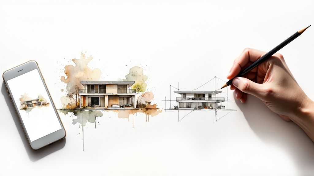
A simple sketch interior design plan is the fastest way to get a creative vision out of your head and onto paper. It’s that crucial first step that turns imagination into something tangible, letting you explore layouts and ideas quickly before you ever open a design program or start moving furniture.
Why Sketching Still Matters in Interior Design
In a world packed with powerful software, the humble pencil and paper are still undefeated for that initial brainstorm. I’ve found that a hand-drawn sketch is more than just lines; it’s a direct conversation between your mind and the space you’re designing. There’s a real connection you get from the physical act that’s hard to replicate digitally.
The process itself is incredibly freeing. You don’t have to deal with menus, loading times, or complex commands. If an idea for a new furniture layout pops into your head, you can sketch it, erase it, and try another one in just a few seconds. That kind of speed is exactly what you need for sorting out problems in the early stages.
The Power of Quick Visualization
A quick interior design sketch does a few things that purely digital methods just can’t match for speed. It’s the best tool I know for:
- Rapid Ideation: You can test out dozens of layouts for furniture, lighting, and traffic patterns without getting stuck on software details.
- Problem Solving: Sketching is fantastic for spotting and fixing spatial challenges, like an awkward corner or a cramped walkway, just by drawing them.
- Clear Communication: A simple drawing is often the best way to explain your vision to clients, contractors, or even AI platforms like RoomGenius.
Getting that immediate visual feedback is invaluable. You can see right away if a sofa is going to overpower the room or if a hallway is too narrow, long before you’ve moved a single thing. It’s all about building a solid, well-thought-out foundation from the very beginning.
The real magic of sketching is its ability to capture the feeling of a space. It forces you to think critically about scale, proportion, and how people will actually move through a room in a way that just clicking a mouse can’t.
A Growing Field Needs Solid Foundations
The demand for thoughtful interior design isn’t slowing down. In fact, the UK market alone is projected to hit £1.9 billion by 2025, with over 6,400 businesses in the field. This growth just goes to show how much clients value a well-executed plan, which always starts with a strong concept. You can find more industry stats about this growing market on ibisworld.com.
At the end of the day, sketching isn’t an outdated practice—it’s a timeless skill. It lays the creative and logical groundwork that makes every digital step you take later on more efficient and intentional.
Nailing Your Foundational Floor Plan Sketch
This is where the magic really starts. Your floor plan is the blueprint for your entire design, the first step in turning those ideas floating around in your head into something real and tangible. But before you draw a single line, let’s talk tools. You don’t need a fancy drafting table—just a few simple items will do the trick.
Here’s what I always have on hand:
- Graph Paper: The grid lines are a lifesaver for keeping everything straight and to scale.
- A Mechanical Pencil: I prefer one because the point stays consistently sharp, which is key for clean, precise lines. Make sure it has a good eraser.
- A Reliable Measuring Tape: A 25-foot (or 7.5-meter) tape is a solid choice and will handle just about any room you throw at it.
- A Ruler or Straight Edge: An architect’s scale is great if you have one, but honestly, any sturdy ruler will work perfectly fine.
With your toolkit ready, it’s time to measure your space. Don’t rush this part. I can’t stress enough how critical accurate measurements are—every single decision from here on out will depend on these numbers. Measure the length of every wall, and be sure to note the exact location and size of doors, windows, and any permanent fixtures like a fireplace or structural columns.
Getting Your Measurements onto Paper
Okay, you’ve got all your room’s dimensions. Now what? The next step is to translate them onto your graph paper using a consistent scale. For a single room, the most straightforward and common scale for a sketch interior design is 1/4 inch = 1 foot.
What this means is that for every foot you measured in the actual room, you’ll draw a line that’s a quarter of an inch long on your paper. So, if a wall is 12 feet long, your line on the graph paper will be 3 inches long (12 x 0.25). This scale is a sweet spot—it’s big enough to let you add detail but small enough to fit most rooms onto a standard sheet of paper.
For a deeper dive into the more technical side of things, our guide on how to create detailed floor plans is a great resource.
And before you even start drawing that scaled-down room, take a moment to really think about your vision. A big part of that is understanding your personal decor style, which will heavily influence your layout choices and the kind of furniture you’ll eventually sketch in.
Using Standard Symbols for Clarity
To keep your sketch clean and easy to understand for anyone who looks at it (including designers, contractors, or even AI platforms), it’s a good idea to use standard architectural symbols. Think of them as a universal shorthand that gets everyone on the same page.
Here’s a quick reference table of the most common symbols you’ll use. These icons are the basic language of floor plans and make your sketch look professional and, more importantly, easy to read.
Essential Symbols for Your Interior Design Sketch
| Element | Symbol Description | Drawing Tip |
|---|---|---|
| Walls | Thick, solid parallel lines representing the room’s perimeter and interior walls. | Use your ruler to ensure they are straight and uniform in thickness. |
| Doors | A straight line showing the door itself, with a curved arc indicating the direction it swings open. | The arc is vital—it shows the clearance space the door needs to function. |
| Windows | A break in the wall line, often with thinner parallel lines inside to represent the glass pane and frame. | Make sure the width of the symbol matches your window measurement. |
| Sofa | A simple rectangle, often with smaller rectangles attached for armrests. | Sketch furniture to scale so you can see how it truly fits in the space. |
Using these symbols is what elevates a simple drawing into a legitimate plan. It creates a clear visual language that eliminates any guesswork.
Remember, a floor plan is more than just a map of walls and windows. It’s a tool for planning movement and flow. As you place furniture, imagine walking through the space. Is the path from the door to the sofa clear? Is there enough room to pull out a dining chair?
This hands-on approach is all about creating a blueprint that actually works. It’s not just an artistic exercise; it’s a problem-solving tool that will help you design a space that’s both beautiful and truly livable. A well-drawn sketch interior design is the foundation for a successful project, saving you from costly mistakes down the line and making sure the final result is exactly what you envisioned.
Bringing Your Plans to Life with Details and Dimensions
A basic outline is a great starting point, but the real magic happens when you start adding the details. This is where your rough idea transforms into a functional blueprint, and where a sketch interior design plan proves its worth. Without clear dimensions and notes, your sketch is just a pretty picture; with them, it’s a practical guide for making things happen.
The process involves layering information right onto your floor plan. You’ll use thin, straight lines—we call them dimension lines—to show the exact length of a wall, the width of a window, or the placement of a door. A good habit is to draw these lines parallel to whatever you’re measuring and pop the number (say, 12’ 6”) right in the middle.
It’s a straightforward flow from concept to a detailed, usable sketch.
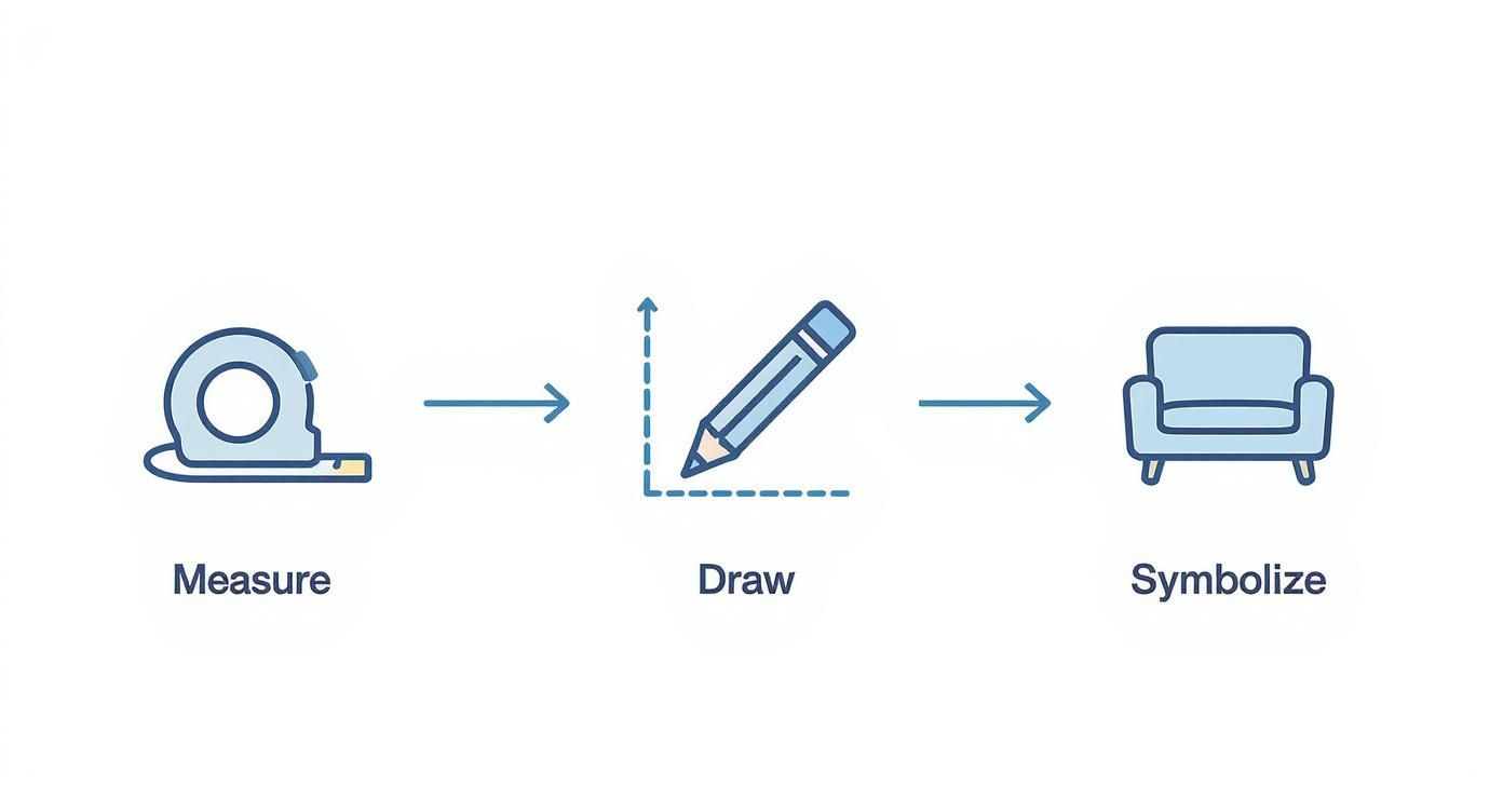
This really sums up the core steps: get accurate measurements of the actual room, translate those into a drawing that’s to scale, and then add in the symbols and notes. Nail this sequence, and your plan will be solid and easy for anyone to understand before you move on to the finer points.
Annotating for Crystal-Clear Communication
When it comes to annotations, clarity is king. A well-marked-up sketch avoids guesswork and costly mistakes, whether you’re handing it to a contractor or uploading it to an AI design tool. That software needs to understand that a rectangle on the wall isn’t just a shape; it’s a window with a specific height, width, and position.
Make sure you always include these key details:
- Overall Room Dimensions: The total length and width of the space.
- Wall Segment Lengths: Don’t just measure the whole wall; note the distance between a corner and a window, or a door and another corner.
- Window and Door Sizes: Mark the width of every opening. Pro tip: also jot down the height from the floor to the bottom of the window (the sill height).
- Fixture Locations: Pinpoint the center for ceiling lights, and mark where outlets and switches are located.
Think of your annotations as a universal language for builders, designers, and even software. Vague notes lead to confusion and errors, but precise numbers ensure everyone is on the same page. This single step is your best insurance against expensive do-overs.
Visualizing Vertical Space with Elevations
A floor plan gives you the bird’s-eye view, but what about the walls themselves? That’s where an elevation sketch is invaluable. An elevation is simply a flat, head-on drawing of a single wall. It’s perfect for showing vertical details like the height of your kitchen cabinets, where you plan to hang a piece of art, or the design of a custom fireplace.
Making one is easier than it sounds. Just draw a rectangle that represents the wall, sticking to the same scale as your floor plan. Then, carefully draw in the features on that wall—windows, doors, built-in shelves—making sure their height and placement are measured accurately. Elevations are an absolute must for designing kitchens and bathrooms, where every vertical inch counts.
Putting in this level of detail gives you a complete picture for anyone you’re working with, human or digital. For a little more inspiration, you can browse through our gallery of different types of interior design sketches.
Bringing Your Sketch into the Digital World
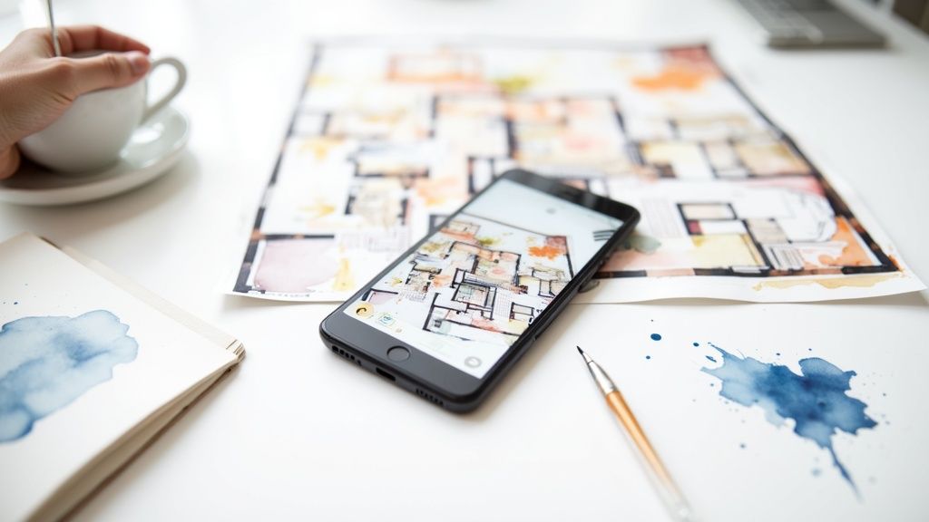
So, you’ve got your hand-drawn plan finished. The next move is bridging the gap between paper and pixel. Getting a high-quality digital copy of your sketch is non-negotiable, not just for sharing but for actually using it with modern design tools.
The quality of your digital file really matters. A blurry, shadowed, or skewed photo can be completely misread by design software or, frankly, just look unprofessional to a client. What you’re aiming for is a digital twin of your sketch—just as clean, crisp, and legible as the original drawing sitting on your desk. This ensures every line and note is perfectly clear for whatever comes next.
Capturing the Perfect Image
You really have two solid options for digitizing your work: a good old-fashioned scanner or the camera on your smartphone. Each has its own perks, and honestly, both can give you fantastic results if you just pay attention to a few key details.
A flatbed scanner is still the gold standard for pure quality. It gives you perfectly even lighting and a completely flat, distortion-free image every time. If you have one handy, it’s often the easiest way to get a professional-grade file without much fuss.
But let’s be realistic—your smartphone is an incredibly powerful and convenient tool that’s already in your pocket. To get a great shot with your phone, lighting is everything. Natural, indirect daylight is your best friend. Try taking the photo near a window on a slightly overcast day to get that soft, diffused light that minimizes harsh shadows.
A quick pro tip: when photographing your sketch, hold your phone directly above the paper. You want the camera to be perfectly parallel to the surface. This overhead angle prevents that weird perspective distortion that can make a perfectly square room look like a trapezoid in the photo.
Simple Edits for a Professional Finish
Once you have the picture, a few quick edits can make a world of difference. You don’t need fancy software; the built-in photo editing tools on your phone or computer are more than enough for this.
There are really just three essential adjustments you’ll want to make:
- Crop and Straighten: First, trim away any background clutter like your desk or your hands. Then, use the straighten tool to fix any slight angles and make sure the lines are perfectly horizontal and vertical.
- Boost Contrast: This is the big one. Bumping up the contrast will make the white paper brighter and the pencil lines much darker and more defined. If you only do one edit, make it this one—it’s the key to legibility.
- Adjust Brightness: Finally, tweak the brightness so the background is a clean white, but be careful not to wash out the finer lines of your drawing.
These simple steps will transform a basic photo into a clean, professional document, ready for the next stage.
This clean file becomes absolutely vital when you start working with AI-powered platforms. For instance, when you upload your floor plan to RoomGenius, the AI needs to clearly “read” every wall, doorway, and dimension you’ve drawn. A crisp, high-contrast image ensures the tool can accurately analyze your layout and generate realistic design concepts that truly honor your original vision. If you’re exploring your options, check out our post about choosing the right AI app for interior design.
How to Avoid Common Sketching Mistakes
Even pros make mistakes, but catching a few common slip-ups during the sketching phase can save you from major headaches down the road. Sidestep these early on, and your sketch interior design will be a much stronger foundation for the entire project.
The single biggest offender I see is mismanaging scale.
It’s tempting to just eyeball where the furniture goes, but this almost always leads to trouble. You might sketch a gorgeous sectional that, in reality, would completely block a doorway or make the room feel cramped. The solution is to always draw your furniture to the same scale as your floor plan. A great hands-on trick is to cut out small paper shapes representing your key furniture pieces—you can then slide them around on your sketch to physically test different layouts.
Another frequent oversight is forgetting about the “unseen” forces in a room. I’m talking about things like door swings, radiator locations, and structural columns. These are permanent fixtures. If you don’t account for a door’s swing arc, you might accidentally render a whole corner useless. Ignoring a column can completely derail what you thought was the perfect furniture arrangement. Make sure you mark these fixed elements on your plan from the very beginning.
Forgetting Practicality and Flow
Beyond the fixed objects, you have to think about how people will actually move through and use the space. A beautiful design is worthless if it’s not functional. I’ve seen countless sketches where a dining table looks great but is so large that no one could comfortably pull out their chairs.
To avoid this, always leave enough clearance for traffic paths:
- Major Walkways: Keep at least 36 inches of clear space for the main routes through a room.
- Furniture Clearance: A good rule of thumb is to leave about 18 inches between a coffee table and a sofa.
- Dining Space: You’ll want at least 24-30 inches behind each chair so people can get in and out easily.
Your best tool here is a “reality check” walkthrough. Once your sketch feels right, mentally walk through it. Imagine opening the windows, pulling out a chair to sit down, or carrying groceries through the kitchen. This simple visualization exercise is incredibly effective at revealing practical design flaws.
Keeping Your Plan Clean and Current
Finally, a messy or outdated sketch can cause just as many problems as an inaccurate one. Your annotations should be neat and easy to read, with dimension lines that don’t clutter up the main drawing.
Think of your sketch as a living document. If you make a change—no matter how small—update it immediately so it always reflects the project’s current state.
This level of accuracy is more important than ever. With a growing industry focus on renovation (70%) over new construction (30%), we’re often working within the quirks of existing structures. At the same time, design needs are changing based on who we’re designing for, from Gen Z’s focus on mental well-being to the financial pressures millennials face. You can read more about these 2025 U.S. design industry trends on thinklab.design. A clean, practical sketch is the first step to addressing these complex needs effectively.
Your Top Sketching Questions, Answered
Jumping into sketching your own space is exciting, but it’s natural to have a few questions before you start. From worrying about the right tools to getting the scale just right, a little guidance can make the whole process feel less intimidating. Let’s tackle some of the most common things people ask when they first put pencil to paper.
Getting a handle on these basics is what turns a rough idea into a reliable plan. This is the foundation for every decision you’ll make later, from picking out a sofa to nailing the final layout.
What’s the Best Scale for a DIY Sketch?
For most rooms in a house, the go-to scale is 1/4 inch = 1 foot. It’s pretty much the industry standard for a reason. This scale strikes the perfect balance—it’s detailed enough to be genuinely useful, but still lets you fit an entire room on a standard piece of paper (like an 8.5” x 11” or A4 sheet).
Now, if you’re sketching a much larger, open-concept area or an entire floor, you might want to switch to 1/8 inch = 1 foot. It’s a smaller scale that helps you fit everything on a single page, but you’ll lose some of the finer details in the process.
A trick I often use is to do both. I’ll map out the whole floor plan at the smaller 1/8” scale to see the overall flow, then create separate, blown-up sketches of important rooms like the kitchen or master bathroom at the larger 1/4” scale.
Do I Really Need to Buy Expensive Tools?
Absolutely not. It’s easy to think you need a whole drafting setup, but you can create a fantastic, perfectly usable sketch with a few simple things. Don’t let a lack of fancy equipment stop you from getting your sketch interior design ideas down on paper.
Honestly, all you truly need to get started is:
- Graph paper: This is your best friend for keeping lines straight and your scale consistent.
- A mechanical pencil: A good one with a decent eraser gives you nice, crisp lines.
- A ruler: Any basic straight edge will do the trick.
- A measuring tape: The one from your toolbox is perfect for getting the room’s dimensions.
Sure, an architect’s scale ruler is a helpful gadget, but it’s definitely not a must-have if you’re okay with doing a little quick math to convert your measurements.
How Accurate Do My Measurements Have to Be?
When you’re creating a sketch for an AI design tool, accuracy is king. These platforms rely completely on the numbers you give them to generate designs that actually fit your space. Think of it this way: the quality of what you put in directly dictates the quality of what you get out.
You don’t need to get down to the millimeter, but try to be accurate within about an inch. Pay extra close attention to the permanent fixtures—the exact location and size of windows, doors, fireplaces, and support columns are critical. The more precise your sketch is, the more realistic and helpful the AI designs will be.
Ready to turn that sketch into something you can see? With RoomGenius, you just upload your hand-drawn plan and our AI gets to work, generating stunning, realistic design concepts in minutes. Stop guessing and start visualizing. See what your home is truly capable of at https://www.room-genius.com.