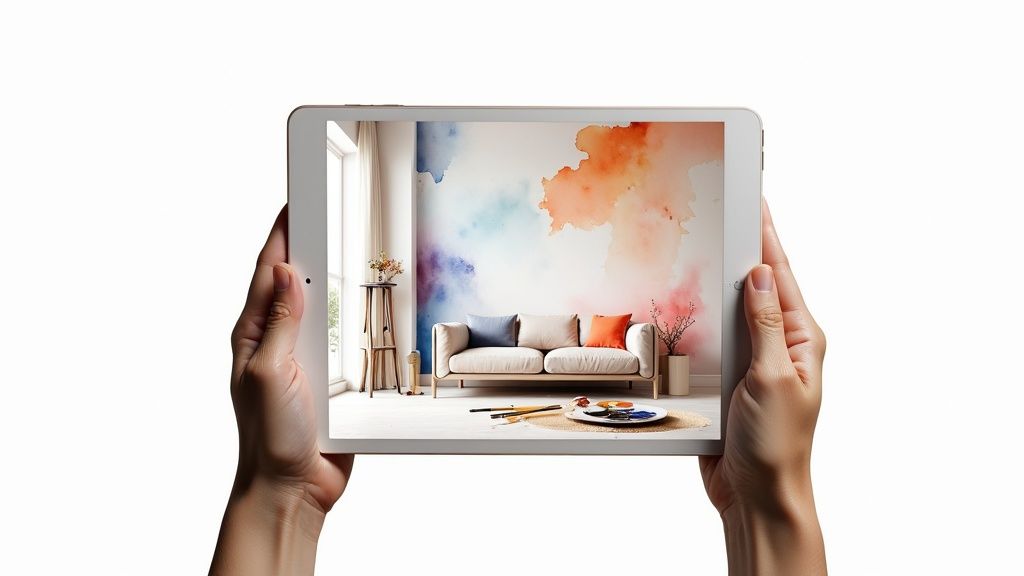
Using a paint color visualizer: choose perfect hues
Choosing a paint color feels like such a huge commitment, doesn’t it? We’ve all been there—taping tiny, misleading swatches to the wall, trying to imagine how a two-inch square will look across an entire room. It’s a stressful process, which is exactly why paint color visualizers have become an absolute game-changer for homeowners and designers.
A paint color visualizer is simply a tool that lets you upload a photo of your room and virtually “paint” the walls. This technology completely takes the guesswork out of the equation, showing you exactly how different shades will look in your space, with your furniture and your lighting. It’s the bridge between imagination and reality.
From Niche Tech to Mainstream Must-Have
Let’s be honest, nobody wants to spend a weekend painting only to realize they hate the color. Visualizers save you from that dreaded “paint regret.” Instead of just hoping a color works, you can see it in action before you even buy a sample pot.
This isn’t just a fleeting trend; it’s a real shift in how we approach design. The global market for these apps recently hit around USD 1.18 billion, and it’s on track to grow to USD 3.85 billion. Those numbers, which you can read more about over at dataintelo.com, tell a clear story: people want smarter, more confident ways to make design decisions.
From my experience, the real magic of a visualizer is how it helps you avoid common pitfalls.
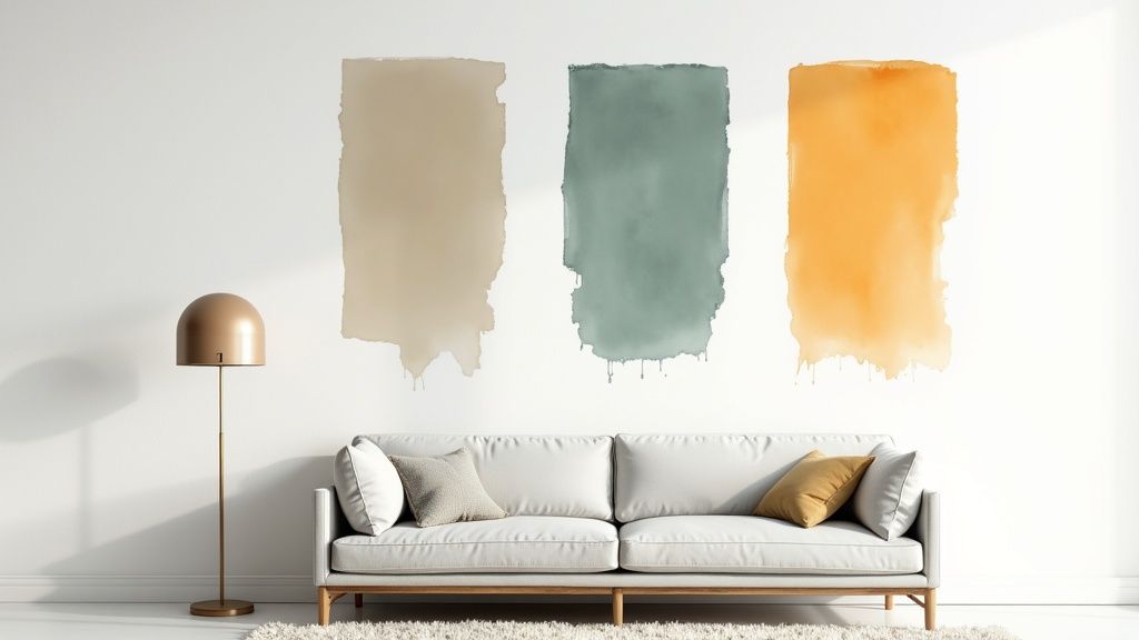
- Experiment with zero risk. Ever been tempted by a bold navy or a vibrant emerald green but were too scared to try? Now you can see if it works without touching a paintbrush.
- Understand the impact of light. A color looks completely different in the morning sun versus under artificial light at night. A good visualizer lets you get a feel for how it will change throughout the day.
- Match your existing decor. The biggest question is always, “Will this color go with my sofa?” A visualizer shows you instantly if a new wall color will clash with your rug, floors, or furniture.
Just look at this example of a visualizer in action. You can instantly see how different colors change the entire mood of the room, all while keeping the existing furniture in place.
One look and you can see how a light, airy color feels compared to a more grounded, earthy tone. A solid online interior design tool gives you this power, turning what used to be a high-stakes gamble into a fun, creative, and informed choice.
Traditional vs Visualizer Paint Selection
The old way of choosing paint involved a lot of trips to the hardware store, dozens of messy sample pots, and a healthy dose of wishful thinking. A visualizer flips that entire process on its head.
Here’s a quick breakdown of how the two methods stack up:
| Factor | Traditional Method | Using a Paint Visualizer |
|---|---|---|
| Process | Buy multiple sample pots, paint swatches on walls, wait for them to dry, and observe in different light. | Upload a photo, and instantly click through hundreds of colors in seconds. |
| Time | Days or even weeks of deliberation and testing. | Minutes to a few hours of virtual experimentation. |
| Cost | Cost of multiple sample pots ($5-$10 each), brushes, and potentially wasted paint from a wrong choice. | Often free or low-cost for the basic tool. |
| Confidence | Low to moderate. It’s hard to be certain based on small swatches. | High. You see a realistic preview of the final result before committing. |
Ultimately, a visualizer doesn’t just save you from a bad color choice; it saves you time, money, and the headache of having to repaint a room you just finished.
Setting Up Your Digital Room for Success
The secret to getting a preview you can trust from any paint color visualizer? It all comes down to the source image. Think of it this way: garbage in, garbage out. A blurry, dark, or cluttered photo will only give you a messy, unrealistic result, which defeats the whole purpose.
Your goal is to give the app a clean, clear canvas to work with. Taking just a few minutes to prep your room before you snap a picture pays off big time when you see a genuinely true-to-life preview of your new wall color.
Capturing the Perfect Room Photo
Getting the right shot isn’t about having a fancy camera; it’s all about technique. Your smartphone is more than capable of doing the job if you just follow a few simple guidelines.
First off, natural light is your best friend. I can’t stress this enough. Artificial lights cast weird yellow or blue tones that will completely throw off how the paint colors look in the visualizer. Try to take your photo during the daytime when the room gets the most indirect light. You want it bright, but try to avoid harsh, direct sun that creates dark shadows.
Next, find your angle. Shooting a wall head-on can make the space feel flat and one-dimensional. A much better approach is to stand in a corner and aim your camera toward the opposite side of the room. This technique captures multiple walls and creates a real sense of depth, giving you a much better feel for how a color will wrap around the space.
This infographic really nails the difference between the old way of guessing and the clarity you get from a modern visualizer.
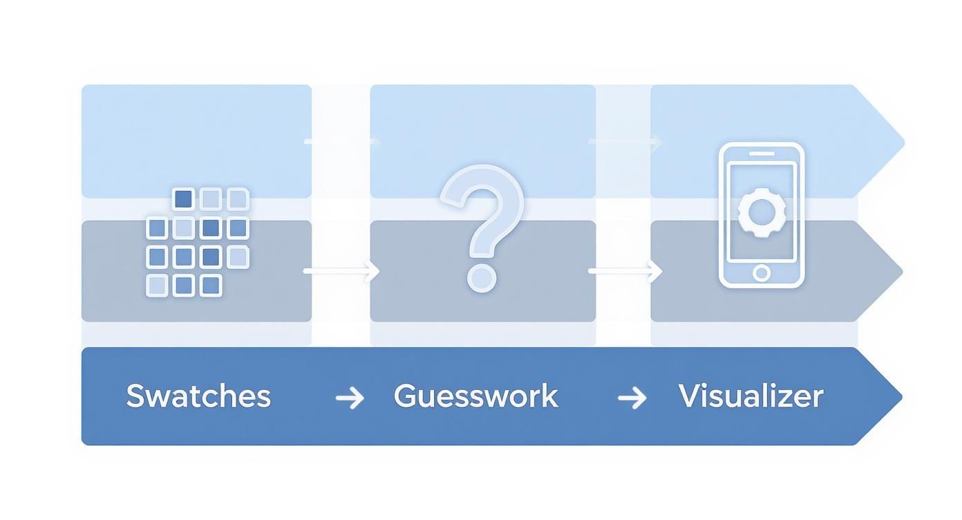
As you can see, tools like RoomGenius cut right through the uncertainty of tiny paint swatches, helping you skip straight to a confident decision.
Prepping Your Space for Accuracy
Before you even think about taking the picture, do a quick tidy-up. You don’t need to scrub the floors, but getting clutter away from the walls is a game-changer. Piles of laundry, stacks of magazines, or stray toys can easily confuse the software’s edge detection, which leads to a splotchy digital paint job. You need a clear line of sight where the walls meet the floor and ceiling.
Pro Tip: If your room has interesting architectural details like built-in shelves, a vaulted ceiling, or a cool archway, don’t hide them! A photo that clearly shows off these features lets the visualizer work its magic by accurately applying color around them. This is where a good tool really proves its worth.
For a photo that gets the job done right, just follow these simple rules:
- Clear the Walls: Temporarily remove any busy artwork or a gallery wall from the surfaces you plan to “paint.”
- Steady Your Shot: Hold your phone as still as you can to avoid blur. Propping it on a bookshelf or a tripod is even better.
- Focus on the Walls: Make sure the walls are the star of the show, not the couch or the rug in the foreground.
By taking a few extra minutes to create a clean and well-lit digital canvas, you’re setting yourself up for a successful visualization. This critical first step is what ensures the colors you test out look as real as possible, turning your ideas into a preview you can actually rely on.
Exploring and Comparing Your Color Options
Okay, you’ve got your photo uploaded. This is where the magic happens. A good paint color visualizer stops being a gimmick and starts acting like your personal design consultant, letting you splash color all over your digital walls without making a mess.
Forget taping tiny, misleading paint chips to the wall. Now you can instantly see how that deep navy blue actually looks behind your sofa or whether a soft sage green really works with your hardwood floors. The feedback is immediate, and honestly, it’s a game-changer.
It’s also a huge confidence booster. I’ve seen people agonize over colors for weeks, but with a visualizer, that stressful deliberation often shrinks to just an hour of fun, creative exploration. Seeing a realistic preview of the final look on your own walls is the ultimate way to avoid that dreaded “color regret.”
Creating Accent Walls and Comparing Shades
Thinking about an accent wall? This is the perfect, risk-free way to try it out. That bold color choice that feels a little scary in the store might be exactly what your room needs.
Just click on the wall you want to make a statement with—maybe the one behind your headboard or where the TV is—and go wild with a dramatic shade. You might be surprised to find that the deep emerald you were on the fence about creates the perfect sophisticated focal point you were hoping for.
But what if you’re stuck between two very similar shades of gray? The best tools let you compare them right in the same photo.
- Split-Screen View: Some visualizers have a cool split-screen feature, letting you put one color on the top half of a wall and another on the bottom.
- Adjacent Wall Comparison: A great trick is to apply “Coastal Blue” to one wall and “Stormy Sky” right next to it. This is the best way to see how the subtle undertones play off each other in your room’s unique lighting.
This side-by-side comparison is priceless. It helps you understand not just what a color looks like, but how it feels next to another. You might realize that one gray feels cozier because it has a slightly warmer undertone—a detail you’d never catch from two separate paint chips. For more ideas, you can dive into our guide to living room paint colors.
The Overlooked Importance of Paint Finish
Let’s talk about something people always forget: the finish. Color is only half the battle. The sheen of your paint, from flat to high-gloss, completely changes how a color reads in a room. A visualizer that lets you toggle between finishes is an indispensable tool.
A matte finish absorbs light, giving you a soft, velvety look that’s great for hiding small imperfections on the wall. A satin or semi-gloss finish, on the other hand, reflects light, making the color appear brighter and the surface more durable.
Picture a dark, moody color. In a matte finish, it feels cozy and enveloping. But put that same color in a satin finish, and suddenly it’s sleek and modern, adding a subtle glow. This is especially true when you’re looking for the best paint colors for kitchen cabinets, where the finish affects both the look and how easy they are to clean.
By playing with both color and finish in the visualizer, you get the full picture. It’s the difference between hoping for the right mood and knowing you’re going to get it.
Creating a Cohesive Room Design
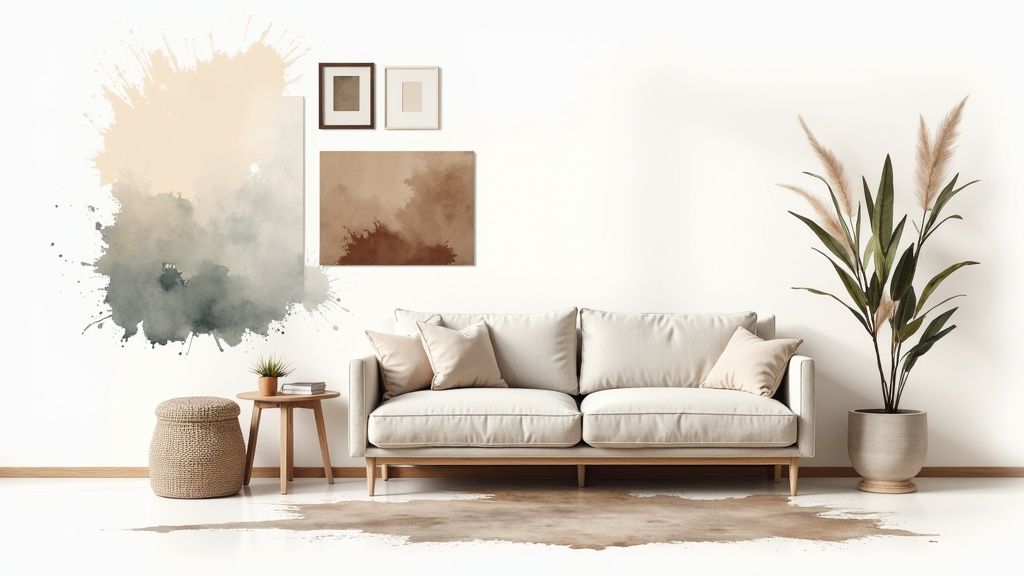
Nailing the perfect wall color is a huge win, but it’s really just the first step. To get that truly “put-together” look, you need to see how that color plays with everything else in the room. This is where a good paint color visualizer becomes so much more than a paint tool—it helps you see the bigger picture.
It lets you test how a new hue will mesh with what you already own, from the sofa to the floorboards. Instead of just guessing if that gorgeous terracotta will clash with your oak flooring, you can see it for yourself. This is how you move from just painting a room to creating a complete, harmonious atmosphere.
Building Your Design From the Walls Out
One of the most effective ways to approach a room redesign is to start with the walls and build out from there. Once you’ve used the visualizer to apply a color you love, you can begin layering in other elements to see what works.
Modern visualizers, including tools like RoomGenius, let you experiment with more than just paint. This is your chance to see how different area rugs or curtain colors look against that new wall shade. It’s all about making sure every piece of the puzzle fits.
A truly great room feels intentional. Every element, from the wall color down to the smallest throw pillow, works together. A visualizer is your personal sandbox to mix and match until the entire space just feels right.
This process is also your best defense against expensive mistakes. We’ve all been there—you buy a pricey new rug, bring it home, and realize it makes your beautiful new wall color look jarring or dull. Visualizing it all beforehand gives you the confidence to pull the trigger on purchases that will actually complete your vision.
Coordinating With Key Furnishings and Finishes
Think of your largest pieces of furniture—like your sofa or bed—as the main characters in your room’s color story. They’re the anchors, and your wall color needs to get along with them. The same rule applies to permanent fixtures like flooring, tile, and kitchen countertops.
Use the visualizer to play with these specific combinations:
- Wood Tones: See how that cool, crisp gray you love looks next to your warm, honey-colored wood floors. You might discover that a greige (a gray with beige undertones) is a much better fit.
- Upholstery: How will a bold navy accent wall really look behind your cream-colored sofa? Test it out.
- Decor: This is the fun part. Experiment with different throw pillow colors or even upload a picture of your favorite artwork to see what really pops against a new paint color.
By simulating these pairings before you even touch a paintbrush, you’re curating a complete palette that feels connected and thoughtful. It’s a proactive approach that ensures your new wall color doesn’t just look good in a vacuum—it elevates the entire room. For a deeper dive, our guide on how to choose color schemes is a fantastic resource.
Putting a Paint Visualizer to Work on Your Project
A paint color visualizer isn’t just a fun toy; it’s a serious tool. But its real value comes from knowing how to use it for your specific situation. A renter testing out a bold accent wall has completely different needs than a designer preparing a pitch for a major client. The trick is to adapt your workflow to get the answers you need.
The confidence these tools give people is a big deal. It’s part of why the global exterior paint retail market hit USD 35.5 billion recently and is still climbing. When people can see what a color will look like before they buy, they’re more willing to try something new, which is great for everyone.
Let’s break down how different people can get the most out of a tool like this.
For Homeowners Tackling a Renovation
If you’re a homeowner in the middle of a big project, think of a paint visualizer as your planning partner. Your main goal is probably to make sure your home feels connected, especially if you have an open-concept floor plan. The last thing you want is for your living room, dining area, and kitchen to feel like three separate, clashing spaces.
Here’s a practical approach: start by uploading photos of each area. Apply your chosen foundational neutral—say, a soft, warm gray—to the main walls across all the images. Once you have that consistent base, you can start playing with accent colors for a feature wall in the dining area or the kitchen island. This method helps you see the entire palette together, ensuring a smooth, cohesive flow throughout your home.
For Renters Looking to Personalize Their Space
Renters have a unique set of constraints. You want a place to feel like your own, but you can’t exactly knock down walls or make permanent changes. This is where a visualizer shines for low-commitment, high-impact ideas.
Focus on things you can easily undo, like a dramatic accent wall. Have you been dreaming of a deep navy blue or an earthy forest green for the wall behind your bed? Snap a picture, upload it, and see how it looks with your actual furniture and bedding. It’s the perfect way to build the confidence to go for it without worrying about your security deposit later.
Key Takeaway: A visualizer takes the fear out of making a bold choice. By showing you the end result upfront, it empowers you to personalize a temporary space and make it feel truly yours.
For Designers and Real Estate Agents
For professionals, a visualizer is all about communication and marketing. Whether you’re an interior designer or a real estate agent, your job is to sell a vision. Showing is always more powerful than telling.
-
Designers: Stop trying to describe a mood and just show it. Create a few different mockups for your client. Present “Option A” with a calming, monochromatic look and “Option B” with a more adventurous, vibrant scheme. When clients can see the possibilities laid out so clearly, decisions happen faster and they feel more involved in the process.
-
Real Estate Agents: You know how a seller’s questionable color choices can tank a showing? A visualizer is your secret weapon. If a home is painted in dated or polarizing colors, create a virtual “after” shot with a fresh, modern neutral like a go-to greige or a warm off-white. Pop these digitally refreshed photos right into the listing to help buyers look past the current paint job and see the home’s true potential.
A great visualizer gets your color palette right, but the final result still depends on good technique. For a truly professional finish, it never hurts to brush up on some professional paint and decorating tips before you start.
Visualizer Use Cases by User Type
Different users approach a paint visualizer with distinct goals. The table below breaks down how various individuals and professionals can get the most out of the tool by focusing on the features that matter most to their work.
| User Type | Primary Goal | Key Feature to Use |
|---|---|---|
| Homeowner | Create a cohesive, long-term color scheme for their entire home. | Applying a single palette across multiple room photos to check flow. |
| Renter | Personalize a temporary space with low-commitment, high-impact changes. | Testing bold colors on a single accent wall to see the effect. |
| Real Estate Agent | Help potential buyers see a property’s potential beyond its current state. | Virtually repainting rooms with neutral colors for listing photos. |
| Interior Designer | Present multiple design concepts to a client for faster decision-making. | Creating and comparing different color schemes for client presentations. |
| Event Planner | Visualize a color theme for a venue for a specific event or wedding. | Testing theme colors against photos of the actual event space. |
Ultimately, a paint visualizer is a flexible tool designed to build confidence. By tailoring your approach to your specific project, you can move from idea to execution with a clear vision of the final result.
Common Questions About Paint Visualizers
Even the most seasoned DIY-ers and designers have questions when they first start using a paint visualizer. It’s a fantastic piece of tech, but getting the hang of it and trusting what you see on screen takes a little insight. Let’s dig into some of the things people always ask.
The big one is always color accuracy. Will the Navajo White on my screen actually look like that on my wall? Honestly, it’s going to be very close, but rarely a 100% perfect match straight out of the gate.
Think about it: the color you see is filtered through two things—your screen’s unique settings and the light in the original photo you uploaded. If you snap a picture at night under the warm glow of a lamp, every color you test is going to look warmer than it really is. This is exactly why a photo taken in neutral, natural daylight gives you the most honest preview.
Dealing With Lighting and Accuracy
So, what can you do to make sure you’re not getting misled? The key is to shift how you think about the tool. A paint visualizer isn’t meant to give you the final answer; it’s designed to help you slash your options from an overwhelming wall of paint chips down to just a few solid contenders. It’s perfect for seeing if a color’s undertones clash with your floors or if that bold accent wall you’re dreaming of is a go or a no-go.
Key Takeaway: Treat the visualizer as your first step, not your last. Once you’ve used an app like RoomGenius to find a few colors you love, the next and most critical move is to get physical paint samples. Paint large swatches directly on the wall and watch how they change as the light shifts from morning to night.
Costs and App Availability
People often wonder if they need to shell out money for a good visualizer. You’ll be happy to know that most of the big paint brands, like Sherwin-Williams and Benjamin Moore, offer excellent visualizer tools for free. These are my go-to recommendation because they’re tied directly to their paint lines, which makes going from screen to sample can a breeze.
While there are some standalone apps out there, the free, brand-specific tools are usually all you need to get the job done right. They give you a fantastic way to test-drive an entire color library in your own space without spending a penny.
A few final pro tips to get the best results:
- Go High-Res: A fuzzy, low-quality photo will only confuse the software, leaving you with a splotchy and inaccurate rendering. A crisp, clear image is non-negotiable.
- Declutter First: Before you snap your photo, move any clutter away from the walls you’re “painting.” This helps the tool find clean edges and deliver a much sharper result.
- Don’t Hold Back: This is the fun part! The whole point of a visualizer is risk-free experimentation. Go ahead and try that daring emerald green or sophisticated charcoal—you might be surprised by what actually works.
Ready to stop guessing and start visualizing? The RoomGenius AI can help you not only pick the perfect paint color but also see how it works with new furniture and decor. Transform your space with confidence by visiting the official RoomGenius website today.