Paint a Feature Wall: paint a feature wall with easy steps for a pro DIY finish
That blank wall you’ve been staring at? It’s not just a wall; it’s a blank canvas. Painting a feature wall is one of the quickest ways to anchor your furniture, create an undeniable focal point, and really inject your personality into a room—all without the time and expense of a complete repaint.
Why a Feature Wall Is Your Best Weekend Upgrade
Let’s get one thing straight: feature walls (or accent walls, if you prefer) are not some tired trend from the early 2000s. When done right, they’re a surprisingly sophisticated and incredibly budget-friendly way to completely change the vibe of your space. Forget just randomly slapping a loud color on one wall; today’s approach is all about smart, strategic design.
The modern way to paint a feature wall is to use it to your advantage. It’s about highlighting a room’s best assets—drawing the eye to a cool architectural detail, defining a specific zone in an open-concept layout, or simply adding a bit of depth and drama to a room that feels a little flat.
More Than Just Paint
Think of a feature wall as the ultimate high-impact, low-commitment design move. For the cost of a single gallon of paint and a few hours of your time, you can pull off a transformation that feels both significant and intentional. It’s the perfect project for anyone craving a big change without a big-project headache.
This guide will walk you through everything, giving you the confidence and practical skills you need to get a flawless finish. We’ll cover it all, from picking the perfect wall to that final, satisfying brushstroke.
By choosing the right wall and color, you’re not just adding paint; you’re adding character, depth, and a story to your home. It’s an opportunity to be bold and express your personal style without overwhelming the entire room.
Throughout this tutorial, we’ll also touch on how new tools can take the guesswork out of the process. For instance, using an app like RoomGenius lets you virtually try out colors on your actual wall. You can be absolutely sure you love your choice long before you even pry open the paint can. So let’s ditch the anxiety and create something amazing together.
Choosing the Right Wall and the Perfect Color
Before you even touch a paintbrush, let’s talk strategy. The magic of a great feature wall isn’t just about the color—it’s about choosing the right wall to begin with. You want it to feel like a natural, intentional part of the room, not an afterthought.
Take a look around your space. Where does your eye naturally go when you walk in? That’s your focal point. In a bedroom, it’s almost always the wall behind the headboard. For living rooms, it might be the wall with the fireplace or the one where your media center lives. Highlighting this wall enhances the room’s natural flow instead of competing with it.
Don’t forget to look for architectural quirks, too. An interesting nook, a sloped ceiling, or a wall with built-in shelving can be transformed from an awkward space into a stunning, deliberate design choice with a coat of paint.
Finding the Right Hue for Your Space
Once you’ve picked your canvas, the real fun begins: choosing the color. This is where your personality comes in, but the key is to make sure your choice works with what you already have. A great accent color should feel like it belongs, tying everything together.
Think about the vibe you’re going for. Do you want your bedroom to feel like a cozy retreat? A deep, moody color like Sherwin Williams’ Cyberspace (a gorgeous dark navy with gray undertones) can create that enveloping, sanctuary-like feel. In a living room meant for entertaining, something more energetic like a vibrant teal or a warm terracotta can get the conversation started.
Pro Tip: The best accent walls borrow a color from somewhere else in the room. Look at your artwork, the pattern on your area rug, or the throw pillows on the couch. Pulling one of those less-dominant colors for the wall creates a cohesive, professionally designed look.
If you’re struggling to build a complete palette, our guide on how to choose color schemes for your home is a fantastic resource to get you started.
Understanding Paint Finishes
The sheen you pick is just as critical as the color. It affects not only the final look and feel but also how durable the wall will be. Light hits each finish differently, so this choice really matters.
-
Matte (or Flat): With zero shine, a matte finish is a pro at hiding small bumps and imperfections on the wall. Its velvety texture makes colors look incredibly rich and deep—perfect for a dramatic, moody vibe. The downside? It’s the least durable and scuffs easily, so it’s best for low-traffic areas.
-
Eggshell: This is my go-to for most projects. It has just a hint of a low sheen, kind of like its namesake. It’s a great middle-ground—more durable and easier to clean than matte, but it still hides flaws pretty well.
-
Satin: You’ll notice a soft glow with a satin finish. It’s highly durable and stands up well to moisture, making it a solid choice for busier rooms. Just remember, that extra shine reflects more light, which can make your color appear a touch brighter.
For more expert advice on picking the perfect shade, check out these 5 Tips to Choosing the Perfect Accent Wall Color. Getting the color and finish right is the secret to ensuring your project to paint a feature wall looks absolutely stunning.
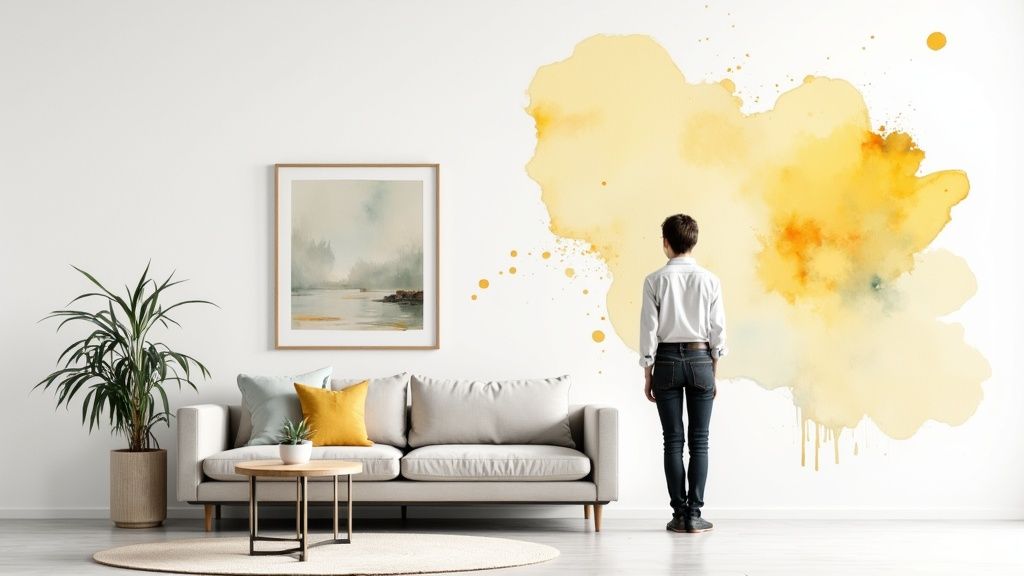
Visualize Your New Wall Before You Paint
Deciding to paint a feature wall is the fun part. The nerve-wracking part? That moment of hesitation right before you crack open the paint can. What if that deep, moody green you fell in love with on a tiny swatch makes your living room feel like a cave? What if that bold terracotta clashes with your favorite gray sofa?
This is where a little bit of tech can save you a whole lot of painter’s regret. Instead of crossing your fingers and hoping for the best, you can now test-drive your color choice virtually. The anxiety just melts away when you can see a realistic preview before you even head to the hardware store.
See Your Vision Come to Life
A tool like RoomGenius is a game-changer here. You simply upload a photo of your actual room and start applying different paint colors to the wall with a click. This goes way beyond just picking a color—it’s about seeing how that specific shade interacts with your real furniture, the light from your windows, and your existing decor.
It’s one thing to look at a paint chip, but seeing how different colors and even furniture layouts will look in your own space is what really matters.
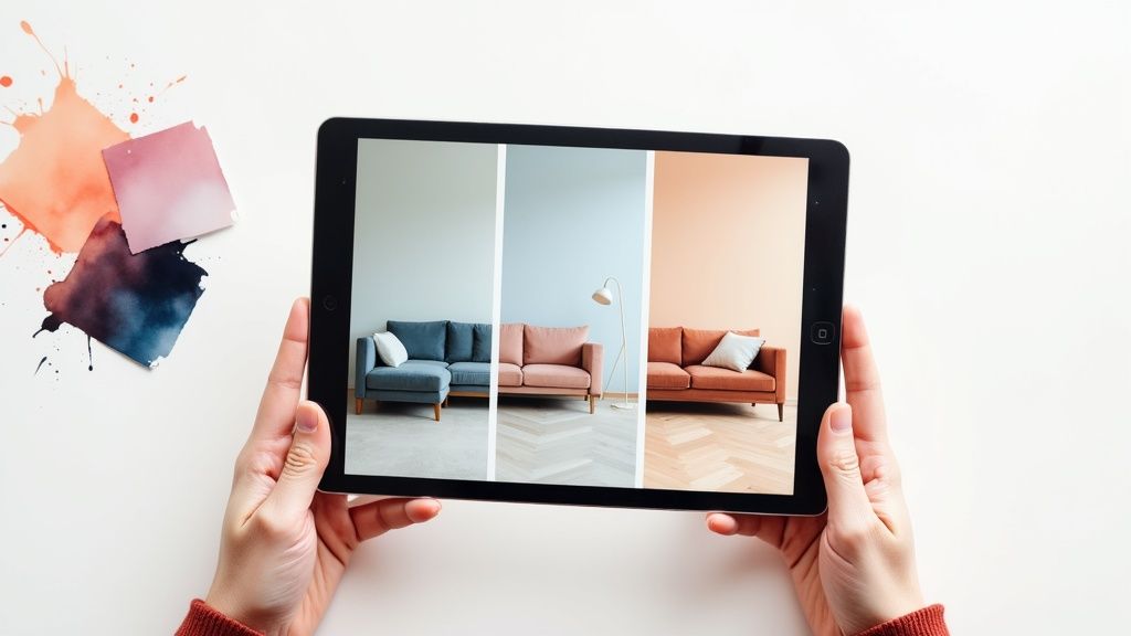
The key thing you gain is context. A swatch held against a white wall tells you almost nothing. But seeing that same color digitally painted behind your couch gives you an incredibly accurate preview of the final vibe.
Spending just a few minutes with a visualizer lets you experiment with total confidence. Think about the common painting dilemmas you can solve instantly:
- Worried about a dark room? See if a dramatic color like Sherwin-Williams’ Cyberspace will make the room feel cozy and sophisticated or just plain gloomy.
- Concerned about clashes? Test a vibrant hue against your current furniture to make sure it complements your decor instead of competing with it.
- Stuck on undertones? Compare three slightly different shades of greige to see which one actually picks up the tones in your flooring or that new area rug.
Taking the time to visualize your feature wall removes the single biggest risk in any DIY paint project: regret. It shifts your process from hoping for the best to knowing you’ve made the perfect choice.
Ultimately, this simple step transforms the entire project from a stressful gamble into a well-planned design decision. If you’re ready to see how it works, you can find out more about using a paint color visualizer and make sure your project is a success from the get-go.
Prepping Your Wall for a Flawless Finish
The secret to a stunning feature wall isn’t really about the final brushstroke. It’s all in the prep work you do before you even crack open a can of paint. Any pro will tell you that 90% of a great paint job is what happens before the color goes on. Honestly, skipping these steps is the single biggest mistake I see DIYers make.
First things first, clear your workspace. Pull all the furniture into the middle of the room, or better yet, move it out completely. Cover everything left behind—and especially your floors—with drop cloths. I prefer canvas, but plastic works too. A little trick is to tape the edges of the cloths right to the baseboards to make sure no sneaky drips find their way underneath.
Creating the Perfect Canvas
With the room protected, it’s time to focus on the wall itself. Your goal is to get the surface perfectly clean and unbelievably smooth. Remember, paint highlights imperfections, it doesn’t hide them.
Start with a good cleaning. Most of the time, a simple sponge with a bit of mild soap and water is all you need to get rid of the dust and grime that can mess with paint adhesion. If you’re working in a kitchen, you might need a dedicated degreaser to cut through any cooking oils. Just be sure to let the wall dry completely.
Now, inspect the wall like a detective. Run your hand across the entire surface to feel for bumps, and get up close to spot any dings, old nail holes, or hairline cracks. These little flaws will stick out like a sore thumb later.
- Fill Imperfections: Grab a putty knife and some spackle. Fill any holes or cracks, leaving the spackle just slightly raised from the surface—it tends to shrink a bit as it dries.
- Sand Until Smooth: Once the filler is bone dry, sand it perfectly flush with the wall. A 220-grit sanding block is your best friend here. When you can run your hand over the patch and not feel a thing, you’ve nailed it.
- Wipe Away Dust: After all that sanding, the wall will be covered in fine dust. Wipe it all down with a tack cloth or a damp sponge to get it perfectly clean again.
Before you go any further, there’s always one question that comes up: what comes first, caulk or paint? Getting this order right is the key to getting those super-crisp lines along your trim. If you’re not sure, check out the definitive guide on whether to caulk or paint first—it’ll save you a headache.
The Great Primer Debate
The last, and arguably most important, prep step is primer. Think of primer as the foundation for your paint. It ensures the color you picked is the color you get, and it helps the paint stick properly, preventing annoying issues like blotches or peeling down the road.
A quality primer is your insurance policy for a professional-looking paint job. It solves problems before they start, ensuring your chosen color is vibrant and your finish is even.
While you don’t need it for every single project, there are a few scenarios where priming is absolutely non-negotiable. You definitely need to prime if you are:
- Making a drastic color change: Going from dark to light (or the other way around) requires a good primer to block the old color from bleeding through.
- Painting over a glossy finish: New paint needs something to grab onto. Primer gives it that “tooth” so it doesn’t just slide off a slick, glossy surface.
- Working with a repaired or new wall: Primer seals the spackle patches and fresh drywall, creating a uniform surface so your final coat looks even, not splotchy.
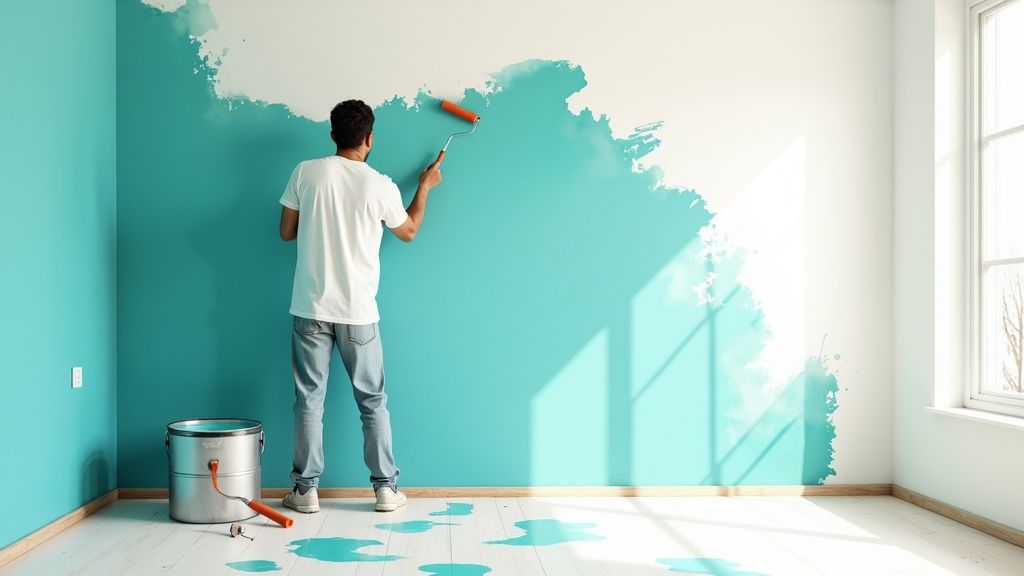
Mastering Your Painting Technique
With your wall prepped and ready, the real fun begins. This is where a little bit of technique and patience will take your project from looking like a simple DIY job to a truly professional-quality finish. The secret really comes down to mastering two things: cutting in with a steady hand and rolling with a consistent rhythm.
Everything starts with cutting in. This is just painter-speak for creating a clean, crisp border around the entire feature wall using a brush. You’ll be painting along the ceiling line, down the corners, along the baseboards, and around any window or door trim. My go-to tool for this is a quality 2.5-inch angled brush—it gives you fantastic control.
The trick is to dip just the tip of your brush into the paint, gently tap off any excess, and then apply it to the wall in a smooth, confident stroke. Aim for a painted border that’s about two to three inches wide. This creates a buffer zone, so when you start rolling, you don’t have to worry about accidentally bumping the ceiling or an adjacent wall.
The Art of Rolling a Perfect Coat
After all your edges are neatly cut in, it’s time to grab the roller and tackle the main part of the wall. The number one rule for avoiding streaks and those dreaded lap marks is to always maintain a wet edge. All this means is that each new stroke of your roller should slightly overlap the still-wet paint from the previous stroke.
To make this happen, a lot of pros (myself included) swear by the “W” or “N” method. It works like this:
- Load your roller with an even amount of paint—don’t let it get so soaked that it’s dripping.
- Start about a foot from a corner and roll a big “W” or “N” shape onto the wall.
- Now, without lifting the roller off the wall, fill in that shape with parallel, vertical strokes that slightly overlap.
- Once that section is filled, reload your roller and repeat the process, making sure your new “W” overlaps the wet edge of the section you just finished.
This technique is the key to distributing the paint evenly and achieving that beautiful, uniform finish everyone wants.
I see this all the time: beginners try to get complete coverage in one thick coat. It’s a classic rookie mistake that almost always ends in drips, an uneven orange-peel texture, and a much longer drying time. Trust me on this—two thin, even coats will always look better and be more durable than one thick one.
And speaking of texture, don’t feel limited to flat colors. The market for specialty paints has exploded, with homeowners looking to add tactile depth to their rooms. The texture paints market was valued at around USD 12.4–13.5 billion in 2023–2024 and is only expected to grow. It’s a clear sign that high-impact accent walls that engage more than just the eyes are a huge trend.
Handling Textured Walls and Second Coats
If your wall already has a texture, like orange peel or knockdown, you’ll need to adjust your approach slightly. The main change is to use a roller with a thicker nap—something in the 1/2” to 3/4” range. This ensures the paint can get into all those little nooks and crannies. You might also find you need to apply a bit more pressure and roll from a few different angles to get full coverage.
Let your first coat dry completely. Check the paint can for the recommended time, but it’s usually at least a few hours. A second coat is almost always necessary to deepen the color and cover any subtle imperfections or thin spots you missed the first time around. This final step is what gives your feature wall that rich, flawless look you’re after.
For more inspiration on how a single project can completely change the feel of a space, check out these other fantastic DIY room makeover ideas.
Styling Your New Feature Wall Like a Pro
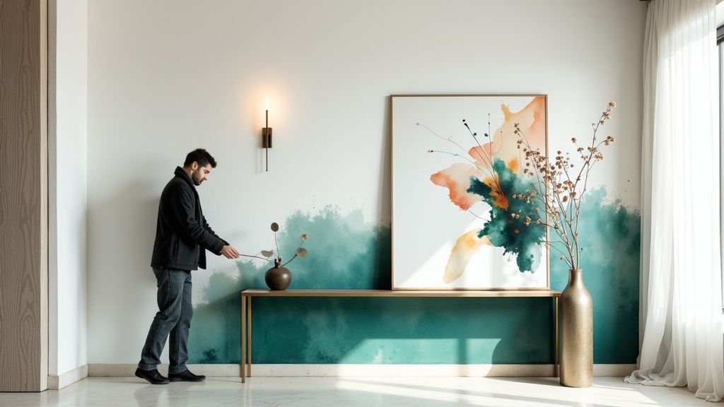
Alright, the paint is finally dry, but don’t put your feet up just yet. The final, and arguably most fun, part is making that wall the true star of the show. Smart styling is what takes a freshly painted wall and turns it into a cohesive, intentional design statement.
First things first, let’s look at your furniture. A simple but effective trick is to pull your main seating, like your sofa, a few inches away from the feature wall. It sounds minor, but creating that little bit of breathing room makes the color feel like a deliberate backdrop instead of just a boundary line for the room.
Finding the Right Finishing Touches
Now it’s time to accessorize. The goal here is to complement the new color, not compete with it. A common misstep I see is leaving the feature wall completely bare, which can make it look a bit lonely and disconnected from everything else.
Here’s how to bring it all together:
- Hang Artwork or a Mirror: A single, large piece of art or a striking mirror can anchor the wall perfectly. If you’ve gone with a dark jewel tone like emerald or navy, try art with a thin, metallic frame—brass and gold absolutely sing against those deep colors.
- Add Minimalist Furniture: A sleek console table is a brilliant choice. It gives you a practical surface for a lamp or a few favourite objects without hiding all your hard work. It’s the perfect home for a stylish lamp, a stack of books, and a plant for a touch of life.
The final styling phase is where the magic truly happens. It’s what integrates your hard work into the room’s overall design, ensuring your feature wall looks thoughtful, balanced, and professionally executed.
Don’t forget about lighting, either. It can completely change the mood. An uplight placed on the floor or a picture light mounted over your artwork will create a dramatic, moody glow in the evening, highlighting both the rich color and the decor you’ve chosen.
Got Questions About Painting a Feature Wall? We’ve Got Answers.
Even after you’ve planned everything out, a few last-minute questions can creep in right before you crack open the paint can. It happens to everyone. Let’s tackle some of the most common ones I hear so you can get started with confidence.
Should an Accent Wall Be Lighter or Darker?
This is probably the number one question people ask. Generally, a feature wall works best when it’s darker than the surrounding walls.
If you’re after a subtle, sophisticated look, try picking a color just two or three shades deeper than your primary wall color. It adds depth without screaming for attention. But if you want to make a bold statement? Go for high drama with a much darker hue or a completely different color altogether to create that powerful focal point you’re envisioning.
Can I Paint More Than One Feature Wall?
I get this one a lot, especially for rooms with interesting layouts. While some uniquely shaped spaces can pull off more than one accent wall, for the average room, stick to one.
Painting two walls often dilutes the effect you’re going for. Instead of looking intentional and high-impact, it can make the room feel busy or, worse, like you just ran out of paint halfway through the job.
The best feature walls look like they belong. They either emphasize a room’s existing architecture or create a clear, deliberate focal point. The goal is purpose, not just a random splash of color.
Are Accent Walls Still in Style?
Absolutely, yes! It’s true that the random, bright-red-wall-in-a-beige-room trend from the early 2000s feels a bit dated now. But a well-planned, thoughtfully executed feature wall is a classic design trick that never goes out of style.
When done right, it brings personality, depth, and a custom-designed feel to any space. It’s all about the execution.
Ready to stop guessing and start visualizing? You can use RoomGenius to test out paint colors and even see how your furniture will look against them—all in a virtual version of your own room.
See your ideas come to life before you pick up a brush at the RoomGenius website.