Long Narrow Room Design: Fixes for the Hardest Layout
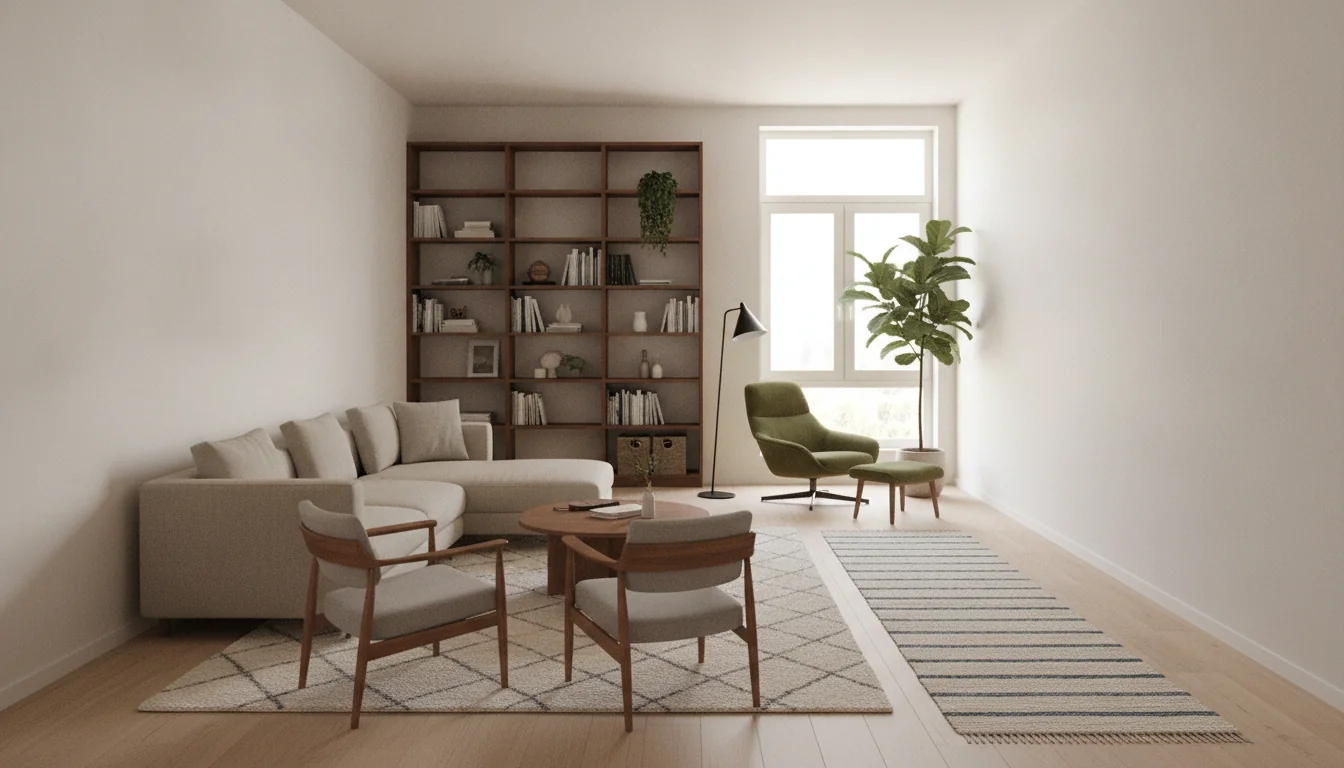
A long narrow room is the layout that makes otherwise confident decorators freeze. You walk in and your eye runs straight to the far wall and out again — the room reads as a corridor with furniture in it rather than a place you’d actually sit. If you’ve ever pushed the sofa against the long wall, stepped back, and thought “this looks like a waiting room,” you’ve met the problem. Long narrow room design is the discipline of breaking that bowling-alley read into real, usable zones — and because the fix is almost always a layout decision rather than a shopping decision, it’s exactly the kind of problem an AI render lets you test before you move a single heavy thing.
This guide covers why these rooms feel like hallways in the first place, the float-and-zone principle that fixes most of them, how to build two (or three) genuine zones inside one long footprint, the rug and lighting and sightline tricks that sell the separation, the furniture scale that keeps a narrow room from feeling like a tunnel, the wall-hugging trap to avoid, and how to preview every layout option with AI before you commit.
What is long narrow room design? Long narrow room design is the practice of planning furniture layout, circulation, and visual zoning for a room whose length substantially exceeds its width — typically a footprint where the long dimension is roughly 1.5× or more the short dimension. The goal isn’t to make the room feel wider than it is (you can’t change the walls), but to stop it from reading as a pass-through by creating distinct functional zones, controlling sightlines, and anchoring each zone so the eye lands on destinations instead of running the length of the room.
Why long narrow rooms feel like hallways
The hallway feeling has a specific cause, and naming it is the first step to fixing it. A corridor is a space you move through; a room is a space you stop in. A long narrow room defaults to corridor unless you interrupt the run.
Three things push a long room toward hallway-read. First, a single sightline from entry to far wall with nothing to stop the eye. Second, furniture lined up along the two long walls — the reflex everyone has — which reinforces “two walls with a path between them.” Third, a lack of floor-area definition: without a rug or a change in ceiling plane or a run of shelving, the long floor is one continuous surface, and one continuous surface reads as a route.
The psychological effect is that people under-furnish long rooms out of fear of crowding them, then the under-furnishing makes them feel even more like corridors. The fix is the opposite of what instinct suggests: you add structure, you float furniture into the middle, and you make the long axis do something instead of just existing.
The float-and-zone principle
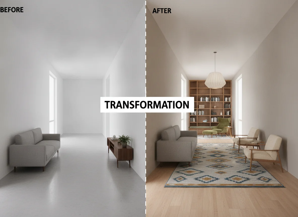
If you take one idea from this guide, take this: float the anchor, then zone around it. In a normal-width room you can push furniture against walls and still get a coherent cluster. In a long narrow room, wall-hugging is what creates the corridor. The single most effective move is to pull the largest piece — usually the sofa — away from the wall and into the middle of the footprint, perpendicular or at a slight angle to the long walls.
Floating the sofa does three things at once. It creates a back of the seating zone (the sofa’s back), which the eye reads as a boundary. It opens a walkway behind the sofa, so circulation moves along the room’s edge instead of straight through the middle. And it leaves the far end of the room free to become a second, distinct zone — a reading nook, a desk, a dining spot, a plant corner.
From there, zoning is just deciding what each segment of the long room is for. A room that is 22 feet long and 11 feet wide is not one 22-foot room; it’s two 11-foot rooms arranged end to end. Once you start thinking in segments, the layout writes itself.
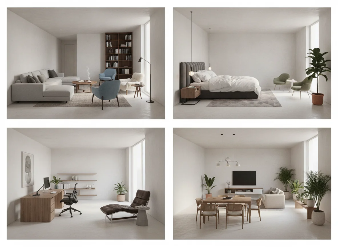
The float-and-zone principle applies whether the room is a living room, a bedroom, a home office, or an open-plan kitchen-diner. The long dimension is the constraint; segments are the solution.
Creating two zones in one long room
Most long narrow rooms want two zones. Long living rooms want a conversation zone at one end and a quiet zone (reading, music, plants) at the other. Long bedrooms want the sleeping zone at one end and a dressing or sitting zone at the other. Long home offices want the desk zone at one end and a meeting or lounge zone at the other.
Here’s the standard two-zone living-room build:
- Conversation zone (near end): Float the sofa about a third of the way into the room, facing across the short axis. Place two accent chairs opposite it at a slight angle to form a loose square. A coffee table sits in the middle of that square. A rug under the whole cluster anchors it.
- Transition strip: A runner or a narrower runner-style rug runs down the center between the two zones. It visually connects them without merging them, and it tells the eye “path goes here.”
- Quiet zone (far end): A bookcase against the far wall, an armchair angled toward a window or a small side table, a floor lamp, and a plant. This gives the long sightline a destination — the eye lands on a styled corner instead of a blank far wall.
For longer rooms — 26 feet and up — a third zone often fits in the middle: a slim console with art above it, or a small dining nook, or a kids’ play corner. The middle zone is where the transition strip naturally sits, so it doesn’t fight the two anchors.
The key mistake is making both zones identical. If zone one is a seating cluster and zone two is also a seating cluster, the room still reads as one long thing. Differentiate: conversation versus reading, or sitting versus working, or lounging versus dining. Different functions are what make the segments feel like separate rooms.
Rug, lighting, and sightline tricks
Three cheap, renter-friendly tools do most of the heavy lifting once the furniture is floated: rugs, lighting, and sightline breaks.
Rugs are the strongest zone-maker. A rug under each zone tells the floor where one area ends and the next begins. In a narrow room, use a rug that’s proportioned to the zone, not the whole room — a 5×8 under the conversation cluster, a 4×6 under the reading nook. The gap of bare floor between them is the transition strip, and it reads as intentional negative space rather than “no rug yet.”
Lighting breaks the sightline overhead. A pendant or a cluster of two pendants over the conversation zone, plus a floor lamp in the quiet zone, creates two ceiling “anchors” that mirror the two floor zones. Without overhead lighting variation, the long ceiling is one flat plane and the room reads as one long box. Even a simple plug-in pendant on a swag cord does the job and needs no electrician.
Sightline breaks stop the eye from running the length of the room. Options: a tall bookcase or open shelving unit positioned perpendicular to a wall (not against it) partway down the room; a sofa with its back to the path; a console with a large piece of art above it placed mid-room; a row of tall plants. Anything that interrupts the straight shot from entry to far wall weakens the hallway read.
Don’t underestimate the power of a single well-placed mirror on a long wall — it widens the perceived space without costing floor area. And vertical elements (tall shelving, floor-to-near-ceiling curtains hung high) draw the eye up, which counteracts the “long and low” tunnel feeling.
Furniture scale for narrow spaces
Scale is where narrow rooms get punished. The wrong piece doesn’t just look off — it can eat the walkway and reintroduce the corridor read.
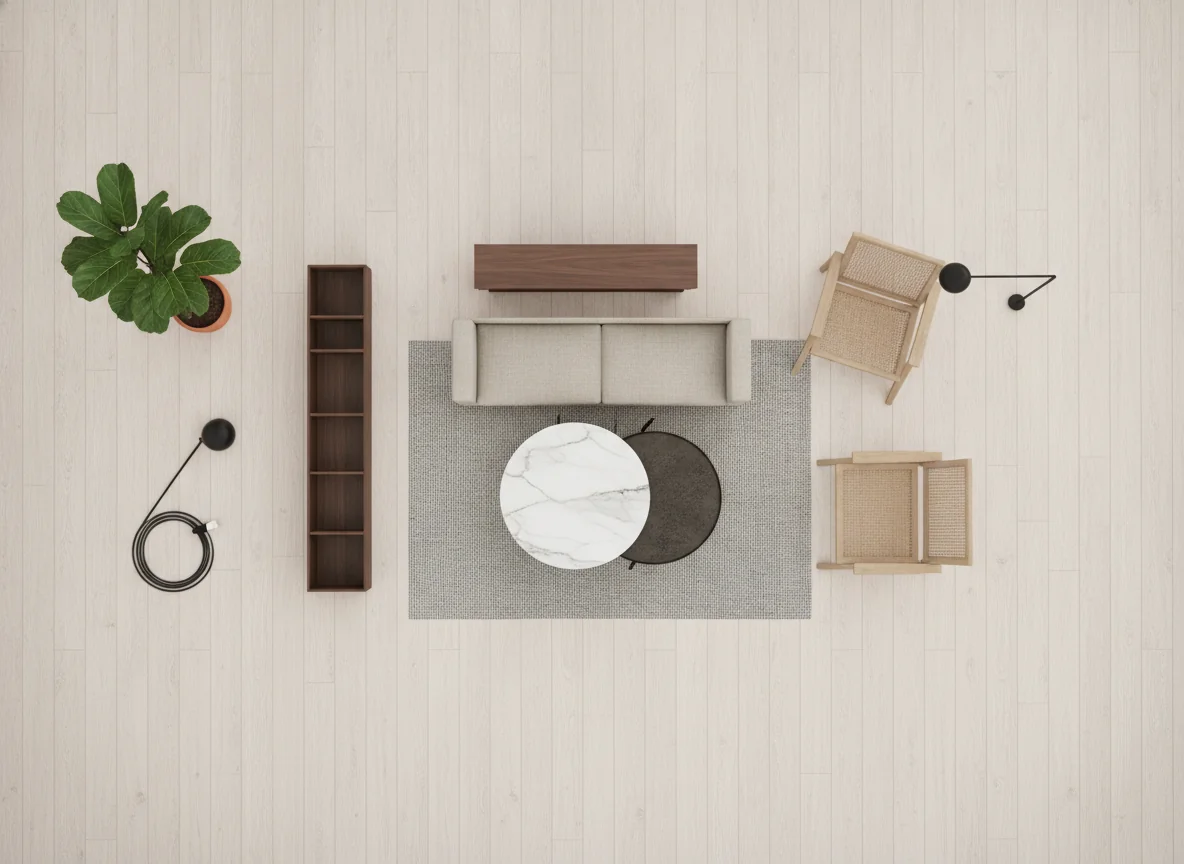
- Sofa: In a room under 12 feet wide, choose a low-profile, armless-or-thin-arm sofa no deeper than about 34–36 inches. Avoid oversized sectionals; a tight two-seater or a small loveseat-plus-chair pairing fits better and floats more gracefully.
- Chairs: Slim accent chairs (wooden legs, open frames) read as “less furniture” than bulky recliners. Two slim chairs occupy less visual mass than one big chair.
- Tables: Round or oval coffee tables move traffic around them more easily than square ones with hard corners poking into the path. Nesting tables earn their keep in narrow rooms — pull them apart when you need surface, tuck them together to reclaim floor.
- Storage: Go vertical. A tall, narrow bookcase uses wall height instead of floor width. A console that’s long but shallow (12 inches deep) defines a zone without protruding into the walkway.
The general rule: in a narrow room, favor pieces that are low and slim over pieces that are big and deep. Mass near the floor keeps sightlines open across the room; mass at sitting height (a deep sectional) blocks the view and re-creates the tunnel.
For the companion thinking on how furniture scale behaves in tight footprints generally, our how to decorate small spaces guide covers the same low-profile logic that applies here, and room layout ideas walks through circulation planning that pairs directly with the float-and-zone method.
What not to do (the wall-hugging trap)
The wall-hugging trap is the default everyone falls into, so it’s worth naming explicitly. When a room feels long and thin, the instinct is to shove everything against the two long walls to “open up the middle.” This is exactly backwards. Lining furniture along both long walls:
- Reinforces the corridor read — two walls of stuff with a path between them.
- Wastes the room’s best asset, which is its length as usable depth, not just circulation.
- Makes the center a dead, awkward strip no one uses.
- Forces everyone to sit facing the long walls, so conversation happens sideways.
Other traps:
- One giant sectional down the long wall. It’s the single most common mistake in long living rooms. It turns the room into a bench.
- A single long rug running the whole length. Reads as a hallway runner, not a room.
- Furniture all the same height. No vertical variation means no visual rhythm; the eye slides straight through.
- Ignoring the far wall. A blank far wall is a missed destination. Even a bookcase, a gallery wall, or a plant corner there stops the slide.
- Pushing the TV to the far wall and the sofa to the near wall. You’ve just built a 20-foot gap you have to shout across. Float the sofa, and if the TV must be far, consider an angled layout or a shorter room segment.
The fix for every one of these is the same reflex: float, zone, differentiate, and give the long sightline somewhere to land.
Previewing layouts before you lift a thing
Here’s where long narrow rooms reward the AI workflow more than almost any other layout, because the difference between “hallway” and “two great rooms” is purely positional — and position is the cheapest thing in the world to test digitally and the most expensive thing to test by moving real furniture.
The workflow: photograph the room from the doorway (one-point perspective, include both long walls and the far wall). Run a render with the floating sofa and conversation cluster at the near end. Run a second render with the sofa against the wall, so you can see the corridor read you’re trying to avoid. Run a third with a reading nook at the far end. Run a fourth varying the rug size and the overhead lighting. Within a few minutes you’ve seen four layouts that would each take an afternoon to stage in real life.
This matters especially because narrow-room mistakes are heavy-furniture mistakes. Moving a sofa is a two-person job; discovering after you’ve done it that the layout still feels like a hallway is a genuinely bad afternoon. A render settles the question first.
For the broader layout-method context, how to arrange living room furniture covers traffic-lane logic that applies directly once you’ve zoned the room, and interior design for small rooms extends the scale principles to the tightest footprints. When you’re ready to act on a render you like, RoomGenius ties each piece to a real, in-stock product so the styled image becomes a shopping list rather than a mood board.
FAQ
What is the best furniture layout for a long narrow living room?
The most reliable layout floats the sofa into the middle of the footprint facing across the short axis, with two accent chairs opposite it to form a conversation square near the entry end, and turns the far end into a distinct quiet zone — a reading nook, bookcase corner, or plant area. This breaks the corridor read by creating two destinations instead of one long sightline. Avoid lining all the furniture against the two long walls.
How do you make a long narrow room feel less like a hallway?
Interrupt the straight sightline from entry to far wall. Float the largest piece of furniture into the middle, add overhead lighting variation (a pendant over the seating zone, a lamp in the quiet zone), use a rug under each zone rather than one long runner, and give the far wall a destination — a bookcase, gallery wall, or plant corner. Vertical elements like tall shelving and high-hung curtains also draw the eye upward and counteract the tunnel feeling.
Should I push my sofa against the wall in a narrow room?
Usually no. Wall-hugging is the reflex that creates the hallway look. Floating the sofa into the room creates a back for the seating zone, opens a walkway behind it, and frees the far end for a second zone. The exception is extremely narrow rooms under about 9 feet wide, where floating may leave too little path — in that case, a slim low-profile sofa against the wall with a clear zone at the far end can work.
How many zones can a long narrow room have?
Most long living rooms support two zones comfortably — conversation and quiet — and rooms 26 feet or longer often fit a third slim zone in the middle (a console with art, a small dining nook, or a play corner). The key is differentiating the zones by function so the room reads as separate areas rather than one long repeated space.
What size rug works in a long narrow room?
Use a rug proportioned to each zone, not the whole room. A 5×8 under the conversation cluster and a 4×6 under the reading nook, with bare floor between them as a deliberate transition strip, reads far better than one long runner-style rug, which reinforces the hallway look. Keep rugs narrow enough to leave a clear walkway along at least one side.
Can AI really help with a long narrow room layout?
Yes — more than with almost any other layout, because the fix is positional, not purchasable. A render lets you test floating versus wall-hugging, two zones versus three, rug size, and lighting variation in minutes, before you move any heavy furniture. Seeing the corridor read side by side with the zoned read is usually the moment the layout clicks.
What furniture should I avoid in a narrow room?
Avoid oversized sectionals down the long wall, bulky deep recliners, square coffee tables with hard corners poking into the path, and any piece that’s big and deep rather than low and slim. Favor low-profile sofas, open-leg slim chairs, round or nesting tables, and tall narrow storage that uses wall height instead of floor width.
Test long-narrow-room layouts before you move the sofa.
The hallway feeling isn’t a flaw in your taste — it’s a layout problem with a known fix. Float the sofa, build two zones, break the sightline overhead, and give the far wall somewhere for the eye to land. The fastest way to find the version of that your room actually wants is to see it rendered before you lift anything heavy.
RoomGenius is the AI room design app that turns a photo of your long narrow room into styled, zoned redesigns you can compare in minutes — conversation cluster here, reading nook there, pendant over the seating, rug under each zone. The free tier covers your first few rooms, and the furniture-matching layer ties every rendered piece to a real product you can order. Try it on the App Store or Google Play. Test long-narrow-room layouts before you move the sofa.