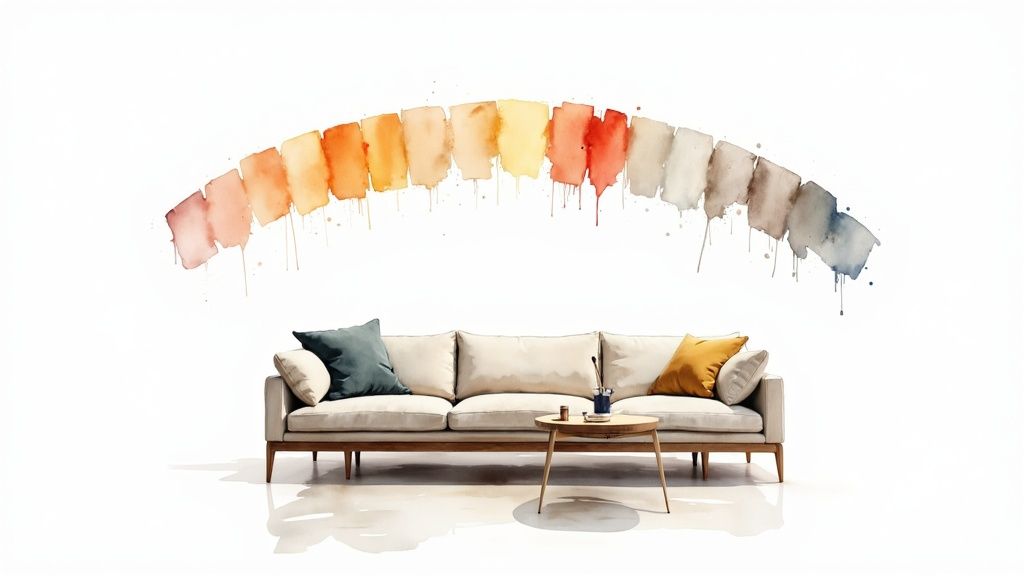
10 Timeless Interior Paint Colors for Living Rooms in 2025
Choosing from the endless array of interior paint colors for living rooms can feel overwhelming. The right shade does more than just cover your walls; it sets the mood, influences the perception of space, and serves as the foundational canvas for your entire design scheme. A living room isn’t just a room, it’s the heart of the home where you relax, entertain, and make memories. The color you select should reflect your personality and enhance the room’s best features, from its natural light to its unique architectural details.
This guide moves beyond fleeting trends to explore 10 timeless and versatile colors that provide sophistication, comfort, and enduring style. We’ll delve into the specific undertones, ideal pairings, and practical application tips for each, helping you make a confident and informed decision. When designing your living room’s palette, remember that the walls are just one component; consider also how you will be choosing the perfect sofa color for your living room to create a cohesive and harmonious space. Our curated list provides the actionable insights needed to transform your living room into a place you’ll love for years to come.
1. Warm White (Creamy Whites)
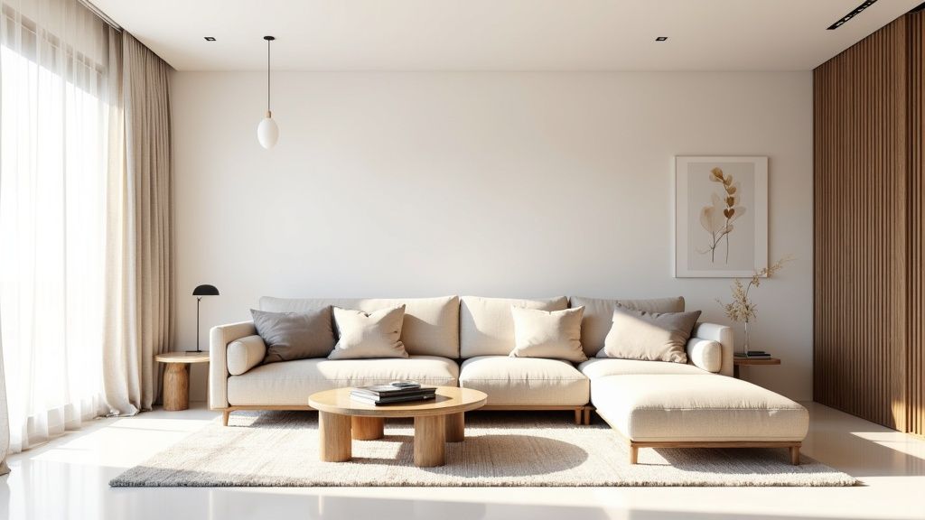
Move beyond stark, clinical whites and embrace the sophisticated comfort of warm whites. These are not your average builder-grade whites; they are nuanced off-whites with subtle undertones of cream, beige, or yellow. This touch of warmth transforms a living room from a simple white box into an inviting, cozy sanctuary without sacrificing brightness. It’s a foundational choice among popular interior paint colors for living rooms because it offers a versatile yet welcoming backdrop.
Warm whites, such as the famous Benjamin Moore ‘Swiss Coffee’ or Sherwin-Williams ‘Alabaster,’ create a soft glow that feels both elegant and lived-in. Unlike pure white, which can feel harsh in certain lights, these creamy hues provide a gentle canvas that complements a wide range of decor styles, from rustic farmhouse to modern minimalist. They work exceptionally well in spaces with abundant natural light, enhancing the room’s inherent brightness.
Key Characteristics
For a quick reference, this summary box highlights the essential features of warm whites.
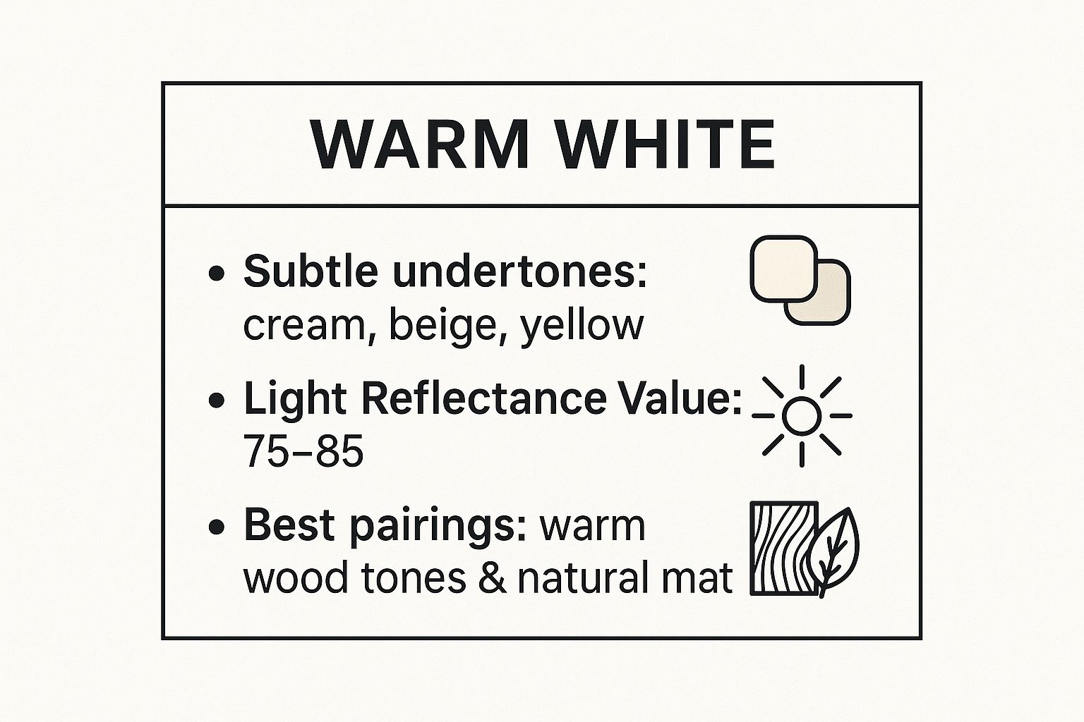
The high Light Reflectance Value (LRV) ensures the space feels bright, while the creamy undertones and affinity for natural materials prevent it from feeling cold.
Application Tips
To make the most of this color family, consider these practical tips:
- Test Extensively: Always paint large sample swatches on multiple walls. A warm white can look more yellow in a west-facing room and more neutral in a north-facing one.
- Create Contrast: Pair warm white walls with crisp, pure white trim. This subtle contrast defines the architectural details and makes the wall color feel more intentional.
- Layer Textures: To prevent a monochromatic scheme from feeling flat, introduce various textures. Think wool rugs, linen curtains, velvet pillows, and warm wood furniture. These layers add depth and visual interest, perfect for a cozy living space. For more inspiration on incorporating textures, you can find a wealth of DIY room makeover ideas on Room-Genius.com.
2. Greige (Gray-Beige Blend)
Greige represents the perfect marriage of gray’s cool sophistication and beige’s comforting warmth, creating an impeccably balanced neutral. This chameleon-like color has dominated the world of popular interior paint colors for living rooms, offering a modern alternative to traditional beige without the potential coldness of pure gray. It provides visual depth and a sense of calm, establishing a versatile foundation that adapts to nearly any design aesthetic.
This sophisticated hybrid, exemplified by iconic shades like Sherwin-Williams ‘Agreeable Gray’ or Benjamin Moore ‘Revere Pewter’, delivers an effortlessly chic backdrop. It feels both contemporary and timeless, making it a go-to choice for designers and homeowners alike. Greige changes character beautifully throughout the day, responding to shifts in natural light to reveal its complex undertones, ensuring a living space never feels static or one-dimensional.
Key Characteristics
For a quick reference, this summary box highlights the essential features of greige.
- Color Family: Neutral
- Undertones: Varies (can lean warm with beige/brown or cool with gray/blue/green)
- Mood: Balanced, Sophisticated, Serene, Modern
- Light Reflectance Value (LRV): Mid-range (typically 45-65)
- Best For: Creating a flexible and enduring neutral backdrop for any style
- Pairs Well With: Crisp whites, warm woods, black accents, muted colors (blues, greens)
The mid-range LRV offers a subtle depth that brightens a room without washing it out, while its balanced undertones make it exceptionally adaptable.
Application Tips
To make the most of this color family, consider these practical tips:
- Sample in Your Space: Greige is highly susceptible to lighting conditions. Test large swatches next to flooring, furniture, and trim to see how its undertones appear in your specific environment.
- Consider Room Direction: Use warmer-toned greiges to counteract the cool, indirect light in north-facing rooms. Cooler greiges work well to balance the intense, warm light in south-facing spaces.
- Define with White Trim: Pair greige walls with a crisp, pure white on trim, ceilings, and doors. This contrast highlights the architectural features and makes the greige appear richer and more intentional.
- Build a Tonal Palette: For a sophisticated monochromatic look, layer various textures in similar tones. Think about incorporating materials like leather, chunky knits, and light-toned woods to add depth and interest.
3. Soft Gray (Cool Neutral)
For a modern, sophisticated, and calming atmosphere, soft gray is an enduring choice among popular interior paint colors for living rooms. These cool neutrals offer a clean, contemporary alternative to warmer beiges, creating a refined backdrop that allows furniture and artwork to shine. Shades range from pale, airy silvers to deeper, more grounded charcoals, providing a versatile palette for various design aesthetics.
Popularized by the Scandinavian design movement and luxury paint brands like Farrow & Ball, soft grays such as Benjamin Moore’s ‘Stonington Gray’ are celebrated for their ability to create serene, uncluttered spaces. They perform beautifully in rooms with ample natural light, where the cool undertones feel crisp and clean. A gray living room can feel both tranquil and chic, adapting easily to minimalist, industrial, or classic decor styles.
Key Characteristics
For a quick reference, this summary box highlights the essential features of soft grays.
| Aspect | Details |
|---|---|
| Mood | Calming, Sophisticated, Modern, Refined, Serene |
| Best For | Rooms with abundant natural light (south/west facing), creating a backdrop for art and colorful decor, minimalist and contemporary styles. |
| Undertones | Blue, Green, Violet |
| Pair With | Warm wood tones, brass or gold metals, crisp whites, bold accent colors like navy, blush, or emerald. |
The cool undertones provide a clean look, while the color’s versatility makes it a modern staple for sophisticated living spaces.
Application Tips
To make the most of this color family, consider these practical tips:
- Test for Undertones: Gray is highly susceptible to light. Test large swatches on different walls and observe them throughout the day to see how the undertones (blue, green, or purple) appear in your specific lighting.
- Introduce Warmth: To prevent a gray room from feeling cold or sterile, balance it with warm elements. Incorporate wood furniture, leather accents, brass light fixtures, and plush, warm-toned textiles like a wool throw or velvet cushions.
- Layer Your Lighting: Relying on a single overhead light can make gray feel flat in the evening. Use a layered lighting strategy with lamps, sconces, and dimmers to create a warm and inviting ambiance after sunset. For more guidance on creating functional and beautiful spaces, explore the expert articles available on InteriorDesign.net.
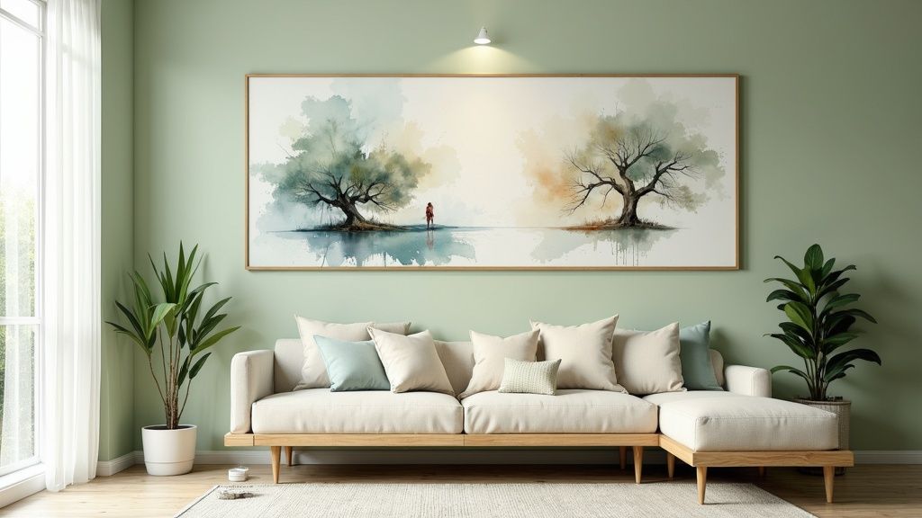
4. Sage Green (Muted Nature-Inspired)
Bring the tranquil, grounding essence of nature indoors with sage green. This soft, muted green features significant gray undertones, creating an earthy and sophisticated hue that serves as a refreshing alternative to traditional neutrals. It’s one of the most versatile interior paint colors for living rooms, capable of fostering a serene atmosphere that feels both timeless and perfectly on-trend. Sage green adds a subtle touch of color without overwhelming the space.
Popularized by brands like Farrow & Ball and designers like Studio McGee, sage green provides a calming backdrop that connects the home to the natural world. Colors like Sherwin-Williams ‘Clary Sage’ or Farrow & Ball’s ‘Vert de Terre’ shine in styles ranging from modern farmhouse to bohemian eclectic. This color works beautifully to create a restorative and peaceful living area, making the room feel like a quiet retreat.
Its mid-range LRV offers a perfect balance, providing color depth without making a room feel dark, especially when paired with lighter elements.
Application Tips
To successfully incorporate this calming color, consider these application strategies:
- Balance with Lightness: Pair sage green walls with crisp white or soft cream trim and ceilings. This contrast prevents the room from feeling too dark and makes the green appear more vibrant.
- Layer Natural Textures: Enhance the organic feel by layering materials like jute, rattan, linen, and light-toned woods. These textures add warmth and depth, preventing the cool undertones from feeling stark.
- Use Warm Metal Accents: Complement sage green with warm metallics. Brass, copper, or antique gold hardware, light fixtures, and decor will pop against the cool green and add a touch of elegance.
- Consider an Accent Wall: If you’re hesitant to paint the entire room, a sage green accent wall behind a sofa or fireplace can introduce the color effectively, creating a strong focal point without full commitment.
5. Navy Blue (Bold Dramatic Neutral)
For those looking to make a confident design statement, navy blue offers a sophisticated and dramatic alternative to standard neutrals. This deep, rich hue brings an enveloping, jewel-box effect to a living room, creating a space that feels both luxurious and intimately cozy. Navy has become one of the most sought-after interior paint colors for living rooms because it acts as a powerful neutral, grounding the room while providing striking visual depth.
Classic examples like Farrow & Ball’s ‘Hague Blue’ or Sherwin-Williams ‘Naval’ wrap a room in timeless elegance. Far from being cold or intimidating, navy blue creates a serene and stable atmosphere, perfect for a relaxing living space. It provides a stunning backdrop for art, furniture, and metallic accents, making everything in the room pop. Navy works well in traditional homes with classic architecture and in modern spaces that need a touch of warmth and character.
Key Characteristics
This summary box outlines the core attributes of a navy blue living room.
The low LRV creates a cozy, enveloping mood, while its strong compatibility with metallics and contrast colors makes it a versatile, high-impact choice.
Application Tips
To successfully use this bold color, keep these tips in mind:
- Balance with Light: Use navy in rooms with ample natural light or a well-planned artificial lighting scheme to prevent the space from feeling too dark.
- Create Crisp Contrast: Pair navy walls with crisp white trim and ceilings. This contrast highlights architectural details and keeps the look feeling fresh and classic.
- Layer with Lightness: Furnish the room with lighter-colored sofas, chairs, and rugs to balance the deep wall color and maintain an open feel.
- Incorporate Metallics: Warm metals like brass, gold, and copper beautifully complement navy’s cool tones, adding a layer of warmth and luxury. This is an essential step when learning how to choose color schemes on Room-Genius.com for a cohesive look.
6. Soft Blush/Dusty Rose (Warm Contemporary)
Step away from conventional neutrals and consider the subtle sophistication of soft blush and dusty rose. These are not saccharine pinks; they are muted, complex shades with gray or beige undertones that bring a unique warmth and elegance to a living room. This color family has transcended its traditionally feminine association to become a chic, versatile choice that feels both contemporary and inviting, making it one of the more unique interior paint colors for living rooms.
Colors like Farrow & Ball’s ‘Calamine’ or Sherwin-Williams’ ‘Charming Pink’ offer a gentle, welcoming glow that is both modern and timeless. These hues create a nurturing atmosphere, providing a soft backdrop that pairs beautifully with a wide range of decor, from minimalist to bohemian. They are particularly effective at making a space feel cozy and intimate without sacrificing a sense of brightness and airiness.
Key Characteristics
For a quick reference, this summary box highlights the essential features of soft blush and dusty rose.
Mood: Inviting, Warm, Elegant, Nurturing Best For: Creating a sophisticated yet cozy atmosphere; spaces that need a touch of warmth and personality without overwhelming color. Pairs Well With: Crisp white, soft gray, charcoal, navy, warm metallics (brass, copper), natural wood, and stone. Style Fit: Modern, Scandinavian, Bohemian, Transitional, Contemporary.
The gray and beige undertones are crucial for maintaining a sophisticated, rather than overtly sweet, appearance.
Application Tips
To make the most of this color family, consider these practical tips:
- Choose Muted Tones: Opt for dusty, muted versions with visible gray or beige undertones. This ensures the color reads as a sophisticated neutral, not a child’s bedroom pink.
- Balance with Contrast: Ground the softness of blush walls by incorporating darker furniture and accents. Charcoal gray sofas, navy blue pillows, or forest green decor will create a chic, balanced look.
- Use Warm Metallics: Accentuate the inherent warmth of dusty rose with metallic finishes. Brass, copper, or rose gold light fixtures, frames, and decor add a touch of glamour and sophistication.
- Select the Right Finish: A matte or eggshell finish enhances the soft, velvety quality of these colors. It minimizes sheen and allows the subtle undertones to take center stage, contributing to a more high-end feel.
7. Warm Beige/Tan (Classic Neutral)
While grays and greiges have dominated recent trends, the enduring appeal of warm beige and tan remains unshakable. These classic neutrals, infused with brown, yellow, or golden undertones, create an inherently inviting and comfortable atmosphere. Their timeless quality provides a cozy, sophisticated backdrop that anchors a room in warmth, making them a go-to choice for those seeking a traditional yet versatile living space.
Colors like Benjamin Moore’s ‘Manchester Tan’ or Sherwin-Williams’ ‘Accessible Beige’ offer a dependable foundation that pairs beautifully with a wide range of furnishings. Unlike cooler neutrals that can sometimes feel stark, warm beiges evoke a sense of heritage and stability. This makes them one of the most reliable interior paint colors for living rooms, especially in spaces designed for comfort and classic style, from traditional homes to modern transitional interiors.
Key Characteristics
For a quick reference, this summary box highlights the essential features of warm beige and tan.
| Attribute | Description |
|---|---|
| Mood | Cozy, Traditional, Inviting, Comfortable |
| Best For | Traditional, Transitional, and Classic living rooms; spaces needing warmth. |
| Pairs Well With | Rich wood tones, crisp white trim, leather furniture, and antique brass. |
| Undertones | Yellow, Gold, Brown, or sometimes a hint of pink or orange. |
| LRV Range | 45-65 (Mid-range, providing color depth without making a room feel dark). |
The mid-range LRV offers a perfect balance, absorbing enough light to feel cozy while reflecting enough to keep the room from feeling heavy.
Application Tips
To make the most of this classic color family, consider these practical tips:
- Create Crisp Contrast: Use a clean, bright white for trim, ceilings, and moldings. This contrast makes the beige walls look intentional and sophisticated while highlighting architectural details.
- Layer Neutrals: For a rich, layered look, combine multiple shades of beige, tan, and cream in your textiles, rugs, and decor. This monochromatic approach adds depth and prevents the space from feeling flat.
- Balance with Cool Tones: Introduce accents of soft blue, muted green, or even charcoal gray through pillows, art, or curtains. This adds a modern touch and keeps the warm palette from becoming monotonous.
- Pair with Rich Woods: Warm beige is a natural partner for wood finishes. Dark walnut, warm cherry, and medium oak tones all complement the color and enhance a traditional or transitional aesthetic.
8. Soft Blue-Gray (Tranquil Hybrid)
Embrace serenity with a soft blue-gray, a sophisticated hybrid that marries the calming essence of blue with the versatile neutrality of gray. This tranquil hue creates an airy, restorative atmosphere without feeling cold or uninviting. It’s an ideal choice among interior paint colors for living rooms, offering a peaceful backdrop that supports various decor styles, from coastal to contemporary. A soft blue-gray has the unique ability to make a room feel both more spacious and more intimate.
Celebrated shades like Benjamin Moore ‘Quiet Moments’ or Sherwin-Williams ‘Rainwashed’ evoke a sense of calm sophistication. These colors are chameleons, shifting subtly with the light throughout the day, appearing more blue in the morning light and grayer in the evening. This dynamic quality adds a layer of depth and interest, making the living room feel elegant, grounded, and deeply peaceful.
Key Characteristics
For a quick reference, this summary box highlights the essential features of soft blue-grays.
- Mood: Calm, serene, airy, sophisticated, tranquil
- Best For: Creating a relaxing retreat; rooms with ample natural light; coastal, transitional, and modern farmhouse styles
- Pairs Well With: Warm woods, crisp white trim, cream and beige textiles, brass or gold accents, natural textures like rattan and linen
- LRV Range: 45-65 (mid-range, reflects a good amount of light without washing out)
The mid-range LRV keeps the space feeling bright and open, while its cool undertones are easily balanced with warmer decor elements.
Application Tips
To make the most of this color family, consider these practical tips:
- Warm It Up: Counteract the inherent coolness of blue-gray by incorporating warm elements. Natural wood tones in furniture or flooring, cozy textiles in cream or beige, and warm metallics like brass will create a balanced, inviting space.
- Choose the Right Trim: Pair with a warm or creamy white trim instead of a stark, cool white. This subtle difference will make the wall color feel softer and more integrated into the room’s design.
- Layer with Texture: Introduce natural materials such as rattan, jute, and linen to add depth and prevent the color from feeling flat. Thoughtful layering is key when you learn how to arrange living room furniture on Room-Genius.com to complement the serene wall color.
- Light Accordingly: This color thrives in rooms with good natural light, particularly southern exposure. In the evening, enhance its ambiance with warm-toned light bulbs (2700K) in your lamps and fixtures to maintain a cozy feel.
9. Warm Taupe (Sophisticated Earth Tone)
For a truly sophisticated and enveloping atmosphere, warm taupe offers a perfect blend of brown’s comfort and gray’s modern chic. This complex neutral brings an earthy richness to living rooms, creating a backdrop that is both grounding and refined. Unlike a standard beige, taupe possesses a greater depth and character that prevents it from feeling bland, making it one of the most enduring interior paint colors for living rooms.
Warm taupe shades like Farrow & Ball’s ‘Mouse’s Back’ or Benjamin Moore’s ‘Copley Gray’ exude a timeless elegance. This color family is incredibly versatile, fitting seamlessly into styles from traditional Ralph Lauren-inspired interiors to the modern-classic aesthetic seen in Restoration Hardware showrooms. It provides a sense of cozy luxury, wrapping the room in a color that is both substantial and serene.
Key Characteristics
For a quick reference, this summary box highlights the essential features of warm taupe.
The mid-range LRV offers depth without darkness, while the balanced undertones support a wide variety of decor and architectural styles.
Application Tips
To make the most of this sophisticated color, consider these practical tips:
- Test for Undertones: Taupe is a chameleon color. Swatch samples on different walls to see how the brown, gray, or even purple undertones appear throughout the day.
- Balance with Brightness: Use crisp white or soft cream for trim, ceilings, and doors. This contrast highlights the room’s architectural details and prevents the taupe from feeling too heavy.
- Layer Rich Textures: Enhance the color’s luxurious feel by incorporating materials like velvet, leather, wool, and linen. These textures add depth and prevent the space from feeling one-dimensional.
- Introduce Metallics: Warm metallics such as brass, bronze, or antiqued gold beautifully complement taupe walls, adding a touch of glamour and warmth.
10. Soft Cream (Warm Ivory)
Soft cream offers a luminous, welcoming foundation that sits gracefully between stark white and traditional beige. This warm, buttery off-white provides both brightness and a gentle warmth, giving it more character than its purer counterparts. It is an ideal choice for creating a light and airy living space that feels subtly sophisticated and inviting, enhancing furnishings and architectural details without ever overpowering them. This classic makes the list of essential interior paint colors for living rooms due to its timeless appeal.
Timeless shades like Benjamin Moore’s ‘Linen White’ or Farrow & Ball’s ‘Clunch’ evoke a sense of heritage and comfort, often seen in classic American interiors and English country cottages. This color family excels at creating a radiant, sun-kissed feel, particularly in spaces with southern or western light. The inherent warmth of soft cream provides a versatile backdrop that complements styles from French country to traditional Hamptons beach houses, making a space feel both elegant and lived-in.
Key Characteristics
This quick summary box outlines the main features of soft cream.
The color’s moderate to high LRV keeps rooms bright, while its distinct buttery undertones create a cozy, established atmosphere.
Application Tips
To maximize the potential of this inviting color family, consider these practical tips:
- Sample Against Trim: Before committing, test paint swatches directly next to your window and door trim. This ensures the undertones complement each other and create a pleasing, intentional contrast.
- Embrace Warm Light: Soft creams truly shine in rooms with warm-toned natural light from south- or west-facing windows, which enhances their golden, buttery qualities.
- Define with White: Pair soft cream walls with a slightly brighter, crisper white on the trim and ceiling. This distinction adds definition and keeps the cream from looking too yellow.
- Layer Rich Textures: Prevent a monochromatic scheme from feeling bland by layering textures. Incorporate warm wood tones, natural fibers like jute or linen, and patterned textiles to add depth and visual interest.
Living Room Paint Colors Comparison Guide
| Color | Implementation Complexity 🔄 | Resource Requirements ⚡ | Expected Outcomes 📊 | Ideal Use Cases 💡 | Key Advantages ⭐ |
|---|---|---|---|---|---|
| Warm White (Creamy Whites) | Moderate - requires testing undertones and trim coordination | Moderate - samples and high-quality paint recommended | Cozy, inviting, bright rooms with soft warmth | Living rooms with warm or natural light, versatile neutrals | Versatile, timeless, reduces harsh glare, brightens spaces |
| Greige (Gray-Beige Blend) | Moderate to High - many shades to choose, testing essential | Moderate - multiple sample testing needed | Sophisticated, balanced neutral bridging warm/cool | Contemporary/transitional living rooms with ample light | Works with warm & cool palettes, hides dirt, broadly appealing |
| Soft Gray (Cool Neutral) | Moderate - careful lighting consideration due to undertones | Moderate - sample multiple lighting scenarios | Clean, modern, calming, and fresh atmosphere | Modern, minimalist living rooms with good natural light | Modern look, great backdrop for artwork, cool-tone friendly |
| Sage Green (Muted Nature-Inspired) | Moderate - balance with white trim and textures | Moderate - trials suggested to avoid drabness | Calming, grounded, earthy, nature-inspired spaces | Traditional to modern rooms needing subtle color | Stress-reducing, adds color with versatility, timeless |
| Navy Blue (Bold Dramatic Neutral) | High - needs excellent lighting and prep | Higher - quality paint and lighting crucial | Dramatic, cozy, intimate, luxurious, and sophisticated | Larger, well-lit rooms or accent walls needing depth | Bold statement, timeless elegance, hides imperfections |
| Soft Blush/Dusty Rose (Warm Contemporary) | Moderate - lighting shifts undertones, testing advised | Moderate - requires sampling in various lights | Warm, soft, nurturing, elegant, and welcoming spaces | Warm contemporary interiors, nurturing social rooms | Adds warmth and subtle color, flattering, versatile |
| Warm Beige/Tan (Classic Neutral) | Low to Moderate - straightforward application | Moderate - widely available paints | Warm, inviting, cozy, and traditional spaces | Traditional, transitional rooms with warm wood accents | Timeless, versatile, affordable, comforts spaces |
| Soft Blue-Gray (Tranquil Hybrid) | Moderate - varies with lighting and undertones | Moderate - sample testing recommended | Airy, calm, peaceful, spacious atmosphere | Coastal, transitional, contemporary spaces needing calm | Calming & versatile, enhances space feel, tranquil |
| Warm Taupe (Sophisticated Earth Tone) | Moderate to High - undertones shift, lighting impacts | Moderate - sample and lighting testing needed | Sophisticated, cozy, rich, and grounded ambiance | Elegant, upscale living rooms with varied lighting | Complex neutral, hides wear, blends warm and cool tones |
| Soft Cream (Warm Ivory) | Low to Moderate - coordination with trim important | Moderate - quality paint advised | Luminous, warm, bright, inviting foundation | Traditional, coastal, and bright open spaces | Enhances natural light, versatile, broad appeal |
From Inspiration to Implementation: Your Next Steps
You’ve journeyed through a curated palette of the best interior paint colors for living rooms, from the timeless elegance of Warm Whites and Soft Creams to the sophisticated depth of Navy Blue and Warm Taupe. The true power of this exploration isn’t just in seeing what’s popular; it’s in understanding the why behind each choice. We’ve seen how Greige offers unparalleled versatility, how Sage Green connects us to nature, and how a Soft Blush can introduce warmth without overwhelming a space.
The central takeaway is that color is a deeply personal and powerful tool. Your living room is more than just a room; it’s the backdrop for your life’s moments. The right paint color sets the stage for everything, from quiet mornings with a cup of coffee to lively evenings with friends and family.
Translating Vision into Reality
Now, the exciting part begins: turning your newfound inspiration into a tangible reality. Before you commit to a full-scale painting project, it’s crucial to bridge the gap between the color swatch and your actual wall. This is where a methodical approach ensures you achieve the look you desire without any regrets.
Your Actionable Checklist:
- Revisit Your Top Choices: From the ten options we covered, narrow down your selection to your top two or three favorites. Consider the mood you want to create. Are you aiming for the tranquil and airy feel of a Soft Blue-Gray, or the cozy and inviting ambiance of a Warm Beige?
- Analyze Your Space: Take a critical look at your living room’s fixed elements. What are the undertones in your flooring, furniture, and window treatments? A color like Greige can look vastly different depending on whether it’s paired with warm-toned wood or cool-toned stone.
- Factor in Lighting: Remember that natural and artificial light dramatically alter how a color appears. A Soft Gray might look crisp and modern in a sun-drenched room but could feel cold and somber in a space with limited northern light.
The Most Important Step: Always Test First
The single most critical step in selecting interior paint colors for living rooms is sampling. Never, ever skip this phase.
Pro Tip: Instead of painting small swatches directly on your wall, paint them on large white poster boards. This allows you to move the samples around the room and see how the color looks on different walls and next to various pieces of furniture. Observe them at all times of the day-morning, noon, and night-to see how the color shifts with the changing light.
Mastering this final selection process is what separates a good living room from a great one. It empowers you to make a confident decision that reflects your personal style and enhances your home’s unique character. By combining the knowledge from this guide with careful, real-world testing, you are fully equipped to create a living room that is not just beautifully painted, but perfectly you.
Ready to see these colors in your living room without picking up a paintbrush? RoomGenius uses advanced AI to instantly visualize any paint color on your walls. Upload a photo of your space and experiment with endless possibilities to find your perfect match before you buy the first can of paint. Try RoomGenius today and take the guesswork out of your design journey.