Your Guide to the Interior Design Sketch
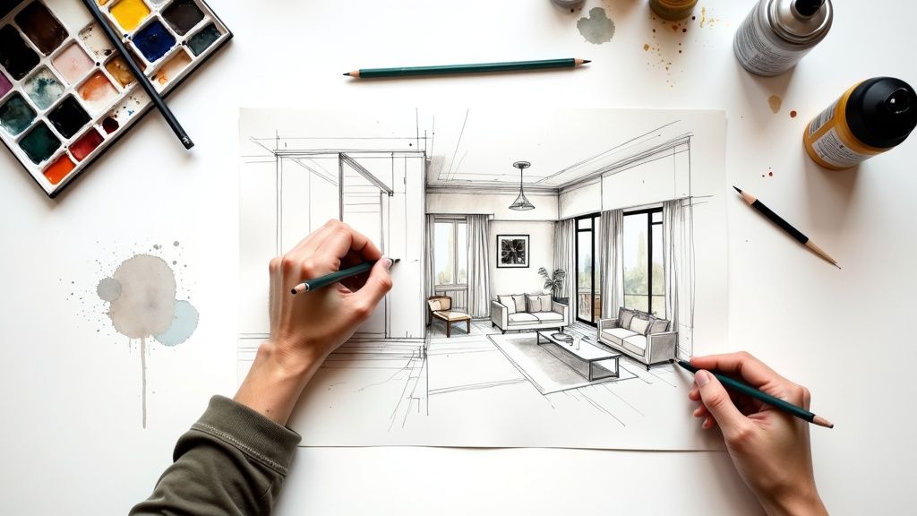
At its heart, an interior design sketch is simply a quick, freehand drawing that helps bring an idea to life. Think of it as more than just a preliminary doodle—it’s a powerful way to explore how a room could feel, solve tricky layout problems, and show clients a vision before you dive into complex digital renders.
Why Sketching Is Still a Designer’s Superpower
Even with all the incredible software at our fingertips, the simple act of putting pencil to paper is a skill that truly sets great designers apart. An interior design sketch is, first and foremost, a thinking tool. It’s the most direct and intuitive way to pull a complex vision out of your head and get it onto a page where clients and collaborators can actually see what you’re imagining.
This isn’t about creating a perfect, gallery-worthy piece of art. It’s all about clear communication and lightning-fast ideation. I’ve often used quick sketches right in the middle of a client meeting to solve a spatial puzzle on the spot. Will that sofa completely overwhelm the living room? How will the afternoon light hit that armchair? A sketch can give you a gut-check answer in minutes, long before you’d ever open a piece of software.
The Power of Quick Ideation
Sketching opens the floodgates for ideas. It’s a wonderfully low-stakes way to explore a dozen different layouts without the pressure of getting every line perfect, a feeling that digital tools can sometimes impose. This creative freedom is absolutely essential in the early brainstorming phase when you’re just trying to find the best possible solution.
“The magic of sketching is its immediacy. You can capture the essence of a room, test a layout, and convey a feeling almost as quickly as you can think it. It’s a direct line from imagination to paper.”
Enhancing Client Communication
For clients, a hand-drawn sketch can make a design feel personal and approachable. It feels more like a collaborative conversation and less like a final, polished presentation, which naturally invites more open feedback and discussion. Showing up with a hand-drawn concept builds a unique kind of trust and makes clients feel genuinely connected to the creative journey.
Understanding how top professionals use this skill is key. The most successful designers, including those at the top high-end interior design firms, rely on sketching as a core part of their process. It’s a foundational skill for a reason. At the end of the day, the humble sketch remains a designer’s superpower because it excels at what matters most: turning a spark of an idea into a tangible reality.
Assembling Your Essential Sketching Kit
You don’t need a mountain of supplies to create a compelling interior design sketch. In fact, I find that a small, carefully chosen set of tools is far more powerful than an overflowing art bin. Let’s move past the generic “get a pencil and paper” advice and build a real-world toolkit that delivers professional-looking results.
It all starts with the right pencil. I always have a couple of different graphite grades within reach because they each play a unique role. For those first, barely-there layout lines that map out a floor plan or establish perspective, a hard 2H pencil is your best friend. Its lines are light and crisp, making them easy to erase without smudging.
Once I’m happy with the basic structure, I’ll switch to something softer, like a 2B pencil. This is what I use to define the important shapes—darkening the walls, outlining a sofa, or defining a doorway. That simple contrast immediately gives the sketch a sense of depth and hierarchy, long before any shading begins.
Before we dive into the specific tools, here’s a quick overview of what I recommend for both beginners and seasoned pros. This isn’t about buying the most expensive gear, but about choosing the right tool for the job.
Essential Toolkit for Interior Design Sketching
| Tool | Primary Use | Beginner Recommendation | Professional Upgrade |
|---|---|---|---|
| Pencils | Initial layout, shading, detail | Graphite set (2H, HB, 2B, 4B) | Mechanical pencils with varied lead |
| Pens | Final line work, annotations | Set of 3 fineliners (0.1, 0.5, 0.8mm) | Staedtler Pigment Liner or Copic Multiliner |
| Paper | Sketching surface | Sketchbook with 120+ gsm paper | Marker paper or Bristol board |
| Markers | Shading, color, depth | 3-5 cool and warm grey markers | Full set of Copic Sketch or Promarker markers |
| Eraser | Corrections and highlights | Kneaded eraser | Tombow Mono Zero Eraser Pen |
Having a solid kit like this means you’re always prepared to capture an idea, whether you’re in the studio or meeting a client on-site.
Finalizing with Precision and Confidence
When you’re ready to make your lines permanent, a good set of fineliner pens is non-negotiable. They create clean, consistent marks that give your sketch a sharp, polished look. There’s a certain confidence that comes from using ink; it forces you to be decisive, which is a fantastic skill to hone.
I suggest starting with just a few different tip sizes to cover all your bases:
- 0.1mm or 0.2mm: Perfect for rendering fine textures like wood grain or fabric patterns.
- 0.5mm: Your everyday workhorse for outlining furniture and most architectural features.
- 0.8mm: Great for creating bold, outer contour lines that make the whole drawing jump off the page.
Your sketchbook is more than just paper—it’s the canvas for your concepts. Always choose one with paper that’s at least 120 gsm thick. Anything less, and you’ll struggle with ink bleeding through or the paper tearing when you erase.
Taking Your Sketches to the Next Level
While I’ll always start my ideas with a pen and paper, blending that with digital tools opens up a world of possibilities. For designers curious about this workflow, exploring an interior design app online is a great way to start. You can scan your hand-drawn sketches and then use the software to add color, experiment with materials, or create polished client presentations.
If you want to upgrade your physical kit first, my number one recommendation is to invest in a small set of alcohol-based markers. You don’t need the whole rainbow. Just a few cool and warm grey markers can add incredible depth and realism through shadows and highlights. This one addition can transform a flat line drawing into a dynamic, three-dimensional concept.
Bringing the Room to Life: The Scaled Floor Plan
This is where the magic really starts—turning your vision into a concrete, workable blueprint. Creating a scaled floor plan is the absolute foundation of a solid interior design sketch. Forget about artistic flair for a moment; this part is all about precision and methodically capturing the space as it truly is.
Before you can draw anything to scale, you need to measure everything. I’m not talking about guestimates. Get out your tape measure and start by creating a rough, not-to-scale outline of the room’s shape. As you measure the length of each wall, jot the number down directly on your rough sketch. It’s a rookie mistake to just measure from wall to wall and call it a day. The real gold is in the details.
Capturing the Room’s “Bones”
Beyond the basic perimeter, you have to map out every single fixed element. These are the non-negotiables, the features your design has to respect and work around. Think of it as creating a DNA map of the room.
Your on-site checklist should include:
- Doors and Windows: Measure their width and, just as importantly, their distance from the nearest corner. Don’t forget to draw a little arc showing which way the doors swing open—this detail alone can make or break a furniture layout.
- Outlets, Switches, and Vents: Mark every single one. Knowing where your power sources are is critical for everything from your lighting plan to where the TV can realistically go.
- Permanent Fixtures: Note the exact position and size of radiators, fireplaces, built-in shelving, or any other architectural feature you can’t just pick up and move.
A floor plan without these details is just an empty box. An accurate plan, with every outlet and window precisely located, is a powerful problem-solving tool. It stops you from making costly mistakes, like falling in love with a gorgeous sideboard that perfectly blocks the only useful outlet in the room.
This detailed map is what allows you to truly visualize the room’s layout and natural flow, as you can see here.
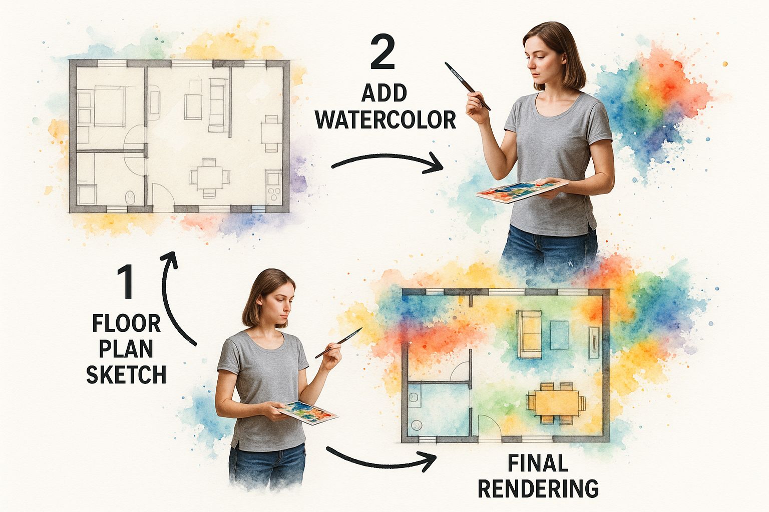
This kind of visual shows how a simple pencil sketch, once it’s properly scaled, becomes the framework for placing furniture and carving out different functional zones in a room.
Making Scale Your Best Friend
With all your measurements in hand, it’s time to translate them onto paper so that everything is perfectly proportioned. This is done using a scale. The most common one you’ll see in interior design is 1/4” = 1’-0”, which simply means a quarter-inch on your drawing represents one foot in the actual room.
An architect’s scale ruler makes this process incredibly straightforward. If you measured a wall that’s 12 feet long, you just find the 1/4” scale on your ruler and draw a line that goes to the “12” mark. You’ll use this exact method for everything—from the width of a doorway to the depth of a bookshelf.
Let’s walk through a quick example. Imagine you’re mapping out a living room that’s 14 feet wide by 20 feet long.
- Using the 1/4” scale, your first step is drawing a rectangle that measures 3.5 inches (which represents 14’) by 5 inches (representing 20’). This is the room’s shell.
- Let’s say there’s a window that starts 3 feet from a corner and is 5 feet wide. On your drawing, you’d measure 3/4 of an inch from the corner, make a mark, and then draw the window to be 1 1/4 inches wide.
- Now for the fun part—furniture. A sofa that’s 7 feet long by 3 feet deep becomes a little paper rectangle measuring 1 3/4 inches by 3/4 of an inch.
This trick of using scaled paper cutouts is a game-changer. You can physically slide them around your floor plan to test different layouts without breaking your back. You’ll see instantly if a walkway feels too tight or if that coffee table completely overwhelms the space.
For those who like to blend the old-school with the new, you can take your hand-drawn sketch a step further by using an online room layout planner to experiment with arrangements virtually. This hybrid approach gives you the best of both worlds: the tactile, hands-on benefit of sketching combined with the speed and flexibility of digital tools.
Creating Depth with Perspective Drawing
A floor plan is great for figuring out what fits, but a perspective sketch? That’s what shows a client what it feels like to actually be in the room. This is the magic moment where your design stops being a flat, two-dimensional map and becomes a believable space they can imagine themselves in.
Bringing this sense of depth to life all comes down to understanding perspective drawing.
Honestly, this skill is less about raw artistic talent and more about grasping a few simple rules of how we see the world. Think about it: objects farther away from you look smaller. Perspective drawing is just a system for faking that effect on paper in a way that looks convincing and consistent.
Getting Started with One-Point Perspective
The easiest way to dip your toes into 3D drawing is with one-point perspective. This view is your go-to when you’re looking head-on at a single wall—picture yourself standing in a bedroom doorway, looking straight at the window on the far side.
In this scenario, all the lines that travel away from you—the corners where the walls meet the ceiling and floor, the long edges of the bed—all seem to head towards a single spot. That spot is called the vanishing point, and it always lives on your horizon line (which represents the viewer’s eye level).
Here’s a quick way to set one up for a simple room sketch:
- Start by lightly drawing a horizontal line across your page. That’s your horizon line.
- Place a single dot somewhere on that line. This is your vanishing point.
- Now, draw the back wall as a simple rectangle. The horizon line can run right through it.
- From each of the four corners of that rectangle, draw faint lines connecting back to your vanishing point.
Just like that, you’ve created the illusion of a box-like room that recedes into the distance. Every piece of furniture and every architectural detail you add will follow these same guiding lines, making the whole scene look cohesive and real.
Your horizon line is more powerful than you think—it sets the entire mood. A low horizon line makes the viewer feel like they’re sitting on the floor, creating an intimate or child’s-eye view. A high one feels like you’re standing and looking down into the space. Experiment with it!
Placing Furniture Realistically
Once your room’s basic structure is there, you can start adding furniture. This is where a lot of people get tripped up, ending up with objects that look like they’re floating or have weird, distorted angles.
The secret is to remember that every single object has to follow the perspective grid you’ve already created.
Let’s say you’re drawing a rug on the floor. Its front edge will be a simple horizontal line, parallel to the bottom of your page. But the side edges won’t be parallel to each other; they’ll angle inward, following the guidelines that lead back to your vanishing point. The same exact rule applies to a bed, a dresser, or a nightstand. The only lines that don’t follow this rule are the vertical ones (like the legs of a chair or the sides of a tall bookshelf), which always stay perfectly vertical.
Mastering this skill is more than just a party trick; it’s a fundamental communication tool in a rapidly expanding industry. Projections show a potential 13% increase in interior design jobs over the next decade. For specialized roles, that growth could jump as high as 20%, and sketching remains a non-negotiable skill. You can learn more about the promising outlook for interior design careers and see why this is a skill worth honing.
Graduating to Two-Point Perspective
After you get comfortable with one-point, you’ll be ready for two-point perspective. This is the view you’d use when looking at a room from a corner, so you can see two walls stretching away from you at the same time.
Instead of one vanishing point, you’ll now have two. Both will sit on the same horizon line, but you’ll usually place them far apart, often off the edges of your paper.
The setup is a little different. You’ll start with a single vertical line that represents the corner of the room closest to you. From there, you draw lines from the top and bottom of that corner line out to both vanishing points. This creates your two receding walls. It’s a bit more complex, but it results in a much more dynamic and engaging sketch that captures a wider, more realistic view of the space.
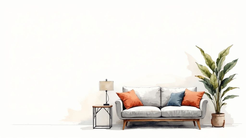
Rendering Your Sketch with Texture and Light
You’ve nailed the perspective, and the room’s form and scale are all there on the page. Now for the magic. Rendering is where you take that solid foundation and breathe life into it, layering in the textures, light, and shadow that make a sketch feel like a space you can walk into. This is the step that turns a technical drawing into a compelling vision for your client.
Think of your line drawing as a blueprint. It’s accurate, but it doesn’t have a soul. Rendering is how you give it one. The easiest place to start is with your light source. Where is the light coming from? A big picture window? A lamp in the corner? Once you decide, you can start laying in shadows on the opposite sides of your furniture and objects.
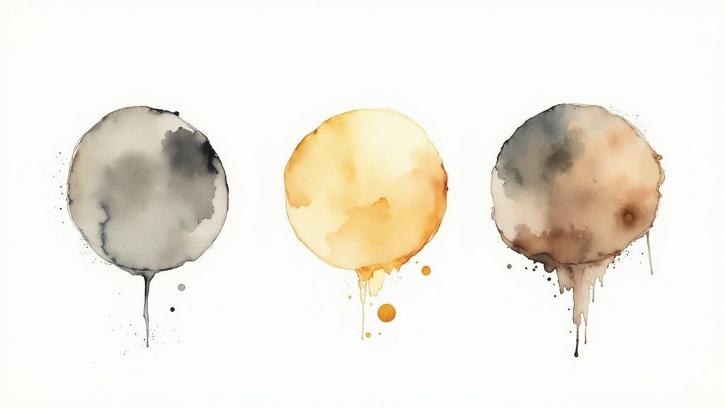
Just this simple act of adding shadows with a soft pencil or a few strokes of a grey marker immediately gives every piece of furniture a sense of weight, anchoring it to the floor.
Bringing Surfaces to Life with Texture
Okay, now let’s make those flat surfaces feel real. The trick to texture isn’t drawing every single thread or wood grain. It’s about suggestion—making a few smart marks that let the viewer’s brain fill in the blanks. It’s an illusion, and a powerful one at that.
Here are a few of my go-to techniques:
- Wood Grain: A few long, slightly wavy parallel lines are all you need to hint at wood grain on a floor or table. I like to throw in a couple of small ovals or circles to represent knots, which really sells it.
- Fabric: For something soft like velvet, I use the side of my pencil for some gentle, smudged shading. If it’s a more textured material like linen or tweed, short, crisp cross-hatching lines do the job beautifully.
- Metal and Glass: It’s all about high contrast. You need to leave parts of the paper completely blank to serve as bright, sharp highlights, placed right next to dark, defined shadows. That stark difference is what makes a surface look reflective.
The goal is to suggest texture, not to create a photorealistic copy. A few confident lines are almost always more effective than a fussy, overworked drawing. Let the client’s imagination do some of the work.
Using Color to Guide the Eye
You don’t always need to create a full-color masterpiece. In fact, sometimes a little bit of color is far more effective. I often use a single colored pencil or a couple of markers to highlight one key feature—maybe it’s a bold accent chair, a piece of artwork, or a colorful rug. This immediately draws the eye and communicates the core of my design concept.
This approach keeps the sketch from feeling too busy and puts the focus exactly where I want it. Clear visual communication is more critical than ever, especially as the industry continues to evolve. In its 2025 Trends Outlook, the American Society of Interior Designers (ASID) pointed out that new technologies and changing demographics are transforming the profession, making skills like this essential.
Your color choices can completely change the feel of a room. If you need some help building a palette that tells the right story, our guide on how to choose color schemes is a great place to start.
Ultimately, rendering is the final conversation you have on the page. It’s what elevates a floor plan into a persuasive vision that gets your client excited.
Your Top Interior Design Sketching Questions, Answered
As you start your sketching journey, you’re bound to have some questions. It’s totally normal. Let’s walk through some of the most common ones I hear from aspiring designers, from whether you need to be a “natural artist” to picking the right tools for the job.
Do I Need to Be a Great Artist?
This is probably the number one question I get asked, and the answer is a resounding no. Interior design sketching is a communication tool, not fine art. It’s a technical skill, like learning to write, focused on showing clients your vision for their space—the scale, the layout, the feeling.
The goal isn’t to create a masterpiece for a gallery. It’s to get your brilliant ideas out of your head and onto paper so someone else can understand them.
How Long Should a Sketch Take?
Another big one is speed. There’s no single answer here, because sketching is incredibly flexible. A quick concept sketch to figure out a tricky furniture layout might take you just a few minutes. On the other hand, a more polished perspective drawing you’re preparing for a formal client presentation could easily take an hour or two.
Think of it as a spectrum—use it for rapid-fire ideation one moment and for a more detailed, refined presentation the next.
Digital vs. Traditional Sketching: Where to Start?
People often wonder if they should just jump straight to an iPad. I always, always recommend starting with a good old-fashioned pencil and paper. There’s something about the tactile experience that builds a foundational understanding of perspective, line weight, and proportion that software just can’t replicate.
Once you’ve built that muscle memory, making the leap to a digital workflow will feel so much more natural.
That said, digital tools are undeniably powerful and have become a huge part of the industry. Just look at the numbers: the global interior design software market was valued at around USD 5.37 billion in 2024 and is on track to nearly double by 2030. You can dig into the full interior design software market research on grandviewresearch.com to see just how central these tools are becoming.
The sweet spot for most designers? A hybrid approach.
- Hand-sketching is perfect for those initial brainstorming sessions and quick on-site client meetings.
- Digital tools like Procreate or Morpholio Trace are fantastic for refining ideas, adding color, and creating clean, professional presentations.
This way, you get the raw, creative freedom of sketching by hand, plus the efficiency and polish of digital software.
Overcoming the Fear of the Wobbly Line
So, what happens if your lines aren’t perfectly straight? Or your circles look more like ovals? Honestly, don’t sweat it.
The most effective interior design sketch is one that clearly communicates an idea, not one that is technically flawless. Confidence in your lines will come with practice, so focus on getting your thoughts onto the page.
Your unique “hand”—the little quirks and imperfections in your drawing style—is what gives your sketches personality. Clients often find that personal touch far more engaging and authentic than a sterile, computer-generated rendering. Embrace it as part of your creative voice.
Ready to bring your ideas to life without the learning curve? RoomGenius uses AI to generate stunning design variants from just a photo of your room. Explore endless possibilities and find the perfect look for your space instantly at https://www.room-genius.com.