8 Must-Try Interior Design Living Room Paint Colors for 2025
The foundation of any stunning living room isn’t just the furniture or the artwork; it’s the color that envelops the space. The right paint can transform a room from ordinary to extraordinary, setting the mood, influencing the perception of size, and serving as the canvas for your personal style. But with a seemingly infinite spectrum of shades, choosing the perfect one can feel overwhelming. This guide moves beyond generic advice to explore the nuanced world of interior design living room paint colors, providing a roadmap to a more intentional and beautiful home.
We’ve curated a comprehensive list of eight versatile and sophisticated hues that are defining modern living spaces. For each color family, we will explore its psychological impact, offer practical implementation strategies, and suggest specific paint shades from popular brands to get you started. You’ll learn which colors make a room feel larger and brighter, which create a sense of intimacy and drama, and how to pair them with existing furniture and decor. The goal is to equip you with the knowledge to select a color not just because it’s trendy, but because it perfectly aligns with your vision for the room.
Whether you’re aiming for a serene sanctuary, a moody lounge, or a warm and inviting family hub, the perfect color is waiting. As you embark on choosing the perfect paint colors, you can find further guidance with expert tips on creating a cozy home, transforming your living space into a haven of comfort. Let’s explore the palettes that will redefine your home’s most important gathering space.
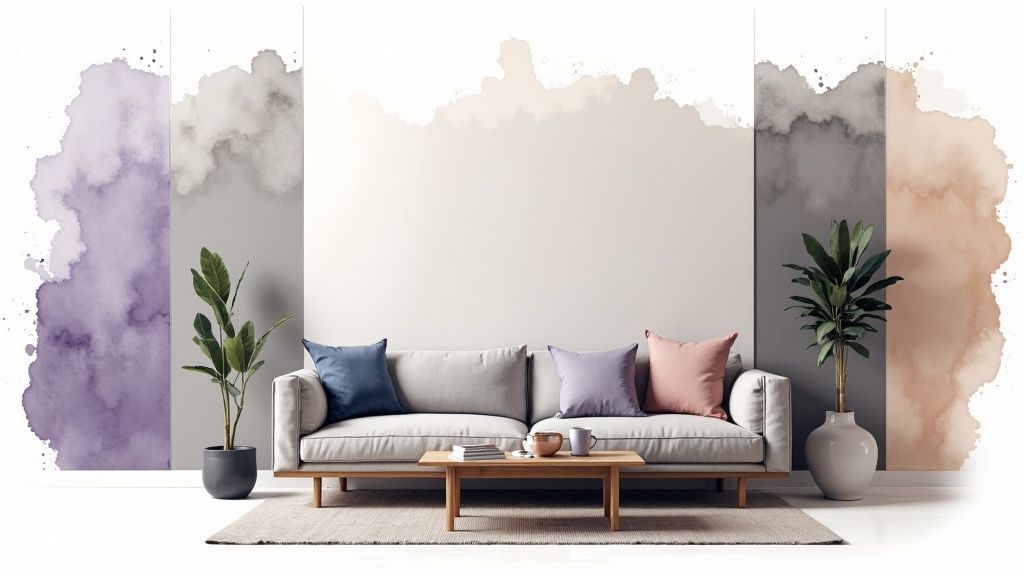
1. Warm Greige (Gray-Beige Blend): The Ultimate Versatile Neutral
Greige represents the perfect marriage of gray and beige, creating a sophisticated neutral that has dominated the world of interior design living room paint colors for good reason. It captures the modern, chic feel of gray while retaining the inviting warmth of beige, resulting in a color that is both grounding and exceptionally versatile. This unique blend prevents the living room from feeling sterile or cold, a common pitfall of pure gray, while offering a more contemporary alternative to traditional beige.
Why Greige Works So Well
The magic of greige lies in its complex undertones. Depending on the specific blend, it can lean slightly warmer with more beige or cooler with more gray. This chameleonic quality allows it to adapt beautifully to different lighting conditions throughout the day. In bright, natural sunlight, the beige undertones may become more prominent, creating a cozy and airy feel. In the evening under artificial light, the gray notes might step forward, lending a more intimate and sophisticated atmosphere to the space.
Expert Insight: Greige is the ultimate foundation for design flexibility. It provides a refined backdrop that supports a wide array of styles, from minimalist and Scandinavian to rustic modern and transitional.
How to Implement Greige in Your Living Room
Achieving a balanced and dynamic look with greige is all about understanding its undertones and pairing it with the right elements.
- Identify the Undertone: Before committing, test paint swatches on different walls. A greige with green or blue undertones will feel cooler and more serene, while one with yellow or pink undertones will feel warmer and cozier.
- Layer with Textures: To prevent a greige room from feeling flat, incorporate a rich variety of textures. Think of a chunky knit throw, a plush velvet sofa, a rough-hewn wooden coffee table, and smooth metallic accents. These layers add depth and visual interest.
- Choose Complementary Colors: Greige is a versatile partner for a wide spectrum of colors.
- For a serene, monochromatic look: Pair it with various shades of white, charcoal, and deeper browns.
- For a pop of color: It works beautifully with muted jewel tones like emerald green, sapphire blue, or dusty rose.
- For a natural, earthy feel: Accent with sage green, terracotta, and warm wood tones.
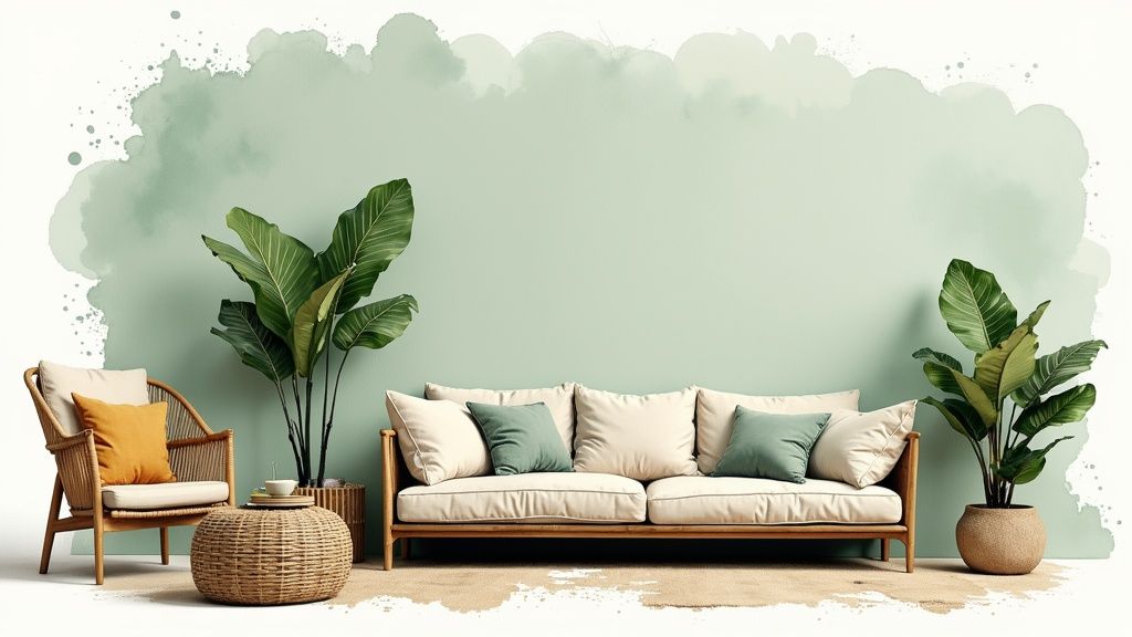
2. Soft Sage Green: Bringing Nature’s Serenity Indoors
Soft sage green brings the calming influence of nature indoors, creating a serene and refreshing living room environment. This muted green with gray undertones has surged in popularity as part of the biophilic design movement, which emphasizes connecting interior spaces with the natural world. It provides a sophisticated alternative to neutral grays and beiges, offering a hint of color while maintaining a peaceful, grounded atmosphere perfect for modern interior design living room paint colors.
Why Sage Green Works So Well
The appeal of sage green lies in its organic, restorative quality. As a color directly pulled from nature, it has a psychologically soothing effect, helping to reduce stress and create a sanctuary-like feel in the home. Its gray undertones give it a muted, earthy complexity that prevents it from being overwhelming. This quality allows it to act as a “new neutral,” providing a subtle color base that is both interesting and incredibly easy to live with, adapting effortlessly to morning light or cozy evening lamps.
Expert Insight: Sage green is the ideal choice for creating a living room that feels like a retreat. It connects us to the outdoors and establishes a foundation of calm that is both timeless and deeply on-trend.
How to Implement Sage Green in Your Living Room
To maximize the tranquil and sophisticated potential of sage green, focus on creating balance with natural materials and complementary hues.
- Balance with Warmth: Pair sage green walls with warm wood tones in furniture and flooring to prevent the space from feeling too cool. Brass or gold fixtures for lighting and hardware add a touch of elegant warmth that contrasts beautifully with the soft green.
- Embrace Natural Textures: Enhance the biophilic connection by layering textures like linen curtains, a jute rug, a leather armchair, or wool throws. These materials reinforce the room’s organic, comfortable aesthetic.
- Choose Complementary Colors: Sage green is a surprisingly versatile backdrop for other colors.
- For a crisp, clean look: Use a bright, clean white for trim and ceilings to make the sage pop and keep the room feeling airy.
- For an earthy, warm palette: Introduce accents in terracotta, rust, or blush pink through pillows, artwork, or ceramics.
- For a deeper natural connection: Pair with abundant houseplants and darker greens to create a lush, layered look. For a deeper understanding of building palettes, explore this guide on how to choose color schemes.
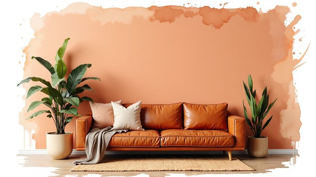
3. Warm Terracotta and Clay Tones
Terracotta and clay-inspired hues bring an undeniable earthy warmth and a grounded, organic feel to interior design living room paint colors. These rich, rust-to-coral tones evoke Mediterranean landscapes and desert sunsets, creating spaces that feel both adventurous and deeply cozy. This color family has enjoyed a major resurgence as homeowners pivot from cool grays toward palettes that reflect a tangible connection to the natural world.
Why Terracotta Works So Well
The appeal of terracotta lies in its ability to be both a statement color and a comforting neutral. Its rich, baked-earth quality provides depth and character without being overwhelming. It’s a color that feels ancient yet completely modern, making it suitable for a wide range of styles from bohemian and rustic to Southwestern and contemporary. This warmth makes a living room feel instantly more welcoming and sociable, wrapping the space in a comforting glow. Sherwin-Williams even named a similar shade, ‘Cavern Clay,’ its 2019 Color of the Year, cementing its place in modern design.
Expert Insight: Terracotta serves as a bridge between bold color and neutral territory. It introduces personality and warmth while remaining grounded enough to pair with a vast array of textures and materials, particularly natural ones like wood, leather, and linen.
How to Implement Terracotta in Your Living Room
Using this rich, earthy tone effectively is about balance and thoughtful pairing to enhance its inherent warmth.
- Start with an Accent: If you’re hesitant to commit to four terracotta walls, start with a single feature wall. This creates a powerful focal point and allows you to test the color’s impact before proceeding with a full room makeover, which can be one of many high-impact DIY projects.
- Balance with Lightness: To prevent the room from feeling too dark or heavy, pair terracotta walls with crisp white trim, ceilings, or even light-colored furniture. This contrast makes the warm color pop while keeping the space feeling airy and bright.
- Embrace Natural Textures: This color begs to be paired with natural materials. Enhance the earthy vibe by incorporating jute or sisal rugs, worn leather sofas, rattan furniture, and rough-hewn wooden elements.
- Incorporate Greenery: The combination of terracotta and lush green plants is a timeless, natural pairing. The vibrant green of houseplants provides a beautiful contrast and reinforces the connection to nature.
4. Soft Navy and Deep Blue: The Sophisticated New Neutral
Deep blue tones, particularly soft navy, have boldly stepped forward as a sophisticated alternative to conventional neutrals in the world of interior design living room paint colors. These rich, enveloping hues create a sense of drama and intimacy, wrapping the space in a color that feels both elegant and profoundly calming. Far from being overwhelming, navy acts as a “new neutral,” providing a deep, personality-rich foundation that remains surprisingly versatile for various decor styles.
Why Deep Blue Works So Well
The power of a deep blue lies in its ability to evoke both serenity and confidence. It has a grounding effect, reminiscent of the night sky or deep ocean waters, which can make a living room feel like a protective, cozy sanctuary. Unlike black, which can sometimes feel too stark, a soft navy has a subtle warmth and complexity. It absorbs light in a way that blurs the corners of a room, creating an expansive, cocoon-like atmosphere that is perfect for relaxation and conversation.
Expert Insight: A deep, saturated blue like navy is a designer’s secret weapon for making a space feel instantly more luxurious and curated. It provides a stunning backdrop that makes both art and furniture pop with intensity.
How to Implement Deep Blue in Your Living Room
Using a dark color like navy requires a thoughtful approach to ensure the room feels balanced and inviting rather than cavernous.
- Balance with Light: To prevent the space from feeling too dark, contrast is key. Use crisp white or a very light off-white for ceilings, trim, and doors. This creates sharp, clean lines and helps reflect light around the room.
- Layer Your Lighting: A single overhead light won’t suffice. Implement a multi-layered lighting scheme with ambient (ceiling fixtures), task (reading lamps), and accent (picture lights) sources to create pools of light and add dimension.
- Incorporate Warmth and Texture: Offset the cool tones of blue with warm materials.
- For a classic, elegant look: Pair navy walls with warm metallics like brass or polished gold in lighting fixtures, mirror frames, and decor.
- For a cozy, natural feel: Introduce rich wood tones through furniture, flooring, or shelving. Leather accents, particularly in shades of cognac or camel, also create a stunning contrast.
- For a touch of softness: Use light-colored textiles like cream-colored sofas, plush beige rugs, and textured throw pillows to soften the overall aesthetic.
5. Warm White and Off-White: The Foundation of Timeless Design
Warm whites and off-whites are the enduring foundation of classic interior design living room paint colors, offering a clean, versatile backdrop that maximizes light while adding a layer of sophisticated warmth. Unlike stark, clinical whites, these shades are infused with subtle undertones of cream, yellow, or beige that prevent a space from feeling cold or sterile. The result is an atmosphere that feels airy, open, and intentionally designed, providing a canvas that is both comforting and endlessly adaptable.
Why Warm White Works So Well
The power of a warm white lies in its ability to reflect light beautifully without creating a harsh glare. These soft, nuanced shades create an inviting glow that can make a living room feel larger and more welcoming. They serve as a quiet, graceful background that allows architectural details, furniture, and artwork to take center stage. This makes them a favorite in styles ranging from the modern farmhouse aesthetic of Joanna Gaines to the chic, layered interiors seen in Nancy Meyers films.
Expert Insight: Warm whites are chameleons. They can read as soft and traditional or crisp and modern depending on the decor you pair with them. Their inherent warmth makes them especially effective in north-facing rooms that receive cooler, indirect light.
How to Implement Warm White in Your Living room
Selecting the perfect warm white requires careful consideration of your room’s unique characteristics and your desired aesthetic.
- Test Swatches in Your Space: Whites are notoriously sensitive to light. Test large paint swatches on multiple walls to see how the color shifts from morning to night. Popular choices like Sherwin-Williams’ ‘Alabaster’ or Benjamin Moore’s ‘White Dove’ can look completely different from one home to another.
- Consider Fixed Elements: Pay close attention to the undertones in your flooring, fireplace stone, and large furniture pieces. A white with creamy-yellow undertones will harmonize with warm wood floors, while one with a hint of gray may better suit a room with cool-toned tile.
- Layer with Textures and Sheens: To keep an all-white room from feeling one-dimensional, introduce a variety of textures. Think of linen curtains, a plush wool rug, and a boucle sofa. Also, vary your paint sheens: use a flat or matte finish on walls for a soft look and a satin or semi-gloss on trim and doors for subtle contrast and durability. Learn more about how to elevate your space with these and other easy home decor ideas.
- Create Subtle Contrast: Avoid matching your walls and trim exactly. Using a slightly cleaner, brighter white for the trim creates a crisp, professional finish that makes the wall color appear more intentional.
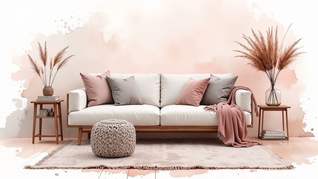
6. Soft Blush Pink and Dusty Rose: The Sophisticated New Neutral
Soft blush and dusty rose tones have shed their traditional associations to become a sophisticated, contemporary choice among interior design living room paint colors. These muted pinks offer a gentle warmth and a hint of color that can function as a neutral, creating an environment that is both welcoming and chic. Unlike bolder hues, these understated shades provide personality and warmth without overwhelming the space, making them a versatile alternative to beige or gray.
Why Soft Pinks Work So Well
The appeal of soft blush and dusty rose lies in their ability to evoke a sense of calm and comfort while remaining stylishly modern. These colors have a unique ability to flatter a room’s lighting, casting a warm, rosy glow that is particularly inviting in the afternoon and evening. Their muted, earthy undertones prevent them from feeling overly sweet, allowing them to serve as an elegant backdrop that enhances architectural details and décor. It’s a color that feels both personal and polished.
Expert Insight: Far from being just a soft, feminine choice, blush pink acts as a “new neutral” that pairs exceptionally well with strong, dramatic accents. It provides a warm foundation that balances cooler tones and brings a subtle energy to the room.
How to Implement Soft Pinks in Your Living Room
To ensure a blush-toned living room feels sophisticated rather than saccharine, it’s crucial to balance it with contrasting elements and rich textures.
- Balance with Strong Contrasts: Ground the softness of blush by pairing it with bold, grounding colors. Accents in charcoal gray, deep navy blue, or even matte black create a striking and modern contrast that feels intentional and high-design.
- Incorporate Natural Materials: To keep the look earthy and sophisticated, integrate natural materials. Light wood floors, a jute rug, marble-topped tables, and linen curtains help to texturize the space and prevent the pink from feeling one-dimensional.
- Choose Complementary Colors: Blush and dusty rose are surprisingly versatile and pair beautifully with a range of palettes.
- For a modern, high-contrast look: Combine with black, white, and gray furniture.
- For a luxe, cohesive feel: Use metallic accents like brushed brass, copper, or rose gold in lighting fixtures and accessories.
- For an organic, calming vibe: Pair with sage green, deep forest green, or creamy whites to enhance the room’s natural serenity.
7. Charcoal Gray and Soft Black: Dramatic and Sophisticated Depth
Charcoal gray and soft black tones represent the bold end of the neutral spectrum, creating dramatic, sophisticated living rooms with a touch of modern elegance. These deep, rich colors provide a striking backdrop that makes artwork, furniture, and architectural details pop. Far from making a space feel small, they can create an intimate, cocooning atmosphere that feels both luxurious and inviting.
Why Charcoal and Soft Black Work So Well
The power of these dark shades lies in their ability to create contrast and absorb light, which paradoxically can make a room feel more expansive and intentional. By minimizing visual distractions on the walls, these colors force the eye to focus on the room’s furnishings, art, and inhabitants. The result is a curated, high-impact space that feels deliberate and enveloping, turning the living room into a cozy, stylish retreat.
Expert Insight: Dark walls recede, which can trick the eye into perceiving more depth. This makes charcoal and soft black excellent interior design living room paint colors for creating a sense of intimacy and grandeur, especially when balanced with proper lighting and contrast.
How to Implement Charcoal and Soft Black in Your Living Room
Successfully using dark paint requires a thoughtful approach to light, contrast, and texture to avoid an overly somber or cave-like environment.
- Balance with Light: Ensure the room has adequate natural light or a comprehensive artificial lighting plan. Layer multiple light sources, such as overhead fixtures, floor lamps, and table lamps, at different heights to illuminate corners and create a warm ambiance.
- Create Sharp Contrast: Paint the trim, ceiling, and even doors in a crisp, bright white. This classic pairing creates sharp, clean lines that frame the dark walls, making the ceiling appear higher and the space feel more defined and structured.
- Incorporate Reflective Surfaces: Introduce mirrors, metallic accents in brass or chrome, and glass tabletops to bounce light around the room. A semi-gloss or satin paint finish will also reflect more light than a flat matte, adding a subtle sheen.
- Choose Complementary Furnishings:
- For high contrast: Use lighter-colored furniture like a cream sofa or a light wood coffee table to stand out against the dark backdrop.
- For a pop of color: Rich jewel tones like emerald, ruby, or sapphire in pillows and accessories look incredibly vibrant.
- For warmth and texture: Integrate warm wood tones, leather, and soft textiles like velvet or wool to soften the look and add a cozy, tactile dimension.
8. Soft Beige and Warm Taupe: Timeless and Inviting Sophistication
Soft beige and warm taupe represent the foundation of classic neutral palettes, offering a timeless warmth and versatility that has endured through decades of design trends. These colors provide an inviting backdrop that works with virtually any decor style, creating a sense of calm and comfort. Modern beiges and taupes are far more sophisticated than their predecessors, with carefully balanced undertones that prevent them from feeling dated or overly yellow, making them a top choice for enduring interior design living room paint colors.
Why Soft Beige and Warm Taupe Work So Well
The appeal of these colors lies in their ability to create a warm, enveloping atmosphere without overwhelming a space. Unlike stark whites or cool grays, beiges and taupes have inherent warmth that makes a living room feel instantly more welcoming and serene. They act as a quiet, confident base that allows furniture, artwork, and textiles to take center stage. Their subtle complexity means they can shift beautifully with the light, appearing softer and creamier in the morning and richer and cozier in the evening.
Expert Insight: Beige and taupe are the cornerstones of traditional and transitional design. They create a seamless and elegant canvas that promotes a feeling of understated luxury and lasting style, as seen in countless Pottery Barn catalogs and high-end hotel lobbies.
How to Implement Soft Beige and Warm Taupe in Your Living Room
To keep this classic look fresh and modern, focus on sophisticated layering and careful color coordination.
- Sample Extensively: Beiges and taupes vary dramatically based on their undertones (pink, yellow, green, or gray). Test large swatches on multiple walls and observe how they change in natural and artificial light before committing. Sherwin-Williams’ ‘Accessible Beige’ is a popular choice known for its balanced undertones.
- Layer with Rich Textures: A neutral room comes to life with texture. Introduce elements like linen curtains, a nubby wool rug, leather armchairs, and velvet pillows. These varied surfaces add depth and prevent the color scheme from appearing flat.
- Use Crisp White for Contrast: Paint your trim, ceilings, and doors in a clean, bright white. This creates a sharp, defined contrast that makes the beige or taupe walls look more intentional and sophisticated, preventing a monotonous look.
- Balance with Accent Colors: These neutrals are the perfect partners for a wide range of accent colors.
- For a classic, tranquil feel: Pair them with muted blues, soft greens, and creamy whites.
- For a more contemporary look: Introduce pops of black, charcoal gray, and warm metallic finishes like brass or bronze.
- For an earthy, organic vibe: Complement with terracotta, olive green, and natural wood tones.
Color Palette Comparison of 8 Living Room Paints
| Color Palette | Implementation Complexity 🔄 | Resource Requirements ⚡ | Expected Outcomes 📊 | Ideal Use Cases 💡 | Key Advantages ⭐ |
|---|---|---|---|---|---|
| Warm Greige (Gray-Beige Blend) | Medium - requires undertone matching and lighting consideration | Moderate - sample testing and lighting evaluation needed | Balanced, sophisticated, versatile neutral backdrop | Modern living rooms, transitional spaces, resale-friendly | Versatile, hides imperfections, timeless appeal |
| Soft Sage Green | Medium - needs coordination with warm accents and textures | Moderate - emphasizes natural materials and lighting | Serene, calming, and organic atmosphere | Nature-inspired, biophilic designs, brightened rooms | Relaxing, on-trend, complements natural materials |
| Warm Terracotta and Clay Tones | High - careful coordination with furniture and lighting | Moderate to high - strong color statement requires testing | Warm, cozy, intimate, earth-inspired spaces | Accent walls, Mediterranean or rustic styles | Inviting warmth, strong design statement, hides imperfections |
| Soft Navy and Deep Blue | High - requires good lighting and balance with accents | Moderate - quality paint and lighting needed | Dramatic, elegant, intimate, moody ambiance | Sophisticated modern, coastal, luxury interiors | Timeless, hides flaws, pairs well with metallics |
| Warm White and Off-White | Low - straightforward but needs undertone selection | Low - widely available, easy application | Bright, open, flexible, timeless backdrop | Any style, galleries, resale-friendly homes | Brightens space, maximizes flexibility, timeless classic |
| Soft Blush Pink and Dusty Rose | Medium - requires thoughtful coordination to avoid overly sweet look | Moderate - testing different shades and pairings | Warm, subtle, feminine yet sophisticated environment | Contemporary, feminine touches, boutique and hospitality | Adds warmth and personality, soft yet elegant |
| Charcoal Gray and Soft Black | High - needs excellent lighting and contrast planning | High - multiple coats and lighting adjustments | Bold, dramatic, intimate, gallery-like backdrop | Modern, luxury, art-focused, intimate spaces | High-impact, hides imperfections, timeless luxury |
| Soft Beige and Warm Taupe | Low to Medium - undertone testing required | Low - versatile and forgiving to work with | Warm, comfortable, versatile, timeless neutral | Traditional and contemporary interiors, broad appeal | Universal appeal, easy to decorate, complements wood tones |
From Inspiration to Action: Painting Your Perfect Living Room
Choosing the perfect paint color is one of the most transformative decisions you can make in your home. As we’ve explored, the world of interior design living room paint colors extends far beyond simple beige and white. From the earthy, grounding presence of Warm Terracotta to the sophisticated drama of Charcoal Gray, each hue offers a unique opportunity to craft an atmosphere that reflects your personal style and enhances your daily life.
The journey from a paint chip to a fully realized room is about understanding the interplay of color, light, and space. Remember, a color doesn’t exist in a vacuum. Its final appearance is shaped by your room’s orientation, the amount of natural light it receives, and the artificial lighting you use in the evening. This is why the advice to “always test your paint” is the most crucial takeaway.
Key Takeaways for a Flawless Finish
To distill the core lessons from our color exploration, keep these principles at the forefront of your project:
- Embrace the Sample: Never commit to a color based on a small swatch. Invest in sample pots and paint large boards that you can move around the room. Observe them in the morning, afternoon, and under artificial light to see how they shift and change.
- Consider the Undertone: A greige isn’t just a greige; it has warm or cool undertones that will interact with your flooring, furniture, and textiles. The same applies to blues, whites, and every other color. Holding a sample up to your largest furniture pieces is a critical step.
- Think Beyond the Walls: The most successful living rooms treat paint as a foundational element, not an afterthought. Your chosen wall color should complement your existing décor or serve as the inspiration for a new design scheme. Consider how Soft Sage Green pairs with natural wood tones or how a Deep Navy provides a stunning backdrop for metallic accents.
Your Action Plan: Moving from Concept to Reality
Feeling inspired is wonderful, but taking action is what creates change. Your next steps are practical and straightforward. Start by identifying the two or three colors from our list that resonated most with you. Then, acquire samples and begin the observation process in your own space.
As you finalize your color choice, remember that paint is just one layer of a cohesive design. The overall success of your living room also depends on how you furnish and arrange the space. This is especially true for smaller areas, where every choice has a significant impact. Beyond just paint, consider practical elements like multi-functional pieces and smart layouts. Exploring stylish furniture solutions for small living rooms can provide the crucial next step in creating a space that is both beautiful and highly functional, ensuring your new paint color has the perfect canvas to shine.
Ultimately, selecting from the vast array of interior design living room paint colors is a deeply personal choice. It’s an opportunity to infuse your most-used space with personality, comfort, and style. Whether you opt for the serene embrace of a warm white or the confident statement of a soft black, the right color has the power to turn a house into a home you truly love.
Ready to see these colors in your own living room without lifting a brush? RoomGenius uses advanced AI to instantly visualize any paint color on your walls. Upload a photo of your space and confidently choose the perfect shade before you buy the paint. Try RoomGenius today and take the guesswork out of your design journey.