How to Choose Color Schemes for Your Home
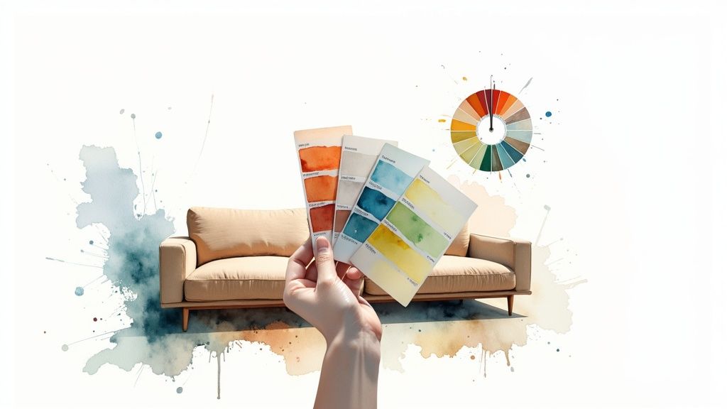
Choosing the right colors for a room is so much more than just picking what looks good. It all starts with a feeling. Before you even glance at a paint swatch, ask yourself: how do I want this space to feel? Do you want a calm, restful sanctuary or a vibrant, social hub? This one decision is your North Star—it will guide every single choice you make from here on out.
Tapping Into Color Psychology and Setting the Mood
Colors have a sneaky way of influencing our emotions, often without us even realizing it. This isn’t just fluffy design talk; it’s a real psychological phenomenon that can make or break how you experience a room. The right palette can make a home office feel more productive or a bedroom feel like a true escape.
Think about a living room meant for lively conversations and cozy nights in. It would come alive with warm, inviting colors—think terracotta, soft yellows, or even a muted red. These shades naturally draw people in and spark connection. Now, picture a bedroom. For a space dedicated to rest, you’d want to lean into cool, calming tones like soft blues, gentle greens, or a serene lavender to help lower stress and encourage sleep.
Matching Colors to How You Use the Room
The secret to a great color scheme is aligning it with the room’s purpose. It’s a simple but powerful concept.
- Need to Focus? For a home office or study, you can’t go wrong with green. It’s known to boost concentration and balance, and a soft sage green is especially easy on the eyes during long work hours.
- Time to Relax? Bedrooms and bathrooms are perfect candidates for blues and light purples. These colors are synonymous with serenity, helping you mentally unwind at the end of the day.
- Want More Energy? For high-traffic areas like kitchens or playrooms, bring on the vibrancy. Yellow is fantastic for sparking creativity and energy, while a dash of orange can inject a sense of fun.
The real trick is making sure the colors support the activities in the room. A bold, high-energy red might be brilliant for a dining room to get conversation flowing, but it would likely be a disaster in a space designed for peaceful sleep.
A Quick Guide to Color Meanings
To make this a bit easier, here’s a quick reference table I often share with clients. It breaks down the common psychological associations of different colors to help you match them to your room’s function.
| Color | Common Associations | Best For Rooms Like… |
|---|---|---|
| Blue | Calm, Trust, Serenity, Stability | Bedrooms, Bathrooms, Offices |
| Green | Nature, Balance, Harmony, Growth | Home Offices, Living Rooms, Bedrooms |
| Red | Passion, Energy, Excitement, Appetite | Dining Rooms, Entryways (in moderation) |
| Yellow | Happiness, Optimism, Energy, Creativity | Kitchens, Playrooms, Breakfast Nooks |
| Purple | Luxury, Creativity, Wisdom, Calm (light shades) | Bedrooms, Creative Studios, Glam Bathrooms |
| Orange | Fun, Enthusiasm, Socializing, Warmth | Playrooms, Gyms, Accent Walls |
| White | Purity, Cleanliness, Simplicity, Space | Kitchens, Bathrooms, Minimalist Spaces |
| Black | Sophistication, Power, Drama, Formality | Accent Walls, Home Theaters, Modern Kitchens |
| Gray | Neutrality, Balance, Sophistication | Living Rooms, Offices, anywhere a neutral is needed |
This table is just a starting point, of course. Your personal connection to a color always matters most, but these general guidelines are a fantastic way to begin building a thoughtful palette.
What the World Thinks About Color
Interestingly, color psychology also uncovers some fascinating global preferences. Did you know that Blue is the world’s favorite color? A whopping 42% of people name it as their top choice. Green comes in second at 14%, which makes sense given its connection to nature and peace. On the flip side, colors like Orange and Brown often land at the bottom of the list—something to keep in mind if you’re designing a space with broad appeal.
Getting this emotional framework right is the most important first step. Once you’ve nailed down the feeling you’re after, you can start building a palette that brings that vision to life. If you want a more comprehensive look at the entire design process, our guide on how to design your room walks you through everything from start to finish.
Build Palettes with Color Harmony Rules
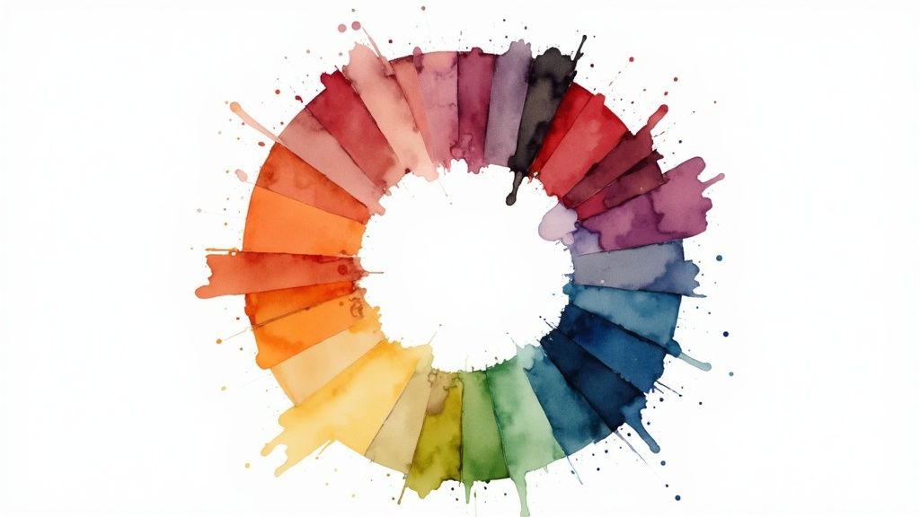
Once you’ve locked in the mood you’re going for, it’s time to actually build the palette that brings it to life. This is where the color wheel becomes your best friend. It’s not just some complicated diagram for art students; think of it as a simple map that shows you which color combinations naturally look good together. A few basic harmony principles can help you create a scheme that feels intentional and beautifully polished.
This isn’t about memorizing a bunch of jargon. It’s about seeing the relationships between colors. Where they sit on the wheel gives you a reliable formula for creating balance, a bit of drama, or a sense of calm. Learning these “rules” really just takes the guesswork out of the whole process. You’ll gain the confidence of knowing why certain colors just click.
Sophisticated Monochromatic Schemes
If you want a look that’s both simple and incredibly chic, a monochromatic palette is a fantastic place to start. This approach is all about using different tints, tones, and shades of a single base color. Imagine a living room wrapped in various blues—from a pale, airy sky blue on the walls to a deep navy sofa and a few slate-blue pillows.
The secret to making a monochromatic room truly sing is texture. Without it, the space can fall flat. Try combining a matte wall finish with a plush velvet couch, breezy linen curtains, and a high-gloss accent table. Even though they’re all in the same color family, the different surfaces create a rich, layered look that feels cohesive and very sophisticated.
Serene Analogous Palettes
For a gentler, more calming vibe, an analogous color scheme is a beautiful choice. This just means picking colors that sit right next to each other on the color wheel. A classic example is combining blue, blue-green, and green. Because they’re neighbors, they blend together effortlessly, creating a low-contrast, harmonious space.
Think of a bedroom with soft green walls, a striking teal headboard, and rich blue accent pillows. The transitions feel so smooth and natural that the room becomes a unified, restful escape. This is my go-to approach for creating a sanctuary where you can truly unwind.
Pro Tip: When you’re working with an analogous palette, pick one color to be the star (the dominant shade). Use the second as a supporting actor, and the third as a small accent. This little trick keeps the colors from fighting for attention and ensures the look stays balanced.
Dynamic Complementary Palettes
Ready to bring some energy and visual pop into a room? Look no further than a complementary color scheme. This involves pairing colors that are directly opposite each other on the color wheel—think blue and orange, or red and green. This high-contrast pairing creates a vibrant, dynamic feel that immediately grabs your attention.
Now, using complementary colors doesn’t mean you have to drench your walls in bright orange and buy a screaming blue sofa. A little subtlety goes a long way. For instance, you could design a mostly neutral living room but introduce navy blue armchairs and then sprinkle in a few terracotta or rust-colored throw pillows. The exciting contrast is still there, but it acts as a powerful accent rather than an overwhelming statement.
If you really want to get a handle on combining colors like a pro, digging into a practical guide to color theory for artists can break these concepts down even further. These foundational principles are your roadmap to choosing color schemes with purpose.
Bring Your Vision to Life with a Mood Board
Okay, you’ve got the feeling you’re after and a general color harmony in mind. Now for the fun part: making it real. This is where a mood board comes in, and trust me, it’s one of the most powerful tools in a designer’s arsenal. It acts as the perfect bridge, taking all those abstract ideas swirling in your head and turning them into a concrete, visual plan.
This step is what ensures the color scheme you’ve imagined actually works in the real world.

A good mood board is so much more than a simple collage. Think of it as a curated story of your future room, told through textures, colors, and finishes. Gathering these physical elements is crucial because it lets you see—and feel—how different materials play off each other before you spend a dime.
Start Gathering Your Materials
Your mission here is to collect tangible pieces that capture the look and feel you want. Don’t censor yourself in the beginning. If something catches your eye and feels right, grab it.
- Fabric Swatches: Get your hands on samples for anything you’re considering—curtains, sofa upholstery, throw pillows. Pay attention to the texture. How does it feel? How does the light hit it?
- Paint Chips: Collect a whole range of shades within your chosen palette. A color can look wildly different in the store versus under the specific lighting in your home, so more options are better.
- Magazine Clippings: Tear out anything that resonates. It could be an entire room, a single piece of furniture, or even an outfit from a fashion magazine that nails the aesthetic you’re after.
- Material Samples: This is a big one people often forget. Don’t neglect the hard surfaces! A small sample of wood flooring, a tile for the backsplash, or a metal finish like brushed brass or matte black is essential to see the full picture.
This hands-on process is where you truly learn how to choose color schemes that feel rich and layered. It’s about moving beyond just a color on a wall and thinking about the entire sensory experience of the room.
Find Your Anchor Piece
I’ve found that nearly every beautifully designed room has an “anchor”—one standout item that the entire color scheme is built around. This is usually something with multiple colors and a pattern you’ve fallen in love with. It might be a fantastic area rug, a bold piece of art, or a statement armchair in a killer fabric.
This anchor piece does the hard work for you by providing a ready-made color palette. Once you have it, you can simply pull different hues from it to inform the rest of your choices.
Imagine you find a rug with deep blues, soft beiges, and a pop of coral. Suddenly, your decisions get a lot easier. You can pull that deep blue for a sofa, use the soft beige for the walls, and sprinkle in that vibrant coral through accent pillows or a vase. Just like that, you’ve created a perfectly coordinated look without the guesswork.
Your anchor piece simplifies every decision that follows. Instead of staring at a wall of a thousand paint chips, you’re just pulling out tones from an item you already know works and that you absolutely love. It’s the ultimate design shortcut.
Once you have all your samples and clippings laid out on your board, take a step back. Start editing. Does anything feel out of place or clash with the story you’re trying to tell? Be ruthless and remove it. What you’ll have left is more than a plan; it’s a tangible blueprint that will guide every single choice, guaranteeing a cohesive and beautiful result.
Use the 60-30-10 Rule for Perfect Balance
So you’ve got a mood board that tells a beautiful, cohesive story. But how do you take that inspiration and translate it into a real room without it turning into a chaotic mess? This is where one of my favorite design principles comes into play: the 60-30-10 rule. Honestly, it’s a game-changer for getting that professional, perfectly balanced look.
The concept is refreshingly simple. It’s all about guiding how you distribute color throughout your space to create harmony and make sure no single hue steals the show.
- Your 60% is the dominant color. This is the main event, the color that anchors the entire room. It’s almost always used on the largest surfaces, like your walls, and sets the foundational tone.
- Your 30% is the secondary color. This one is here to support the main hue, adding some much-needed interest and contrast. Think of things like larger furniture pieces, an accent wall, or your window treatments.
- Your 10% is the accent color. Now for the fun part! This is where you inject personality. These pops of color are used sparingly on smaller decor items like throw pillows, artwork, and decorative accessories.
Seeing the Rule in Action
Let’s picture a cozy living room. The 60% might be a warm, soft beige blanketing the walls. For the 30%, you could bring in a rich navy blue sofa with matching curtains. To finish it off, your 10% could be a splash of vibrant mustard yellow in the cushions, a vase on the mantel, and a key color in a piece of abstract art. The final look feels balanced, intentional, and just plain good.
This is a great visual for how you can start mapping out emotions to colors, which makes picking hues for each percentage much easier.
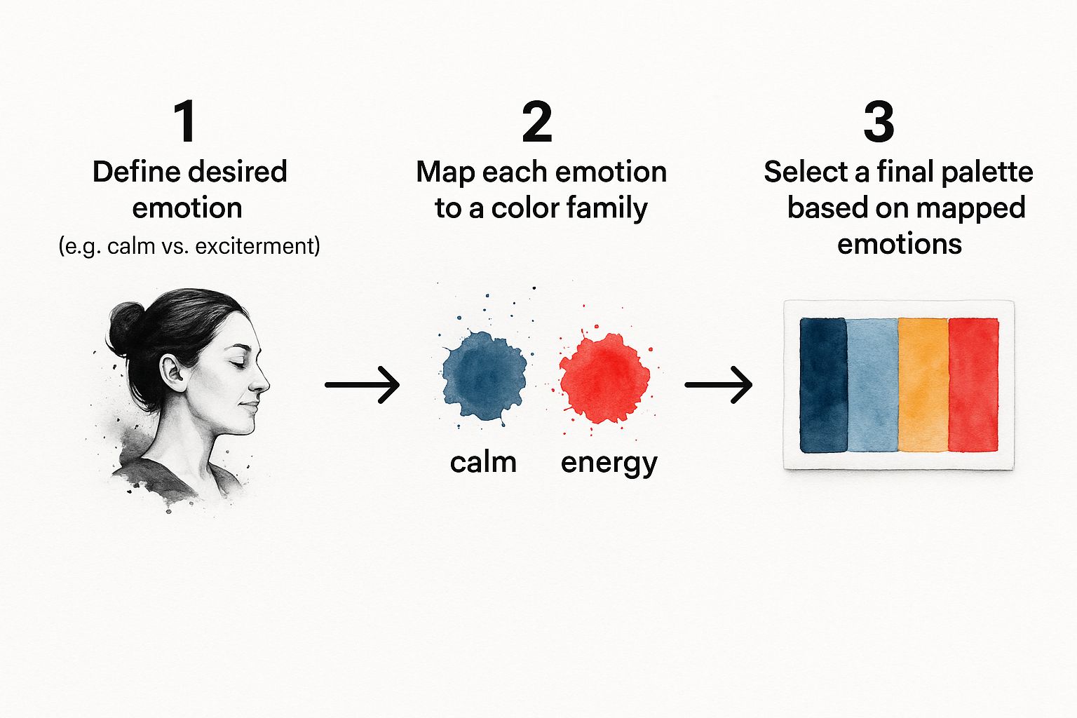
By figuring out the feeling you want first, you can thoughtfully assign a dominant, secondary, and accent color to bring that specific mood to life.
The real beauty of the 60-30-10 rule is its flexibility. It isn’t some rigid law you have to follow perfectly. Think of it as a guide that provides just enough structure to keep your space from feeling either bland or overwhelming. It’s a framework for combining multiple colors with confidence.
We’re seeing a clear shift in global trends away from strictly neutral palettes. While classic achromatic colors like white and gray still make up nearly 80% of some markets, people are craving more individuality. Warm neutrals and bolder, vibrant shades are definitely on the rise—in fact, Beige’s popularity has nearly doubled in some regions since 2021. You can dive deeper into these trends in BASF’s full color report.
This trend makes principles like the 60-30-10 rule more valuable than ever, as it gives you a reliable way to integrate those bolder choices gracefully. And if you’re struggling to picture it, using a top-tier virtual room design app makes it so much easier to experiment with these ratios and find the perfect balance before you even pick up a paintbrush.
Test Your Final Colors in Your Space
You’ve got your mood board, you’ve balanced your palette—now for what I consider the single most important step in this whole process. Honestly, skipping this is the biggest mistake people make, and it almost always leads to a frustrating and expensive repaint down the line.
That tiny paint chip from the store? It’s just a suggestion. In your actual home, that perfect greige can suddenly pull purple undertones, or the soft sage green you fell in love with might look muddy and dull on the wall. Color is a chameleon; it completely changes its personality based on its surroundings.
The Power of Light
The number one thing that influences how a color looks is light. Your room has its own unique lighting signature, and both the natural and artificial light will have a huge say in how a paint shade appears on your walls.
- Natural Light: A north-facing room gets cool, indirect light, which can wash out warm colors and make cool tones feel even cooler. A south-facing room, on the other hand, is drenched in warm, bright light all day long, which can really intensify colors.
- Artificial Light: Don’t forget about your lightbulbs! LEDs come in a whole range of temperatures, from warm yellow to cool blue. Each one casts a different hue on your walls, completely changing a color’s look after the sun goes down.
Never, ever finalize a color based on how it looks in the store. Your home’s lighting is unique, and it will interact with the paint in ways you just can’t predict until you see it in the space.
The Best Ways to Test Paint Colors
To get a real feel for your colors, you need to see them in a big way and live with them for a few days. Forget painting those little swatches directly onto your current wall—the old color will just throw off your perception.
Instead, paint a large sample (at least two feet by two feet) on a piece of white poster board. This is my favorite trick because it lets you move the color around the room. You can prop it up next to your sofa, hold it against the trim, and see how it looks on different walls as the light shifts from morning to night.
Another fantastic, no-mess option is peel-and-stick swatches from companies like Samplize. They’re made with real paint, so you get an accurate preview without any cleanup. And if you want to play around with digital previews, our guide on AI interior design software covers some incredible tools that can help.
This real-world test drive is what ensures your beautiful color scheme translates perfectly from your mood board to your home. Once you’ve locked in your palette, you can get inspired by seeing how others pull it off with these luxury bedroom design ideas.
It’s no surprise that people gravitate toward neutral, safe colors. Just look at the car industry—White, Gray, and Black are by far the most popular choices. A recent report found that White alone makes up 31% of the global market. In Europe, Gray is huge at 26%, followed by Black at 23%. This preference for neutrals is exactly why testing is so important; the subtle undertones in these shades are what will make or break the final look.
Common Color Scheme Questions Answered
https://www.youtube.com/embed/Y45kWzybhAU
You’ve done the hard work of picking a direction for your color scheme, but now you’re facing all the little questions that can make you second-guess everything. It’s the home stretch, and this is where the details really matter.
Don’t worry, these are the same practical hurdles everyone runs into. Let’s walk through some of the most common questions I get asked, from handling tricky room layouts to picking the perfect paint finish. Getting these final details right is what separates a good room from a great one.
How Do I Make a Small Room Look Bigger?
This is probably the number one question in interior design, and for good reason. The secret is all about tricking the eye with light. Using lighter colors—think soft whites, pale blues, and light grays—is a classic strategy because they reflect light, making the walls seem to recede.
A great pro tip is to paint your trim and ceiling a shade or two lighter than the walls. This simple trick blurs the hard lines where the walls end, creating a seamless, more open feeling. Sticking to a simple, low-contrast palette will really amplify that airy, expansive vibe.
A lot of people think they have to go with a stark, clinical white, but that’s not the case. An off-white with a touch of warmth or a very pale, cool hue can feel just as spacious without looking cold or sterile.
Should My Paint Finish Be Matte or Glossy?
The paint finish you choose is just as important as the color. It completely changes how the color looks on the wall and, more practically, how well it holds up over time. Each one has its place, and the right choice really comes down to the room’s purpose.
-
Matte or Flat Finish: This finish has zero shine, giving it a beautiful, velvety look. It’s a master at hiding minor imperfections, which makes it perfect for older homes with quirky walls. The trade-off is durability—it’s not easy to clean, so save it for low-traffic spots like a master bedroom or a formal dining room.
-
Eggshell and Satin Finish: These are the workhorses of the paint world and my usual recommendation. They have just enough of a subtle sheen to be durable and wipeable, making them ideal for busy areas like hallways, living rooms, and kids’ bedrooms.
-
Semi-Gloss and Gloss Finish: With a high-shine, reflective surface, these finishes are built tough. They stand up to moisture and are incredibly easy to clean, which is why you see them on kitchen cabinets, bathroom walls, and trim like baseboards and doors. Just be aware that the shine will highlight every single bump and imperfection on the wall.
How Many Colors Are Too Many in One Room?
This is where people can get a little carried away. While design has no absolute rules, a good guideline is to stick to a palette of three to five colors. The 60-30-10 rule is a fantastic framework to keep you grounded and ensure the space feels balanced, not busy.
If you’re itching to bring in more colors, treat them as tiny grace notes within that 10% accent category. For instance, your primary accent might be a bold navy blue, but you could add a couple of small throw pillows with a pop of complementary orange. The goal is to create a clear visual hierarchy. You need one dominant color, a secondary supporting color, and then the rest can be small, intentional highlights. This is how you create depth and interest without tipping into visual chaos.
Ready to stop guessing and start seeing? With a tool like RoomGenius, you can upload a picture of your actual room and test out different color palettes on your own walls. It takes the anxiety out of the decision. Try RoomGenius today and start designing with confidence.