10 Good Living Room Paint Colors to Try in 2025
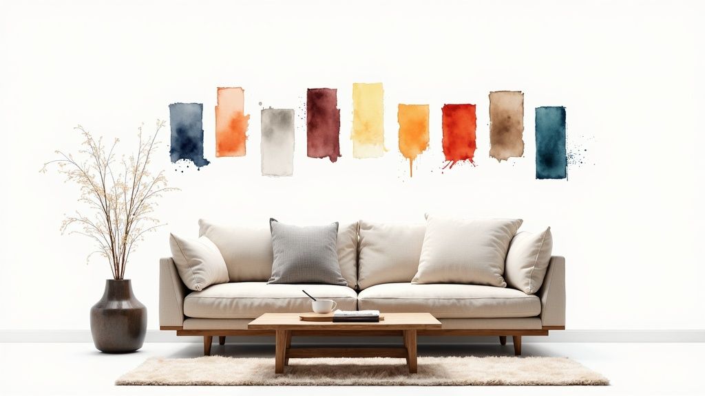
Choosing a paint color for your living room is more than just a design choice; it’s about setting the mood for the heart of your home. The right shade can make a space feel larger, cozier, more sophisticated, or wonderfully serene. But with countless swatches and undertones, finding the perfect hue can feel overwhelming. This guide simplifies the process by curating a definitive list of the most effective and good living room paint colors favored by professional designers.
We move beyond simple suggestions to provide actionable insights for each shade. You’ll discover the specific mood each color creates, its ideal furniture and lighting pairings, and how to adapt it for different room sizes and styles. Understanding the fundamentals behind these choices can be incredibly empowering. Before diving into specific shades, a simple guide to color theory for beginners can equip you with foundational knowledge for making informed decisions.
This curated collection is designed to help you move from inspiration to a confident decision. We’ll break down everything you need to know, helping you visualize the transformation. Ready to see how these colors look in your own home? You can use a tool like RoomGenius to upload a photo of your living room and instantly test these stunning palettes on your walls, taking the guesswork out of your project.
1. Warm Greige (Gray-Beige Blend)
Warm greige has cemented its place as one of the best good living room paint colors for a reason. It expertly combines the earthy warmth of beige with the modern sophistication of gray, creating a perfectly balanced neutral. This chameleon-like hue provides a backdrop that is both inviting and chic, avoiding the potentially stark feel of pure gray or the dated look of traditional beige. It serves as a versatile foundation for nearly any design style, from modern minimalist to rustic farmhouse.
Why It Works for Living Rooms
The genius of greige is its ability to adapt to its surroundings. In a room with abundant natural light, its gray undertones become more prominent, offering a crisp, clean aesthetic. In spaces with warmer, artificial lighting, the beige tones emerge, creating a cozy and comforting atmosphere. This adaptability makes it an incredibly safe yet stylish choice for a central living area.
Expert Insight: Greige is the ultimate bridge color. It effortlessly connects warm elements like wood floors with cool-toned furniture or metal accents, creating a cohesive and harmonious design.
How to Implement Warm Greige
To make this color truly shine, consider these actionable tips:
- Pair with Bright White: Use a crisp white paint for trim, ceilings, and doors. This creates a sharp contrast that makes the greige look intentional and defined, preventing it from appearing muddy.
- Layer with Textures: Since greige is a subtle neutral, build interest through texture. Think chunky knit throws, linen curtains, woven area rugs, and smooth leather accents.
- Emphasize Wood Tones: Warm greige looks stunning next to natural wood. Whether it’s oak flooring, a walnut coffee table, or cherry cabinetry, the pairing feels organic and timeless.
Popular examples of this color include Sherwin-Williams Accessible Beige and Benjamin Moore Revere Pewter.
Visualize it Now! Curious how a warm greige would look in your space? Use our RoomGenius tool to upload a photo of your living room and instantly see the transformation.
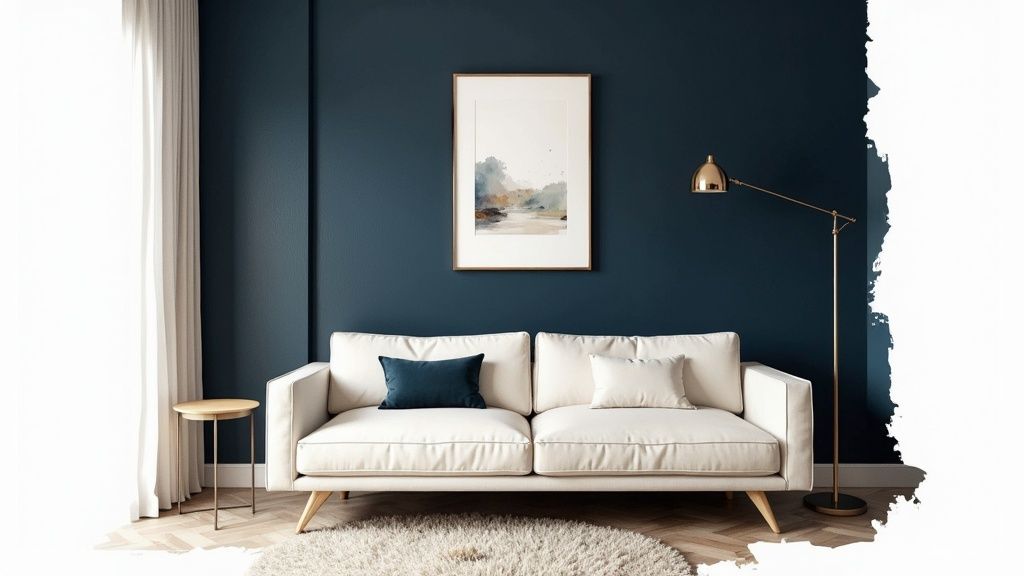
2. Deep Navy Blue
Deep navy blue has confidently moved from a bold accent to a sophisticated and mainstream choice among good living room paint colors. This deep, saturated hue brings drama and intimacy to a space, creating a cozy yet elegant atmosphere. Unlike black, it feels less stark and more versatile, serving as a rich, enveloping neutral that works beautifully in traditional, modern, and transitional designs. It provides a stunning backdrop that makes art, furniture, and metallic accents pop.
Why It Works for Living Rooms
Navy blue creates an instant sense of depth and character. In a well-lit room, it can feel energetic and regal, while in a room with lower light, it becomes a moody, cocooning color perfect for relaxing evenings. This inherent versatility allows it to ground a large, open space or make a smaller room feel intentionally cozy and jewel-box-like. It’s a bold choice that signals confidence and timeless style.
Expert Insight: Don’t be afraid of using a dark color like navy in a smaller room. It can actually blur the corners and make the space feel more expansive and less defined, creating an illusion of depth.
How to Implement Deep Navy Blue
To ensure this powerful color enhances your living room, follow these tips:
- Create Crisp Contrast: Pair navy walls with bright white or soft cream trim and ceilings. This classic combination keeps the look clean and sharp, preventing the deep blue from overwhelming the space.
- Introduce Warm Metallics: Accessorize with brass, gold, or copper elements. Picture frames, light fixtures, and decor in warm metallic tones will stand out beautifully against the navy and prevent the room from feeling too cool.
- Balance with Light Furnishings: Use lighter-colored furniture, like a beige sofa or white accent chairs, and light-toned area rugs to provide visual relief and balance the wall’s depth.
Popular examples of this color include Sherwin-Williams Naval and Benjamin Moore Hale Navy.
Visualize it Now! Not sure if this bold color is right for you? It’s easy to test it out with our paint color visualizer and see how navy transforms your living room.
3. Warm White/Off-White Palette
Moving beyond stark, clinical whites, a warm off-white palette has become a go-to choice for sophisticated living rooms. These shades feature subtle yellow, pink, or gray undertones that infuse a space with light and warmth, avoiding the coldness of a pure, bright white. This approach creates a clean, airy, and expansive feel while maintaining a cozy and inviting atmosphere, making it one of the best good living room paint colors for a timeless look.
Why It Works for Living Rooms
A warm white serves as a brilliant, gallery-like canvas for your furniture, art, and decor. It reflects natural and artificial light beautifully, making small or dark living rooms feel significantly larger and brighter. Unlike beige, which can sometimes feel dated, off-white provides a fresh, modern foundation that is endlessly adaptable to evolving design trends, from Scandinavian minimalism to coastal chic.
Expert Insight: The magic of a warm white is its ability to feel both clean and comfortable. It provides a crisp backdrop without any of the sterile, uninviting qualities of a true neutral white.
How to Implement a Warm White/Off-White Palette
To bring this luminous and inviting look to your living room, follow these guidelines:
- Choose the Right Finish: Opt for a matte or eggshell finish. These less-reflective sheens are excellent at hiding minor wall imperfections and lend a soft, velvety depth to the color.
- Layer with Natural Textures: Prevent an all-white space from feeling flat by layering textures. Introduce linen curtains, wool rugs, wooden furniture, and plenty of live plants to add visual interest and warmth.
- Explore Color Pairings: A warm white base is perfect for experimenting. When considering how to style your furniture, you can find inspiration by exploring different color combinations with white to create a dynamic and personalized space.
Popular examples of this color include Benjamin Moore Chantilly Lace and Sherwin-Williams Alabaster.
Visualize it Now! Curious how a warm white would look in your space? Use our RoomGenius tool to upload a photo of your living room and instantly see the transformation.
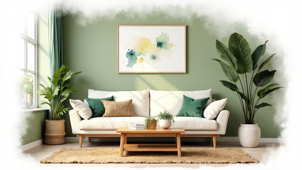
4. Sage Green
Sage green brings the tranquility of nature indoors, establishing itself as one of the best good living room paint colors for creating a peaceful retreat. This muted, earthy hue perfectly balances green and gray undertones, offering a sophisticated splash of color that feels both organic and modern. It avoids the intensity of brighter greens while providing more personality than a standard neutral, making it ideal for a serene and stylish living space.
Why It Works for Living Rooms
The calming effect of sage green is deeply rooted in its connection to nature, which can reduce stress and promote a sense of well-being. This makes it an excellent choice for a living room, a space dedicated to relaxation and social connection. Its gray undertones ensure it remains versatile enough to pair with a wide range of furniture and decor styles, from modern farmhouse to minimalist and bohemian. For a deeper understanding of how colors influence a room’s atmosphere, you can learn more about choosing color schemes on our blog.
Expert Insight: Sage green is a fantastic ‘new neutral.’ It provides a subtle hint of color that enhances natural materials like wood, leather, and stone, making the entire room feel more grounded and cohesive.
How to Implement Sage Green
To maximize the impact of this restorative color, try these design strategies:
- Pair with Natural Textures: Complement sage green walls with natural fibers. Think jute or sisal rugs, linen curtains, and rattan or wicker furniture to amplify the organic feel.
- Introduce Warm Metallics: Accents of brass, bronze, or copper add a touch of warmth and elegance. These metals contrast beautifully with the cool tones in sage, creating a balanced, luxurious look.
- Use Creamy Whites for Trim: Instead of a stark, bright white, opt for a soft cream or off-white for trim and ceilings. This creates a gentler transition and enhances the color’s inherent warmth.
Popular examples of this color include Benjamin Moore October Mist and Sherwin-Williams Evergreen Fog.
Visualize it Now! Curious how a sage green would look in your space? Use our RoomGenius tool to upload a photo of your living room and instantly see the transformation.
5. Warm Taupe
Warm taupe elevates the concept of a neutral with its rich blend of brown and gray undertones, offering more depth and character than standard beige. This sophisticated hue provides a cozy, enveloping feel without being dark or overpowering, making it one of the most enduring good living room paint colors. It strikes an elegant balance between earthy comfort and refined style, creating a backdrop that feels both timeless and grounded. It is particularly well-suited for transitional, traditional, and even organic modern aesthetics.
Why It Works for Living Rooms
The beauty of taupe lies in its quiet luxury. It’s a color that feels substantial and calming, fostering an atmosphere of serene stability perfect for a living room. Its warm undertones connect seamlessly with natural materials like wood and stone, while its gray elements keep it feeling current and chic. This makes it an ideal choice for creating a cohesive design that feels intentionally curated and high-end.
Expert Insight: Warm taupe is a master at creating an intimate and inviting space. It absorbs light in a way that softens corners and minimizes glare, making large rooms feel cozier and smaller rooms feel like a gentle embrace.
How to Implement Warm Taupe
To maximize the impact of this elegant color, follow these design tips:
- Pair with Creamy Off-Whites: Instead of a stark white, use a soft, creamy off-white for trim and ceilings. This creates a lower-contrast, more harmonious look that enhances taupe’s inherent warmth.
- Introduce Metallic Accents: Warm metals like brass, bronze, and copper look spectacular against a taupe background. Use them for light fixtures, picture frames, or decorative objects to add a touch of glamour.
- Layer with Rich Textures: Prevent this mid-tone color from feeling flat by layering various textures. Think velvet pillows, bouclé chairs, woven jute rugs, and smooth marble or stone surfaces.
Popular examples of this color include Benjamin Moore Kona and Farrow & Ball Mouse’s Back.
Visualize it Now! Curious how a warm taupe would look in your space? Use our RoomGenius tool to upload a photo of your living room and instantly see the transformation.
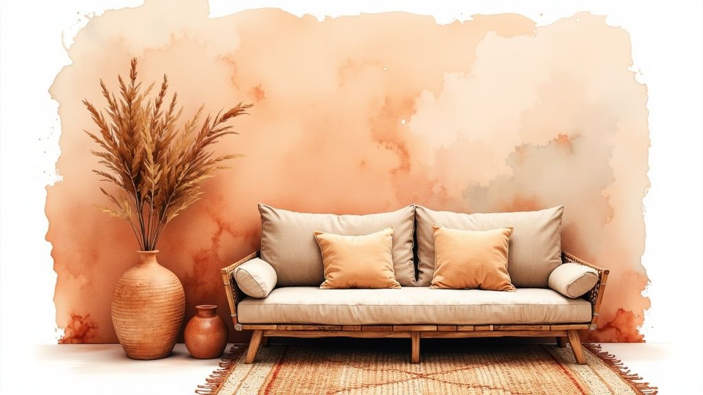
6. Soft Terracotta/Warm Clay
Inspired by sun-baked earth and artisanal pottery, soft terracotta brings a grounded warmth and organic personality to a living space. This hue is a more muted, sophisticated version of its vibrant namesake, blending reddish-brown with rosy or peachy undertones. It offers a rich, inviting alternative to standard neutrals, making it one of the most compelling good living room paint colors for creating a cozy, worldly atmosphere. This color works beautifully in styles ranging from modern bohemian to desert modern and even updated traditional designs.
Why It Works for Living Rooms
Soft terracotta creates an immediate sense of comfort and connection to nature. Its inherent warmth makes a room feel welcoming and is especially effective in spaces that need a cozy boost, like north-facing rooms with cool light. Unlike bolder colors that can overwhelm, this earthy tone provides a rich backdrop that still feels restful, encouraging relaxation and conversation in the home’s primary gathering spot.
Expert Insight: Terracotta has an incredible ability to flatter natural materials. It enhances the grain in wood, complements the texture of linen and rattan, and makes live greenery pop, creating a layered, cohesive, and nature-inspired interior.
How to Implement Soft Terracotta
To harness the warmth of this color without it feeling overpowering, follow these practical steps:
- Balance with Cream: Use a soft cream or off-white for the trim, ceiling, and even larger furniture pieces. This provides a gentle contrast that brightens the room and keeps the terracotta from feeling too heavy.
- Embrace Natural Textures: This color is a perfect partner for natural materials. Incorporate elements like jute rugs, woven light fixtures, clay pottery, and linen upholstery to build an artisanal, textured look.
- Incorporate Warm Metals: Accent the space with metals like aged brass, copper, or bronze. These finishes echo the warmth of the wall color and add a touch of understated elegance and shine.
Popular examples of this color include Sherwin-Williams Cavern Clay and Benjamin Moore Caliente.
Visualize it Now! Curious how a soft terracotta would look in your space? Use our RoomGenius tool to upload a photo of your living room and instantly see the transformation.
7. Soft Gray with Blue Undertones
Soft gray with blue undertones offers a sophisticated twist on the ever-popular neutral gray. By infusing cool, calming hints of blue, this color creates an atmosphere of serene elegance that is both modern and timeless. It’s one of the good living room paint colors for those who want a neutral with more personality and depth than a standard gray, evoking a sense of tranquility and airiness. This hue is a perfect match for contemporary, coastal, and transitional design schemes.
Why It Works for Living Rooms
This color’s strength lies in its ability to feel both calming and refreshing. The subtle blue notes can make a space feel larger and more open, particularly in rooms blessed with ample natural light. It provides a crisp, clean backdrop that allows artwork and furniture to stand out, while its gray base keeps it grounded and versatile. This shade is perfect for creating a peaceful retreat, a space to unwind and relax after a long day.
Expert Insight: Blue-gray is incredibly responsive to light. It can shift from a more dominant gray in the morning to a soft, ethereal blue in the afternoon sun, adding dynamic character to your living room throughout the day.
How to Implement Soft Gray with Blue Undertones
To maximize the impact of this elegant color, follow these actionable tips:
- Introduce Warm Accents: To prevent the space from feeling too cool, incorporate warm elements. Brass or gold metal finishes, warm wood tones like oak or walnut, and cognac leather can create a beautiful, balanced contrast.
- Layer with Cozy Textures: Add warmth and comfort through soft furnishings. Think cream-colored boucle chairs, plush velvet cushions in mustard or rust, and a soft, high-pile area rug.
- Use Crisp White Trim: A clean, bright white on baseboards, window frames, and crown molding will make the blue-gray walls look sharp and intentional, enhancing their sophisticated character.
Popular examples of this color include Benjamin Moore Palladian Blue and Sherwin Williams Sea Salt.
Visualize it Now! Curious how a soft blue-gray would look in your space? Use our RoomGenius tool to upload a photo of your living room and instantly see the transformation.
8. Warm Cream/Ivory Palette
For those seeking a brighter alternative to beige without the clinical feel of pure white, a warm cream or ivory palette is an exceptional choice. These colors offer more depth and character than stark white, creating a soft, sophisticated backdrop that feels both classic and fresh. A warm cream infuses a space with a gentle, sunlit glow, making it one of the most inviting and good living room paint colors available. It’s a timeless neutral that promotes a sense of calm and elegance.
Why It Works for Living Rooms
Cream and ivory excel at making a living room feel bright, open, and welcoming. Unlike cool whites, which can sometimes feel sterile, these hues have warm undertones (yellow, pink, or peach) that create a cozy, enveloping atmosphere. This makes them perfect for creating a comfortable gathering space. They reflect light beautifully, enhancing the sense of space in both large and small rooms while providing a versatile canvas for any decor style.
Expert Insight: Cream is the perfect “quiet” color. It supports bold artwork, patterned textiles, and dark wood furniture without competing for attention, allowing your decor to become the true focal point.
How to Implement a Warm Cream/Ivory Palette
To make this elegant color palette work effectively, consider these key strategies:
- Create Contrast with Trim: Pair warm cream walls with a slightly darker, contrasting trim in a mushroom or greige shade. This adds architectural definition and prevents the room from looking washed out.
- Layer with Natural Textures: Enhance the warmth of cream by layering materials like linen drapery, wool rugs, light wood furniture, and rattan or wicker accents. This adds depth and interest.
- Introduce Strategic Color: Use cream as a backdrop for accent colors. It pairs beautifully with soft blues, sage greens, dusty rose, and even rich jewel tones like emerald or sapphire for a more dramatic effect.
Popular examples of this color include Benjamin Moore Swiss Coffee and Sherwin-Williams Creamy.
Visualize it Now! Curious how a warm cream would look in your space? Use our RoomGenius tool to upload a photo of your living room and instantly see the transformation.
9. Warm Black or Very Dark Charcoal
Once considered taboo for a common living space, warm black or deep charcoal has emerged as a surprisingly sophisticated choice among good living room paint colors. This daring hue envelops a room in drama and intimacy, creating an elegant backdrop that makes furnishings and artwork pop. Rather than feeling small, a dark color can blur the corners of a room, creating a sense of infinite depth and high-end luxury. It’s a statement-making choice for modern, eclectic, or even transitional design styles.
Why It Works for Living Rooms
A dark, moody wall color forces you to be intentional with lighting and decor, resulting in a curated and well-designed space. It creates a cozy, cocoon-like atmosphere that is perfect for relaxing or entertaining in the evening. In well-lit spaces, black walls can feel incredibly glamorous and chic, providing a stark, gallery-like contrast for colorful art, metallic accents, and vibrant textiles. This bold move instantly elevates the room’s architectural character.
Expert Insight: Dark walls absorb light, which minimizes visual clutter and imperfections. This creates a serene, focused environment where statement pieces, like a sculptural lamp or a vibrant sofa, become the undisputed stars of the show.
How to Implement Warm Black
To successfully pull off this dramatic look, balance is key:
- Utilize Ample Light: This color works best in rooms with abundant natural light to prevent it from feeling cavernous. Augment this with a layered lighting plan, including ambient, task, and accent lights.
- Contrast with Light Trim: Crisp white or soft cream trim and ceilings provide a necessary visual break. This contrast defines the room’s architecture and keeps the dark color from feeling overwhelming.
- Incorporate Reflective Surfaces: Use mirrors, metallic finishes (like brass or chrome), and glass tabletops to bounce light around the room and add a touch of glamour.
Popular examples of this color include Benjamin Moore Black Onyx and Sherwin-Williams Tricorn Black.
Visualize it Now! Curious how a warm black would look in your space? Use our RoomGenius tool to upload a photo of your living room and instantly see the transformation.
10. Muted Blush/Warm Mauve Palette
Muted blush and warm mauve have gracefully moved beyond their traditional associations to become one of the most sophisticated and good living room paint colors available. These dusty, warm tones offer a gentle hint of color that feels both modern and timeless. They provide warmth without overwhelming a space, creating an ambiance that is calming, inviting, and effortlessly chic. This palette serves as a perfect, personality-filled alternative to standard beige or gray for contemporary and eclectic designs.
Why It Works for Living Rooms
The subtle complexity of a warm mauve or muted blush makes a living room feel curated and intentional. These colors have an inherent softness that can make large rooms feel cozier and small rooms feel airy and bright. Their warm undertones are particularly flattering in various lighting conditions, casting a soft, welcoming glow that encourages relaxation and conversation. This makes them an excellent choice for a space designed for both quiet evenings and social gatherings.
Expert Insight: A muted blush or mauve is a “new neutral.” It pairs beautifully with a wide range of colors, from deep greens and blues to earthy browns and crisp whites, allowing for immense design flexibility.
How to Implement a Muted Blush/Warm Mauve Palette
To bring this elegant palette into your home effectively, consider these tips:
- Balance with Natural Elements: Ground the soft color with natural wood tones, stone accents, or neutral linen and cotton furnishings. This prevents the space from feeling overly sweet and adds organic texture.
- Mix Your Metals: Both warm metallics like brass and cool ones like chrome or black matte hardware complement this palette. Mixing them adds a layer of modern sophistication.
- Use Complementary Artwork: Select art pieces that feature complementary colors like olive green, deep navy, or rich ochre to create a dynamic and visually interesting focal point against the soft walls.
Popular examples of this color include Benjamin Moore Pale Oak and Farrow & Ball Calluna.
Visualize it Now! Curious how a muted blush would look in your space? Use our RoomGenius tool to upload a photo of your living room and instantly see the transformation.
Comparison of 10 Living Room Paint Colors
| Color | 🔄 Implementation complexity | ⚡ Resource requirements | ⭐📊 Expected outcomes | 💡 Ideal use cases | ⭐ Key advantages |
|---|---|---|---|---|---|
| Warm Greige (Gray-Beige Blend) | 🔄 Low — simple selection; check undertones | ⚡ Low — standard paint; quality recommended | Timeless, balanced backdrop that suits many styles | Living rooms, limited-light spaces, transitional décor | Versatile; hides dust; easy to pair |
| Deep Navy Blue | 🔄 Medium — needs color coordination and lighting | ⚡ Medium — quality paint + layered lighting | Dramatic, elegant, cocooning effect (high impact) | Accent walls, formal rooms, well-lit spaces | Elevates sophistication; pairs with metallics |
| Warm White / Off-White Palette | 🔄 Low — choose correct warm undertone | ⚡ Low — standard paint; more cleaning likely | Bright, airy canvas that enlarges spaces | Minimalist interiors, small rooms, galleries | Timeless; extremely flexible with décor |
| Sage Green | 🔄 Low–Medium — undertone choice prevents muddiness | ⚡ Low — pairs well with natural materials | Calming, organic, restorative atmosphere | Modern farmhouse, bedrooms, living spaces | Natural, soothing; pairs with wood/stone |
| Warm Taupe | 🔄 Medium — undertone selection is crucial | ⚡ Low — standard paint; good lighting advised | Sophisticated, polished neutral with depth | Transitional/traditional rooms, formal areas | Timeless elegance; conceals wear well |
| Soft Terracotta / Warm Clay | 🔄 Medium — bold choice requiring balance | ⚡ Medium — quality paint and warm lighting ideal | Warm, cozy, artisanal ambiance (inviting) | Bohemian, Mediterranean, accent walls | Brings warmth and texture; natural pairing |
| Soft Gray with Blue Undertones | 🔄 Medium — lighting alters appearance | ⚡ Low — standard paint; layered lighting recommended | Calm, contemporary, spa-like serenity | Coastal, modern interiors, bathrooms | Cool sophistication; complements blue décor |
| Warm Cream / Ivory Palette | 🔄 Low — select warm undertones | ⚡ Low — standard upkeep; shows marks more | Soft, elegant brightness that feels timeless | Traditional, classic rooms, larger spaces | Inviting yet bright; classic versatility |
| Warm Black / Very Dark Charcoal | 🔄 High — requires confident design and lighting | ⚡ High — premium paint and extensive lighting | Maximum drama and luxury; high visual impact | Large rooms, feature walls, luxury interiors | Creates drama; hides imperfections completely |
| Muted Blush / Warm Mauve Palette | 🔄 Medium — undertone and pairing matter | ⚡ Low — standard paint; good light recommended | Subtle color with warmth and contemporary personality | Eclectic spaces, bedrooms, soft living areas | Adds personality while remaining refined |
Bringing Your Vision to Life
You’ve journeyed through a curated collection of ten of the most versatile and impactful paint colors, from the grounding warmth of Soft Terracotta to the sophisticated depth of Warm Black. But the true power of this guide lies not just in the swatches themselves, but in the principles behind choosing them. We’ve explored how a single color can transform based on natural light, undertones, and the furniture it surrounds. The difference between a room that feels “nice” and one that feels truly curated often comes down to these crucial details.
The goal was to move beyond generic advice and equip you with a designer’s perspective. Understanding that a Warm Greige can unify disparate decor elements or that a Deep Navy can create an intimate, cozy atmosphere are the kinds of insights that empower confident decisions. The most important takeaway is that there is no single “best” color; the perfect choice is a reflection of your home’s unique character and your personal style.
Your Actionable Next Steps
Before you pick up a paintbrush, it’s time to put this knowledge into practice. Don’t just admire these good living room paint colors on a screen; translate them into your own environment.
- Audit Your Space: Re-evaluate your living room’s fixed elements. What are the undertones in your flooring, fireplace stone, or large furniture pieces? Your chosen paint color must harmonize with these existing features.
- Sample Strategically: Your next step is to acquire paint samples. Select your top two or three contenders from our list and paint large swatches (at least 2x2 feet) on different walls. Observe them at various times of the day: morning, noon, and evening with artificial light. This is the single most effective way to see how a color truly behaves in your home.
- Consider the Finish: Remember that the paint’s finish (matte, eggshell, satin) will significantly impact the final look. A matte finish will hide imperfections and create a soft, velvety appearance, while an eggshell or satin finish will offer more durability and a subtle sheen that can help brighten a room.
Mastering these concepts elevates your design process from guesswork to a deliberate and creative act. It’s the difference between simply painting a room and thoughtfully crafting an atmosphere. By connecting color theory with the practical realities of your own space, you are building a foundation for a home that not only looks beautiful but feels uniquely yours.
Ready to stop imagining and start seeing? The concepts in this article are the perfect foundation, but RoomGenius provides the final piece of the puzzle. Use its advanced AI visualizer to apply any of these good living room paint colors directly to a photo of your own space, allowing you to compare options in seconds and make a decision with total confidence. Visit RoomGenius to bring your vision to life instantly.