10 Decorating Color Schemes to Transform Your Home in 2025
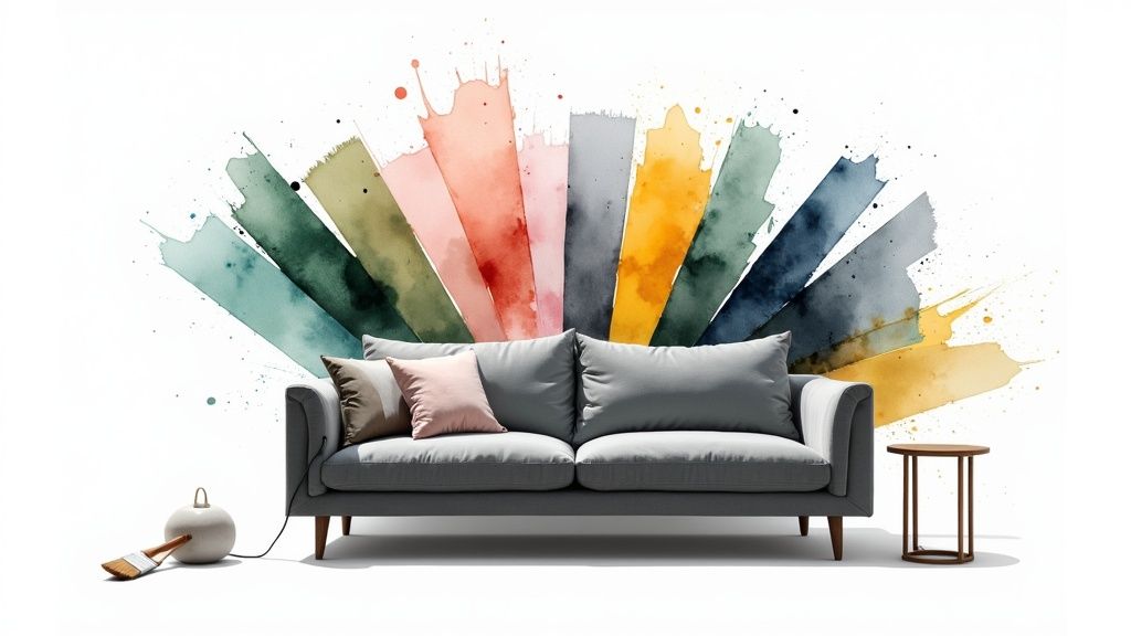
Color is the single most powerful tool in interior design, capable of transforming a room’s atmosphere, influencing size perception, and evoking specific emotions. But with an almost infinite spectrum of shades, choosing the right combination can feel daunting. This guide demystifies the process by breaking down 10 foundational decorating color schemes that professionals use to create stunning, cohesive spaces. We will move beyond simple color picking and dive into the strategy behind creating a harmonious home.
This listicle provides a clear roadmap, exploring the psychology, practical application, and expert tips for each distinct palette. Whether you are aiming for a serene sanctuary with a Monochromatic scheme or a vibrant, energetic hub using a Triadic approach, understanding these core concepts is the first step toward a flawlessly designed interior. To delve deeper into selecting hues that resonate with your home’s aesthetic and personal style, consult an expert’s guide to the perfect color palette. Our comprehensive roundup covers everything from timeless Neutral and Earth Tone schemes to bold Jewel Tone and Complementary pairings, equipping you with the knowledge to make intentional and impactful design decisions that truly reflect your personal taste.
1. Monochromatic Color Scheme
A monochromatic color scheme is a sophisticated and harmonious approach to interior design, built entirely on the foundation of a single color. This decorating color scheme doesn’t mean painting everything the exact same shade. Instead, it involves using a spectrum of tints (adding white), tones (adding gray), and shades (adding black) of one base hue to create a cohesive and layered look. The result is an elegant, uncluttered space where form and texture take center stage.
Why It Works
This scheme excels at creating a serene and unified atmosphere. By eliminating the distraction of multiple competing colors, monochromatic design allows architectural details, furniture silhouettes, and material textures to become the primary focus. It’s an ideal choice for creating a calm retreat, such as a bedroom, or a polished, professional environment like a home office. Think of a serene bedroom decorated in varying blues, from a deep navy accent wall to sky-blue pillows and pale blue-gray linens.
How to Implement It
Successfully executing a monochromatic scheme requires careful attention to detail to avoid a flat or boring outcome.
- Vary Textures: This is the most critical element. Combine different materials to add depth and interest. For example, in a greige (gray-beige) living room, you could pair a soft velvet sofa with a rough linen rug, sleek metal tables, and matte-finish walls.
- Play with Light: Use both natural and artificial lighting to create highlights and shadows, which will emphasize the different tones of your chosen color. A glossy finish will reflect light, while a matte finish will absorb it, creating subtle contrast.
- Incorporate Patterns: Introduce patterns that use different tones of your chosen color. A striped wallpaper or a geometric-print cushion can add visual energy without breaking the single-color rule.
- Add Metallic Accents: A touch of chrome, brass, or gold can act as a neutral element, providing a subtle pop of contrast and a hint of glamour.
2. Complementary Color Scheme
A complementary color scheme is a dynamic and high-impact approach to interior design that uses two colors positioned directly opposite each other on the color wheel. This pairing, such as blue and orange or red and green, inherently creates the strongest possible contrast. The result is a vibrant, energetic space that feels lively and visually stimulating. This decorating color scheme is perfect for making a bold statement and infusing a room with personality.
Why It Works
This scheme excels at creating visual excitement and drawing attention to specific elements within a room. The high contrast makes each color appear more intense and defined, so it’s ideal for spaces meant to be energetic, like kitchens, playrooms, or creative studios. A modern living room using teal and coral, for example, feels both balanced and exciting, with the warm coral accents popping against the cool teal base.
How to Implement It
Successfully using a complementary scheme requires balance to prevent the high-contrast colors from becoming overwhelming.
- Follow the 60-30-10 Rule: Use one color as the dominant (60%) hue for walls or large furniture. Use its complement as a secondary color (30%) in textiles or accent furniture. Add a neutral or a metallic as your 10% accent.
- Vary Saturation: Instead of using two pure, highly saturated colors, play with tints, tones, and shades. For instance, pair a deep navy blue with a softer, muted terracotta orange for a more sophisticated look.
- Use a Neutral Buffer: Balance the intensity by incorporating plenty of neutrals like white, gray, or beige for walls, flooring, and larger furniture pieces. This gives the bold colors room to breathe. For deeper insights, you can learn more about choosing color schemes.
- Establish Dominance: Let one of the two complementary colors be the clear star of the show. Using them in equal measure can create visual tension, so allow one to take the lead while the other serves as a powerful accent.
3. Analogous Color Scheme
An analogous color scheme is a visually pleasing and naturally harmonious approach that uses colors sitting next to each other on the color wheel. This decorating color scheme typically involves three to four adjacent hues, creating a rich yet cohesive look that feels unified and intentional. Because the colors share a common root, they blend seamlessly, resulting in a design that is comfortable and easy on the eyes, much like a sunset blending from orange to red.
Why It Works
This scheme is celebrated for its ability to create a serene yet vibrant atmosphere without the high contrast of complementary colors. It’s more dynamic than a monochromatic palette but less complex than a triadic one, striking a perfect balance. An analogous scheme is excellent for crafting inviting, relaxing spaces that feel connected and thoughtful. Imagine a cozy living room decorated in a warm palette of red, red-orange, and muted yellow, creating a space that feels both energetic and comforting.
How to Implement It
Executing an analogous scheme is about balance and hierarchy, ensuring the colors work together instead of competing for attention.
- Follow the 60-30-10 Rule: Choose one color to be your dominant shade (60% of the space), a second to be a supporting color (30%), and the third as an accent (10%). This creates a clear visual hierarchy.
- Vary Saturation and Value: To add depth, play with the intensity and lightness of your chosen hues. In a blue-green-yellow scheme, you could use a pale, muted green on the walls, a deep teal for the sofa, and bright yellow for accent pillows.
- Incorporate a Neutral: Ground the vibrant palette by introducing a neutral like cream, white, or gray. This can be used for flooring, trim, or large furniture pieces to give the eye a place to rest and prevent the colors from feeling overwhelming.
- Let Nature Guide You: Look for inspiration in nature, where analogous schemes are abundant. Think of the greens and blues of a forest lake or the purples and pinks of a twilight sky to inform your selections.
4. Neutral Color Scheme
A neutral color scheme is a timeless and versatile approach to interior design, using a palette of understated hues like whites, blacks, grays, beiges, taupes, and browns. Rather than relying on bold colors, this decorating color scheme creates a sophisticated and calming foundation. It allows architectural features, furniture forms, and unique decor pieces to become the focal points of a room, providing a clean canvas that never goes out of style.

Why It Works
This scheme is incredibly effective at creating an atmosphere of quiet elegance and spaciousness. Neutral palettes are easy on the eyes, making spaces feel serene and uncluttered, which is why they are a cornerstone of minimalist and Scandinavian design. Think of a luxurious living room with layered beige tones, a sleek industrial loft dominated by shades of gray, or a crisp, modern space defined by a black and white contrast. This approach is highly adaptable, allowing for easy updates with new accessories over time.
How to Implement It
A successful neutral space is rich with detail and avoids feeling one-dimensional. The key is to build depth through a variety of elements.
- Layer Tones: Combine multiple neutral shades to create a layered, sophisticated look. For instance, pair a light gray sofa with charcoal pillows, a greige rug, and an off-white accent chair.
- Embrace Texture: This is essential for adding warmth and interest. Integrate a mix of materials like chunky knit throws, soft linen curtains, a smooth leather ottoman, and rough-hewn wood tables.
- Incorporate Natural Materials: Wood, stone, rattan, and jute bring organic warmth and visual texture to a neutral room, preventing it from feeling sterile.
- Use Subtle Patterns: Introduce patterns in a similar neutral tone, such as a herringbone-print rug or damask wallpaper, to add visual interest without overwhelming the serene aesthetic. For deeper insights into creating a sophisticated and understated look, explore the concept of muted colors.
5. Triadic Color Scheme
A triadic color scheme is a vibrant and dynamic approach to interior design that uses three colors equally spaced around the color wheel, forming an equilateral triangle. This decorating color scheme creates a high-contrast, visually stimulating environment that is inherently balanced. Classic examples include the primary colors (red, yellow, blue) or the secondary colors (orange, green, purple), offering a rich yet harmonious palette.
Why It Works
This scheme excels at creating a playful, energetic, and visually interesting space. While it provides strong contrast similar to a complementary scheme, the third color adds balance and mitigates the intensity, making it more versatile. It is an excellent choice for rooms meant to inspire creativity and activity, such as a child’s playroom, a creative studio, or an eclectic living room. Imagine a modern art-inspired space where a bold blue sofa is accented with yellow cushions and a striking red art piece on the wall.
How to Implement It
Successfully using a triadic scheme involves careful balance to prevent the space from feeling chaotic or overwhelming.
- Follow the 60-30-10 Rule: Adapt this classic design principle. Choose one of the three colors as your dominant hue (60% of the space), a second as the secondary color (30%), and the third as a vibrant accent (10%).
- Designate a Dominant Color: To create cohesion, let one color lead. For instance, in an orange, green, and purple scheme, use a soft green on the walls, incorporate orange through furnishings like chairs or a rug, and use purple for smaller decor items.
- Use Muted Versions: You don’t have to use pure, saturated hues. Consider using tinted or muted versions, like a sage green, a burnt orange, and a dusty lavender, for a more sophisticated and livable palette.
- Balance with Neutrals: Incorporate plenty of white, gray, or black to give the colors breathing room. A neutral background allows the triadic colors to pop without competing against each other.
6. Split-Complementary Color Scheme
The split-complementary color scheme is a sophisticated variation of the complementary pairing. It uses a base color and the two colors adjacent to its direct complement on the color wheel. This creates a high-contrast look that is vibrant and energetic but feels more balanced and less tense than a true complementary scheme. This approach offers a smart way to achieve a dynamic palette with an inherent sense of harmony.
Why It Works
This scheme is perfect for designers and homeowners who want strong visual interest without the potential for clashing that a direct complementary pair can sometimes create. It provides a more nuanced and interesting palette, offering more creative flexibility. Imagine a living room with a dominant deep blue, accented by pops of both coral (red-orange) and warm yellow-orange. The result is lively and engaging, yet sophisticated and easier on the eye than a simple blue-and-orange room.
How to Implement It
Executing a split-complementary scheme successfully involves creating a clear visual hierarchy to guide the eye.
- Establish a Dominant Color: Choose one of the three colors to be your primary hue, using it for larger areas like walls or a sofa. Use the other two as secondary and accent colors for pillows, art, and accessories.
- Balance with Neutrals: Use ample white, gray, or beige to give the bold colors room to breathe. Neutral flooring, trim, or large furniture pieces can prevent the space from feeling overwhelmed.
- Vary Saturation and Tone: To soften the effect, use muted tones or lighter tints of your accent colors. A deep green room could be paired with softer red-violet and red-orange accents rather than pure, vibrant shades.
- Use Color in Patterns: Introduce the split-complementary palette through patterned textiles like rugs or curtains. This is a great way to weave the colors together naturally within a single design element.
7. Warm Color Scheme
A warm color scheme uses hues from the warm side of the color wheel, such as red, orange, yellow, and their variations like terracotta and gold. This decorating color scheme is known for creating an atmosphere that is inviting, energetic, and comforting. These colors are psychologically stimulating, making them ideal for social spaces where conversation and activity are encouraged. The effect is a room that feels cozy, vibrant, and welcoming, wrapping its inhabitants in a sense of comfort and cheer.
Why It Works
This scheme is highly effective at making large or north-facing rooms feel cozier and more intimate. Warm colors advance visually, meaning they make walls seem closer, which helps to create a snug, enveloping environment. This makes them perfect for living rooms, dining rooms, and kitchens where people gather. Consider a traditional dining room painted in a deep burgundy, which encourages conversation and appetite, or a rustic bedroom featuring warm rust and brown tones for a comforting retreat.
How to Implement It
Balancing warmth is key to preventing a space from feeling overwhelming or overly stimulating.
- Balance with Neutrals: Temper the intensity of bold warm colors with grounding neutrals like cream, beige, or warm gray. These neutrals provide a resting place for the eye and prevent the scheme from becoming too saturated.
- Incorporate Natural Materials: Enhance the cozy feeling by using natural wood tones, leather, and warm-toned metals like brass or copper. These materials have inherent warmth and texture that complement the color palette.
- Leverage Warm Lighting: Use light bulbs with a warm temperature (around 2700K) to amplify the scheme. Warm lighting enriches reds, yellows, and oranges, making them appear richer and more inviting.
- Consider Paint Finishes: A matte finish can soften an intense warm color, while an eggshell or satin finish will add a gentle glow. For ideas on how to use these colors in social hubs, explore some popular living room paint colors.
8. Cool Color Scheme
A cool color scheme is one of the most effective decorating color schemes for creating spaces that feel calm, spacious, and serene. It primarily uses colors from the cool side of the color wheel: blues, greens, purples, and their various tints and tones. These hues are often associated with nature, like water and sky, and have a psychologically soothing effect, making them ideal for areas of rest and relaxation.
Why It Works
This scheme excels at making rooms feel larger and more open, as cool colors visually recede. This optical illusion is perfect for small apartments or rooms with limited natural light. Cool palettes are staples in spa and wellness design for their ability to promote tranquility and reduce stress. Think of a serene guest room painted in a soft blue-green or a spa-like bathroom decorated in shades of teal and crisp white.
How to Implement It
The key to a successful cool color scheme is balancing its calming nature with elements that prevent the space from feeling sterile or uninviting.
- Add Warm Accents: Introduce small doses of warmth through colors like coral, mustard yellow, or terracotta in pillows, artwork, or accessories. This creates a pleasing contrast and adds energy.
- Incorporate Warm Wood Tones: Natural wood finishes on furniture, flooring, or shelving provide organic texture and warmth that beautifully balances the cool colors on the walls and textiles.
- Layer Textures: To add depth and coziness, mix various textures. Combine a smooth leather chair with a chunky knit blanket, linen curtains, and a plush area rug.
- Use Warm Lighting: Opt for light bulbs with a warmer temperature (2700K-3000K) to cast a soft, inviting glow that counteracts the inherent coolness of the color palette.
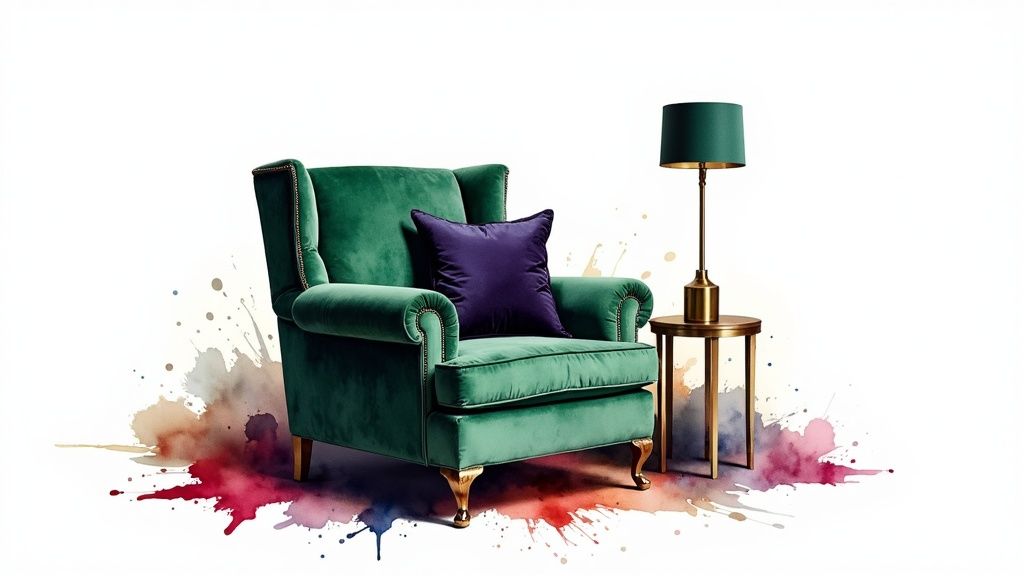
9. Jewel Tone Color Scheme
A jewel tone color scheme brings a sense of opulence and drama to an interior by using rich, saturated colors inspired by precious gems. Think emerald green, sapphire blue, ruby red, and amethyst purple. Unlike pastel or primary colors, these hues are deep and luxurious, creating sophisticated and elegant spaces. This decorating color scheme is often associated with contemporary luxury and modern maximalist design, perfect for making a bold, confident statement.
Why It Works
This scheme is incredibly effective at creating an inviting and glamorous atmosphere. Jewel tones have an inherent warmth and depth that make a room feel cozy yet grand. They are perfect for spaces designed for entertaining, like a dining room with an emerald green feature wall, or for creating an intimate, lavish retreat, such as a primary bedroom swathed in sapphire blue. The richness of the colors adds instant personality and character, turning any room into a memorable space.
How to Implement It
While bold, a jewel tone scheme is manageable when you balance its intensity with thoughtful design choices.
- Balance with Neutrals: To prevent the space from feeling overwhelming, pair vibrant jewel tones with a neutral backdrop. Cream, charcoal gray, or even black walls can make a ruby red sofa or amethyst chairs pop.
- Layer Rich Textures: Enhance the luxurious feel by incorporating plush textures. Velvet, silk, and faux fur complement these deep colors beautifully and add another layer of sensory richness.
- Add Metallic Accents: Warm metals are a perfect match for jewel tones. Use brass, copper, or gold in light fixtures, table legs, and decorative objects to reflect light and amplify the scheme’s opulence.
- Ensure Proper Lighting: Good lighting is crucial. A combination of ambient, task, and accent lighting, especially with warm-toned bulbs, will bring out the deep saturation of the colors and prevent the room from feeling too dark.
10. Earth Tone Color Scheme
An earth tone color scheme is a grounded and inviting approach that draws its palette directly from the natural world. This decorating color scheme utilizes colors found in soil, rock, and vegetation, such as warm terracotta, rich ochre, deep browns, muted greens, and soft, warm grays. The result is a space that feels inherently comfortable, stable, and connected to the outdoors, creating a timeless and organic aesthetic.
Why It Works
This scheme is celebrated for its ability to create a warm, nurturing, and psychologically grounding environment. Earth tones are comforting and easy on the eyes, making them perfect for creating relaxing living spaces and cozy bedrooms. Because these colors are rooted in nature, they have an enduring appeal that transcends trends. Think of a rustic farmhouse living room with warm brown leather sofas, sage green walls, and natural stone accents, creating an atmosphere of enduring comfort.
How to Implement It
Successfully using an earth tone color scheme is about layering and texture, which prevents the muted palette from feeling dull.
- Incorporate Natural Materials: This is essential for authenticity. Use elements like wood furniture, stone countertops, jute or wool rugs, and linen curtains to reinforce the connection to nature.
- Vary Values and Saturation: Combine deep, saturated browns with lighter tans and muted greens to create depth. A burnt sienna accent wall paired with soft taupe upholstery adds visual interest without disrupting the harmony.
- Layer with Plants: Add abundant greenery. Houseplants not only introduce a vibrant, living green but also enhance the organic, earthy theme of the entire space.
- Add Warm Metallic Accents: Introduce touches of unlacquered brass, copper, or oil-rubbed bronze. These metals complement the warmth of the earth tones and add a subtle touch of refined contrast.
Top 10 Decorating Color Schemes Comparison
| Color Scheme | 🔄 Implementation complexity | ⚡ Resource requirements | 📊 Expected outcomes | 💡 Ideal use cases | ⭐ Key advantages |
|---|---|---|---|---|---|
| Monochromatic Color Scheme | Low — simple palette, needs careful lighting/textures | Low — single hue palettes, material focus | Cohesive, calm, sophisticated | Small rooms, minimalist or professional spaces | Easy coordination; serene; texture-focused |
| Complementary Color Scheme | Moderate — high-contrast balancing required | Moderate — bold paints, accents, sample testing | Energetic, striking, high visual impact | Commercial, entertainment, strong focal areas | Creates strong focal points; memorable |
| Analogous Color Scheme | Low — naturally harmonious but needs balance | Low — related hues, limited samples | Unified, flowing, easy on the eyes | Living rooms, nature-inspired, relaxed spaces | Smooth transitions; versatile; cohesive |
| Neutral Color Scheme | Low–Moderate — relies on texture and layering | Low — neutrals plus materials and finishes | Timeless, flexible backdrop for decor | Whole-home bases, resale-focused, modern styles | Timeless; easy to update; broad appeal |
| Triadic Color Scheme | High — three-way balance requires planning | Moderate — multiple pigments, coordinated accents | Vibrant, balanced variety with visual energy | Playrooms, studios, eclectic interiors | Vibrant yet balanced; rich variety |
| Split-Complementary Color Scheme | Moderate — less jarring than full complementary | Moderate — three related colors, proportion testing | Contrasting yet sophisticated and flexible | Living rooms, feature areas, contemporary spaces | Interest without harsh contrast; flexible |
| Warm Color Scheme | Low — intuitive palette, monitor saturation | Low — warm paints, textiles, wood tones | Cozy, intimate, energizing atmosphere | Kitchens, dining rooms, social gathering areas | Welcoming; stimulates interaction |
| Cool Color Scheme | Low — calming palette, requires good lighting | Low — cool paints, textiles, cool-toned materials | Calm, spacious, restful environments | Bedrooms, bathrooms, relaxation spaces | Soothing; makes rooms feel larger |
| Jewel Tone Color Scheme | Moderate — bold choices need confident execution | High — rich pigments, luxe fabrics, strong lighting | Luxurious, dramatic, high-impact interiors | Accent walls, dining rooms, luxury or eclectic spaces | Sophisticated; dramatic; conceals wear |
| Earth Tone Color Scheme | Low — natural palette, needs variation for interest | Low — natural materials, plants, textured finishes | Grounded, warm, timeless spaces | Farmhouse, rustic, eco-conscious and cozy homes | Timeless; cohesive; universally appealing |
From Theory to Reality: Bringing Your Color Scheme to Life
You are now equipped with a powerful arsenal of decorating color schemes, each offering a unique pathway to transform a house into a home. We’ve journeyed through the focused simplicity of a Monochromatic palette, the dynamic energy of a Complementary scheme, and the natural harmony of an Analogous layout. From the sophisticated calm of Neutrals to the balanced vibrancy of a Triadic design, the principles of color theory are no longer abstract concepts but tangible tools at your disposal.
The most crucial takeaway is that a successful color scheme is deeply personal. It’s an extension of your style, a backdrop for your life, and a key driver of the atmosphere within your space. Understanding these foundational palettes, like the rich Earth Tones or the opulent Jewel Tones, empowers you to make intentional choices that resonate with your vision. The true art lies not in rigidly following rules but in using them as a confident starting point for creative expression.
Your Actionable Next Steps
Before you pick up a paintbrush or order a new sofa, take a moment to strategize. This planning phase is where a good design becomes a great one.
- Define the Mood: How do you want the room to feel? A tranquil bedroom might lean toward a Cool or Analogous scheme, while a lively, social living room could benefit from a Warm or Triadic approach.
- Assess Your Lighting: Observe how natural and artificial light interacts with your space throughout the day. A color that looks perfect in the morning sun might appear completely different under evening lamplight. Always test your samples in the actual room.
- Gather Physical Samples: Digital swatches are a great start, but they can’t replicate reality. Collect paint chips, fabric swatches, and material samples (like wood or metal finishes) to see how they interact in person.
- Consider a Focal Point: Sometimes, the most effective decorating color schemes are built around a central feature. This could be a dramatic piece of art, a large area rug, or a stunning architectural element. If your vision includes making a strong statement, exploring how bold tiles can be integrated into your home’s color scheme is essential, as they can serve as a powerful anchor for your entire palette.
Pro Tip: Don’t forget the 60-30-10 rule as a guideline. Use your dominant color for 60% of the space (walls), a secondary color for 30% (furniture, curtains), and an accent color for the final 10% (pillows, decor) to create a balanced and professional look.
Ultimately, mastering decorating color schemes is about building confidence. It’s about moving beyond trends and developing an intuitive sense of what works for you and your environment. The palettes we’ve explored are your roadmap. Now, you get to choose the destination and enjoy the creative journey of bringing your vision to life, one color at a time.
Ready to see these color schemes in your own room instantly? Stop guessing and start visualizing with RoomGenius. Upload a photo of your space and use our AI-powered tool to apply endless decorating color schemes, from serene neutrals to bold jewel tones, in seconds. Try RoomGenius now and design your perfect home with confidence.