Best color scheme for bedrooms: Top picks for 2025
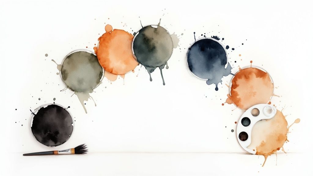
Your bedroom is more than just a place to sleep; it’s your personal sanctuary, a retreat from the world’s demands. The colors you surround yourself with are the foundation of this retreat, directly influencing your mood, sleep quality, and overall sense of well-being. But with an endless spectrum of shades and pairings, finding the best color scheme for bedrooms can feel overwhelming. This guide demystifies the process, moving beyond generic advice to provide specific, actionable palettes backed by design principles and color psychology. For a broader understanding of how different hues interact within a space, exploring various interior paint color combinations can provide invaluable insights.
We will explore 10 distinct schemes, from serene neutral havens to moody, dramatic escapes. Each entry includes detailed palettes and expert styling tips to help you create a space that is not only beautiful but also deeply restorative. Whether you’re aiming for timeless tranquility with a soft neutral sanctuary, the depth of a moody blue retreat, or the bold statement of luxe jewel tones, you’ll find a practical blueprint here. Get ready to transform your personal space and design the bedroom you have always dreamed of.
1. Soft Neutral Sanctuary
A Soft Neutral Sanctuary utilizes a calming palette of warm beiges, gentle grays, and soft creams to cultivate a deeply serene sleeping environment. This timeless approach is a favorite for high-end hotels and minimalist designs because it leverages naturally occurring earth tones to reduce mental stimulation, promoting relaxation and better sleep. The core principle is to create visual calm through a cohesive, low-contrast color story, making it one of the best color schemes for bedrooms where tranquility is the primary goal.

This color scheme excels at making a room feel both more spacious and intimately cozy. It’s a forgiving palette that works well with various lighting conditions and architectural styles, from modern minimalist to rustic farmhouse.
How to Implement a Soft Neutral Sanctuary
To avoid a flat or boring look, the key is to introduce depth and warmth through texture and subtle details.
- Layer Diverse Textures: Combine different materials to add visual interest. Think of a chunky wool knit throw blanket, crisp linen sheets, a soft cotton duvet, and a plush area rug.
- Incorporate Natural Materials: Introduce elements like a light oak bed frame, a stone side table, or woven seagrass baskets to ground the space and add organic warmth.
- Use Strategic Lighting: Opt for warm white LED bulbs (around 2700K) to enhance the cozy, inviting feel of the beige and cream tones.
- Choose the Right Paint Finish: An eggshell or satin finish on the walls offers a subtle sheen that gently reflects light, adding depth without being distracting.
This method is ideal for anyone seeking a sophisticated, peaceful retreat that feels both clean and comfortable. For more guidance on building a palette from scratch, explore these tips on how to choose color schemes.
2. Moody Blue Retreat
A Moody Blue Retreat uses a sophisticated palette of deep blues, from rich navy to jewel-toned teal, to create a deeply enveloping and tranquil atmosphere. This color scheme draws on the calming imagery of the deep ocean and twilight sky, making it an excellent choice for a restful yet personality-filled bedroom. By embracing darker hues, you can create a cocoon-like effect that feels both luxurious and secure, making this one of the best color schemes for bedrooms where sophisticated comfort is the goal.
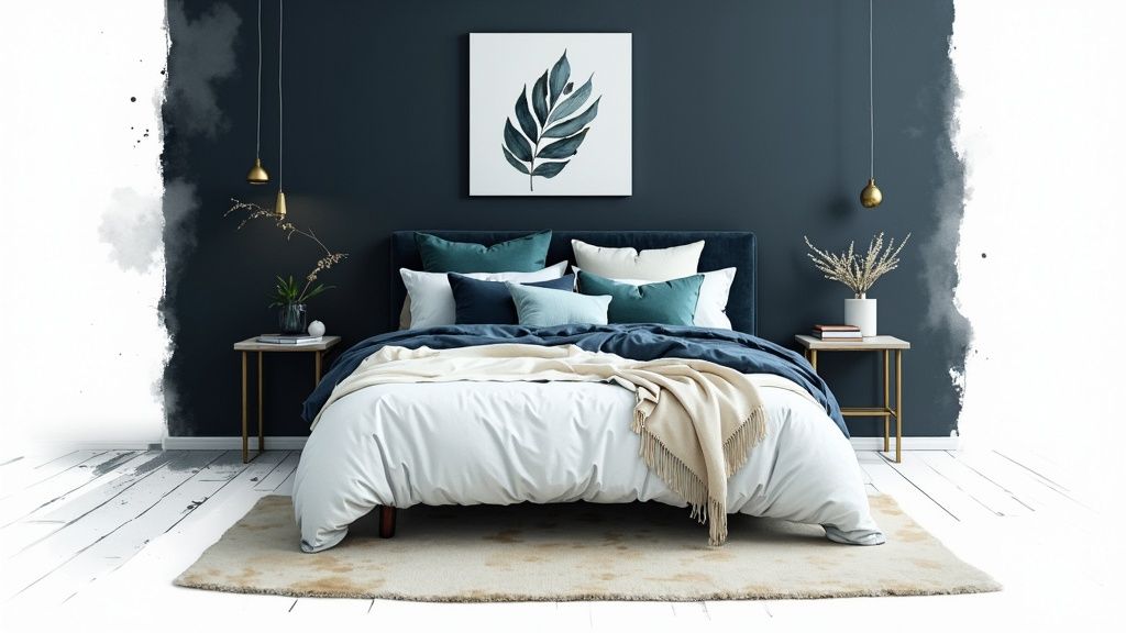
This palette excels at adding visual depth and character, turning the bedroom into a stylish sanctuary. It is often seen in modern hotel suites and high-end residential designs because it balances boldness with a serene, introspective quality.
How to Implement a Moody Blue Retreat
The key to a successful moody blue room is balancing the deep, cool tones with warmth and light to prevent the space from feeling somber.
- Balance with Lightness: Incorporate crisp white or soft cream bedding, trim, and ceilings to provide a bright, clean contrast that prevents the dark blue from overwhelming the room.
- Introduce Warm Accents: Add metallic elements like brushed brass, gold, or copper in light fixtures, hardware, and decor. These warm metals cut through the cool blue tones beautifully.
- Play with Light and Finish: Use a matte or flat paint finish on the walls to absorb light softly and create a velvety, immersive look. Complement this with warm white lighting (around 2700K) to enhance coziness.
- Incorporate Natural Wood: Ground the space with the organic warmth of natural wood. A walnut bed frame, oak side tables, or light wood flooring can provide a perfect counterbalance to the cool blue walls.
This approach is ideal for anyone looking to create a bedroom that feels like a bold, personal, and profoundly calming escape from the outside world.
3. Warm Sage Green Oasis
A Warm Sage Green Oasis harnesses the restorative power of nature by using a palette of soft sage, muted eucalyptus, and pale moss tones. This scheme connects the bedroom to the calming influence of the outdoors, promoting relaxation and mental clarity. It’s a contemporary, organic aesthetic often seen in luxury wellness retreats and design-forward magazines like Domino, making it one of the best color schemes for bedrooms that seek a balance between tranquility and sophisticated style.
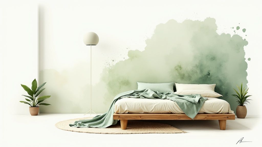
This color scheme is exceptionally effective at creating a peaceful yet invigorating atmosphere. The gentle green hues are known to reduce eye strain and invoke feelings of renewal, making the bedroom a true sanctuary for rest and rejuvenation.
How to Implement a Warm Sage Green Oasis
The goal is to build a biophilic-inspired space that feels cohesive and comforting, not overly thematic.
- Choose Warm Undertones: Select sage and moss greens with warm, yellow undertones rather than cool, blue ones to create a cozier, more inviting environment.
- Incorporate Natural Elements: Pair the green walls with light-toned wood furniture, such as oak or ash. Introduce natural textures like linen bedding, rattan decor, and jute rugs.
- Add Living Greenery: Enhance the biophilic benefits by placing live plants like snake plants or fiddle leaf figs in the room to improve air quality and reinforce the connection to nature.
- Layer with Warm Accents: Introduce subtle warmth with accents in terracotta, warm brass, or brushed copper. These materials beautifully complement the earthy green tones.
This approach is perfect for anyone wanting to create a serene, nature-infused escape that feels both modern and timelessly calming.
4. Luxe Jewel Tone Elegance
A Luxe Jewel Tone Elegance scheme uses a bold, sophisticated palette featuring rich hues like emerald, sapphire, amethyst, or garnet. This dramatic approach creates a statement-making bedroom that feels glamorous and enveloping. By leveraging deep, saturated colors, it fosters a cozy, cavern-like atmosphere that can be surprisingly conducive to restful sleep, making it one of the best color schemes for bedrooms designed to be both opulent and intimate.
This color scheme is perfect for those who want their bedroom to be a bold personal sanctuary, reminiscent of high-end hotel suites or editorial designs seen in Architectural Digest. The depth of these colors adds a layer of richness and character that is both energizing and comforting.
How to Implement Luxe Jewel Tone Elegance
The key to preventing these powerful colors from overwhelming the space is balance and strategic application.
- Create a Feature Wall: Paint one wall, typically the one behind the bed, in your chosen jewel tone. Keep the remaining walls a crisp white or soft cream to maintain brightness and balance.
- Layer with Luxe Fabrics: Enhance the opulent feel with materials like velvet, silk, or satin for curtains, pillows, and headboards. These fabrics catch the light beautifully and deepen the color’s impact.
- Incorporate Metallic Accents: Use golden or brass metallics for light fixtures, mirror frames, and hardware. These warm metals contrast beautifully with cool jewel tones like sapphire and emerald, adding warmth and glamour.
- Balance with Neutral Furniture: Select substantial furniture pieces in neutral tones, such as a light gray upholstered bed or a dark wood dresser, to ground the space and let the accent color shine.
This method is ideal for creating a sophisticated, high-impact retreat that feels both personal and luxurious. For more ideas on how to work with bold palettes, explore these inspiring decorating color schemes.
5. Calming Lavender Dreamscape
A Calming Lavender Dreamscape uses a delicate palette of soft lavender, muted lilac, and dusty purple tones balanced with clean whites and gentle grays. This romantic and soothing approach is scientifically associated with tranquility and stress reduction, as the gentle tones can help lower heart rate and promote a sense of calm. Its connection to wellness makes it a prime choice for creating a restorative escape, making it one of the best color schemes for bedrooms focused on deep relaxation.
This color scheme is especially effective in bedrooms where the goal is to create a peaceful, almost ethereal atmosphere. It’s a sophisticated alternative to pink, offering a unique blend of femininity and elegance that feels both modern and timeless.
How to Implement a Calming Lavender Dreamscape
The key to mastering this look is to keep the tones soft and airy, preventing the purple hues from becoming overpowering.
- Balance with Neutrals: Use crisp white or soft cream for bedding, trim, and larger furniture pieces to keep the room feeling bright and open. A lavender accent wall paired with three light gray walls is a popular strategy.
- Opt for Softer Finishes: Choose a matte or eggshell paint finish for the walls. This non-reflective surface absorbs light, creating a velvety, soft-focus effect that enhances the color’s calming properties.
- Layer Gentle Textures: Complement the soft colors with equally soft materials. Think of natural linen curtains, a plush velvet headboard, or a silky smooth duvet cover to add tactile comfort.
- Incorporate Botanical Elements: Introduce fresh or dried lavender, eucalyptus, or other gentle greenery. This not only adds a natural touch but can also provide a subtle, calming scent to the space.
- Use Warm Lighting: Stick to warm white light bulbs (around 2700K) to bring out the warmth in the lavender and prevent it from feeling cold or stark.
This approach is perfect for anyone wanting to design a serene, spa-like bedroom that actively supports rest and well-being.
6. Minimalist Monochrome Zen
A Minimalist Monochrome Zen bedroom uses a refined palette from a single color family, employing varying tints, tones, and shades to create sophisticated simplicity. This approach creates a deeply restful environment by eliminating visual clutter and focusing on form and texture. Inspired by Japanese minimalism and high-end Scandinavian design, this scheme leverages a cohesive, low-contrast color story to promote a sense of order and tranquility, making it one of the best color schemes for bedrooms where a calm, uncluttered mind is the ultimate goal.
This color scheme is exceptionally effective at making a space feel intentional, serene, and curated. The beauty of monochrome lies in its ability to highlight architectural details, the quality of materials, and the play of light and shadow, turning the room itself into a piece of art.
How to Implement a Minimalist Monochrome Zen
Success with a monochrome palette depends on a masterful use of texture and light to create depth and prevent the space from feeling one-dimensional.
- Choose Textures Strategically: Introduce a variety of materials to add tactile and visual interest. Combine the crispness of linen bedding, the organic grain of a light wood bed frame, the subtle roughness of a plaster accent wall, and the smoothness of a concrete side table.
- Use Lighting as a Design Tool: Layer ambient, task, and accent lighting to sculpt the space. Directional spotlights can create dramatic shadows and highlight specific textures, adding depth to the monochromatic tones.
- Select Furniture with Clean Lines: Opt for pieces with strong, simple silhouettes that emphasize form over ornamentation. This reinforces the minimalist aesthetic and allows the subtle color variations to stand out.
- Limit Accessories Carefully: Adhere to a “less is more” philosophy. Choose just a few meaningful objects, like a single piece of sculpture or a beautifully crafted ceramic vase, to serve as focal points.
- Embrace Matte Finishes: Use matte or flat finishes on walls and large surfaces for a sophisticated, soft look that absorbs light and enhances the room’s serene, quiet atmosphere.
7. Warm Terracotta & Ochre Earthiness
A Warm Terracotta & Ochre Earthiness scheme uses a sun-baked palette of rust, warm ochre, and sandy beige to create a bedroom that feels grounded and inviting. This approach draws inspiration from natural landscapes like Southwestern deserts and Tuscan hillsides, leveraging these rich earth tones to evoke feelings of stability, comfort, and warmth. The core idea is to build a nurturing environment that feels deeply connected to nature, making it one of the best color schemes for bedrooms intended to be a cozy, restorative escape.
This color scheme excels at making a room feel intimate and enveloping. It’s a bold yet comforting choice that works beautifully in Bohemian, rustic, or Mediterranean-inspired designs, adding a sophisticated, worldly character to the space.
How to Implement Warm Terracotta & Ochre Earthiness
To prevent the rich colors from feeling heavy, the key is to balance them with lighter elements and diverse textures.
- Layer Warm Tones: Combine various shades of terracotta, ochre, and rust to create a sophisticated, layered look. A rust-colored accent wall paired with ochre pillows and a sandy beige duvet adds depth.
- Embrace Natural Materials: Ground the palette with natural wood furniture, such as a walnut bed frame or teak side tables. Introduce woven textiles like jute rugs or rattan lighting fixtures to enhance the organic feel.
- Use Matte Finishes: Opt for a matte or flat finish on terracotta walls to absorb light and create a soft, velvety look that feels modern and prevents a dated shine.
- Balance with Cream and White: Use crisp white or soft cream for bedding, trim, and ceilings. This contrast prevents the warm tones from becoming overwhelming and keeps the room feeling bright and airy.
8. Cool Scandinavian White & Natural Wood
A Cool Scandinavian White & Natural Wood scheme pairs a bright, airy palette of pure whites and light grays with the organic warmth of natural wood tones. This design philosophy, rooted in Nordic principles of simplicity and functionality, maximizes natural light to create a clean, uncluttered, and highly functional sleeping space. It emphasizes quality craftsmanship and minimalist beauty, making it one of the best color schemes for bedrooms where a sense of calm and order is paramount.
This approach is perfect for making smaller rooms feel larger and brighter. The contrast between crisp white and warm wood creates a balanced environment that feels both refreshing and inviting, a hallmark of popular designs seen in IKEA displays and publications like Kinfolk magazine.
How to Implement a Cool Scandinavian White & Natural Wood Scheme
The key to mastering this look is balancing the starkness of white with the inherent warmth of natural materials and textures.
- Select Quality Wood Furniture: Choose pieces with a beautiful, visible grain, such as a bed frame in light oak, birch, or ash. Layering different wood tones can add depth and prevent the space from feeling too uniform.
- Add Soft Textures: Introduce cozier elements to soften the minimalist aesthetic. Incorporate sheepskin rugs, wool blankets, and linen curtains to add tactile warmth and comfort.
- Embrace Matte Finishes: Use a matte or flat finish for white walls to create a sophisticated, soft look that absorbs light gently rather than reflecting it harshly.
- Use Warm Lighting: Counter the cool tones by using warm white LED bulbs (around 2700K). This ensures the bedroom feels like a cozy hygge-inspired retreat, not a sterile clinic.
This color scheme is ideal for those who appreciate clean lines, functionality, and a strong connection to natural elements, creating a peaceful and effortlessly stylish sanctuary.
9. Soft Blush & Dusty Rose Romance
A Soft Blush & Dusty Rose Romance palette blends gentle pinks, muted mauves, and warm creams to create a sophisticated and inviting atmosphere. This approach moves beyond traditional pinks, opting for more complex, earthier tones that feel elegant and mature rather than juvenile. The goal is to evoke a sense of warmth, comfort, and subtle femininity, making it one of the best color schemes for bedrooms designed as a personal and intimate retreat.
This color scheme is popular in boutique hotels and high-end design for its ability to feel both modern and timeless. It wraps the room in a soft glow, creating a calming effect that is ideal for unwinding at the end of the day. The muted nature of the colors prevents them from overwhelming the space, ensuring a serene environment.
How to Implement a Soft Blush & Dusty Rose Romance
The key to mastering this look is balancing the blush tones with grounding neutrals and rich textures to avoid a one-dimensional feel.
- Layer Tonal Shades: Combine dusty rose on the walls with blush pink bedding and mauve accent pillows. This creates depth and a cohesive, layered look.
- Introduce Metallic Accents: Incorporate brushed gold or rose gold in lighting fixtures, mirror frames, or hardware. These warm metals complement the pink tones beautifully.
- Balance with Neutrals: Use soft ivory or warm white for trim, ceilings, and larger furniture pieces like a dresser or headboard to keep the space feeling bright and balanced.
- Focus on Texture: Add dimension with a velvet armchair, a silk throw, linen curtains, or a high-pile rug. These materials enhance the luxurious and comforting feel of the color palette.
This scheme is perfect for anyone wanting a bedroom that feels elegant, warm, and deeply personal. To understand how these softer shades work, you can find more information about what are muted colors.
10. Dramatic Black & White Contrast
A Dramatic Black & White Contrast scheme leverages a bold, high-contrast palette to create a sophisticated and modern sleeping environment. This timeless pairing is a favorite in contemporary and minimalist designs, often seen in luxury hotels and high-end lofts. The core principle is to create visual tension and drama through the stark juxtaposition of pure white and deep black, resulting in a look that is both clean and powerful. This is one of the best color scheme for bedrooms if you desire a space that feels confident and stylish.
This color scheme excels at making a strong design statement. It provides a crisp, clean backdrop that allows architectural details and curated decor to stand out, offering a gallery-like feel that is both chic and refined.
How to Implement a Dramatic Black & White Contrast
To prevent the space from feeling cold or overly stark, the key is to balance the high contrast with texture, warmth, and strategic accents.
- Balance the Colors: Use the 60-30-10 rule, with white as the dominant color (60%), black as the secondary (30%), and a metallic or accent color as the 10%. A black accent wall behind the bed can create a dramatic focal point without overwhelming the room.
- Incorporate Metallic Accents: Introduce elements like brass, gold, or chrome in light fixtures, drawer pulls, and mirror frames to add warmth and a touch of glamour, softening the starkness.
- Layer Soft Textiles: Balance the graphic nature of the palette with soft textures. Think of a plush velvet headboard, a faux fur throw, linen curtains, and a high-pile area rug to add comfort and depth.
- Use Strategic Lighting: Warm lighting is crucial to prevent the room from feeling cold. Use dimmable lamps with warm white bulbs (around 2700K) to create an inviting and cozy atmosphere in the evening.
Top 10 Bedroom Color Schemes Comparison
| Style | 🔄 Implementation Complexity | ⚡ Resource / Efficiency | 📊 Expected Outcomes | 💡 Ideal Use Cases | ⭐ Key Advantages |
|---|---|---|---|---|---|
| Soft Neutral Sanctuary | Low–Medium: simple palette + texture layering | Low: common paints/fabrics; easy updates | Promotes calm, reduced anxiety, better sleep | Residential bedrooms, hotels, timeless renovations | Versatile, timeless, easy to accessorize — ⭐⭐⭐⭐ |
| Moody Blue Retreat | Medium: requires balanced lighting & finishes | Medium: quality paint, metallics; moderate upkeep | Adds depth and sophistication; calming effect | Master suites, luxury rooms, spaces needing depth | Sophisticated, hides imperfections, luxe pairing — ⭐⭐⭐⭐ |
| Warm Sage Green Oasis | Medium: select correct undertone + biophilic elements | Medium: plants, natural wood; test paint samples | Reduces stress; connects to nature; restorative | Wellness homes, contemporary nature-focused bedrooms | Biophilic, on-trend, calming — ⭐⭐⭐⭐ |
| Luxe Jewel Tone Elegance | High: careful balance of saturation, fabrics, lighting | High: premium paints, velvet, statement fixtures | Dramatic, luxurious, high-impact statement | Luxury suites, high-light bedrooms, statement designs | Bold, glamorous, hides wear — ⭐⭐⭐⭐⭐ |
| Calming Lavender Dreamscape | Low–Medium: coordinate tones to avoid overwhelm | Low: paint + soft textiles; add scent for effect | Reduces anxiety; supports sleep quality | Spa-like bedrooms, calming retreats, kids/teens rooms | Scientifically linked to relaxation; soothing — ⭐⭐⭐⭐ |
| Minimalist Monochrome Zen | Medium–High: depends on material quality & restraint | Medium–High: high-quality finishes, curated pieces | Visual harmony; meditative calm; reduced cognitive load | Minimalist homes, gallery-like spaces, meditation rooms | Timeless, highlights craftsmanship — ⭐⭐⭐⭐ |
| Warm Terracotta & Ochre Earthiness | Medium: tone layering and warm-light planning | Medium: natural textiles, wood, textured finishes | Grounding, cozy, emotionally warm atmosphere | Mediterranean, Southwestern, rustic and boho homes | Warm, grounded, nature-connected — ⭐⭐⭐⭐ |
| Cool Scandinavian White & Natural Wood | Low–Medium: focus on organization + material selection | Low–Medium: white paint, light wood furniture; maintenance | Bright, airy, spacious; functional simplicity | Small/light-filled apartments, functional design fans | Maximizes light, timeless simplicity — ⭐⭐⭐⭐ |
| Soft Blush & Dusty Rose Romance | Low–Medium: coordinate dusty tones; avoid saturation | Low: paints/textiles; quality finish preferred | Nurturing, warm, elegant atmosphere | Romantic bedrooms, boutique hotels, transitional spaces | Flattering, emotionally warm — ⭐⭐⭐⭐ |
| Dramatic Black & White Contrast | High: precise execution, lighting, and accents | Medium: strong furniture choices; styling critical | High visual drama; can be stimulating if unmanaged | Contemporary lofts, statement rooms, design-forward spaces | Timeless contrast; flexible with accent colors — ⭐⭐⭐ |
From Inspiration to Implementation: Your Next Steps
You’ve journeyed through a curated selection of ten distinct bedroom color schemes, from the understated elegance of a Soft Neutral Sanctuary to the bold confidence of a Dramatic Black & White Contrast. We’ve explored how different palettes can evoke specific moods, whether you crave the calming embrace of a Moody Blue Retreat or the earthy comfort of Warm Terracotta & Ochre. The central lesson is clear: the best color scheme for bedrooms is not a one-size-fits-all formula. It is a deeply personal choice that reflects your unique personality, supports your daily rituals, and transforms your space into a true sanctuary for rest and rejuvenation.
As you move from inspiration to action, remember the foundational principles we’ve discussed. Your room’s unique characteristics, such as its size, architectural style, and the amount of natural light it receives, are crucial factors. A Calming Lavender Dreamscape might flourish in a sunny room but could feel too cool in a darker, north-facing space. Similarly, your existing furniture and flooring provide a baseline that your new color palette must complement, not compete with.
Your Actionable Checklist for Success
To bridge the gap between concept and reality, follow these concrete next steps:
- Shortlist Your Favorites: From the ten schemes presented, select your top two or three contenders. Which ones genuinely sparked excitement and aligned with your vision for a perfect restful space?
- Gather Physical Samples: Digital swatches are a great starting point, but they can’t replicate real-world conditions. Collect paint chips, fabric swatches, and material samples. Observe them in your bedroom at different times of the day to see how they interact with both natural and artificial light.
- Consider Every Detail: A cohesive design extends beyond the walls. To truly bring your chosen color palette to life, consider all elements of your room, including window treatments. For a comprehensive guide on choosing the perfect curtains for your bedroom, you can find detailed advice to ensure your drapes perfectly complement your new color scheme.
- Test Before You Commit: Before painting the entire room, purchase sample pots of your top paint choices. Paint large swatches (at least 2x2 feet) on different walls to accurately assess how the color feels within the space.
By methodically testing and thoughtfully curating each element, you move beyond simply picking a color and begin the art of crafting an atmosphere. The right color scheme has the power to improve your sleep, reduce stress, and ensure you start and end each day in a space that feels unequivocally yours. This investment in your environment is an investment in your well-being.
Ready to see these color schemes in your own room without lifting a paintbrush? RoomGenius uses AI to instantly apply different palettes to a photo of your space, helping you visualize the final result with confidence. Stop guessing and start designing your dream bedroom today at RoomGenius.