AI Color Palette Generator: Build a Room-Ready Palette
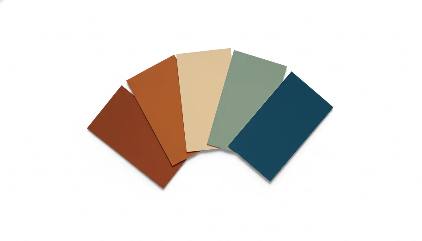
You stand in front of a wall of paint chips at the hardware store. A hundred warm whites. Forty greens. Eight kinds of “greige.” You came in to find one color and you’re leaving with twelve sample pots and no plan. The problem isn’t your taste — it’s that you’re trying to build a palette from a deck the size of a phone book, in a fluorescent aisle, holding chips that bear no relationship to the actual light in your actual room.
This is the gap an AI color palette generator fills. Instead of starting from a swatch wall, you start from a photo of your room. The model reads the light, the wood tones, the existing fabric, and the mood — then proposes a small set of palettes that respect what’s already there. You don’t pick a color. You pick a palette. The wall paint becomes one decision inside a coherent set, not a guess in isolation.
What is an AI color palette generator? An AI color palette generator is software that analyzes a room photo and produces a curated set of three to seven colors that work together — for walls, trim, and accents — based on the room’s existing light, materials, and mood. It builds the palette from scratch rather than letting you preview a single pre-chosen color.
The distinction matters because the failure mode of paint shopping is rarely the wall color in isolation. It’s the wall color against the floor you already have, in the light your windows actually deliver, next to the sofa you’re not replacing. AI palette generation moves the decision up a level: pick the system, and the wall color falls out. People who pick a single color end up repainting; people who pick a palette end up done.
Palette Generator vs Paint Visualizer — the Real Difference
These two tools sound similar and frequently get confused. They are not the same thing, and using them in the wrong order is the most common reason a paint project ends in regret.
A paint visualizer answers one question: what does this specific color look like on my wall? You upload a photo, pick a color from a vendor’s deck, and the tool renders it onto the walls. It’s a confidence check on a decision you’ve already made. Our guide to using a paint color visualizer walks through that workflow end to end.
A palette generator answers a different question: given my room, what set of colors actually belongs here? You upload the photo. The tool returns three to seven colors with relationships between them — walls, trim, accent, soft furnishings, hardware finish. You haven’t decided anything yet. The model has done the upstream work of figuring out what kinds of colors this room can support.
The right order is generator first, visualizer second. Build the palette, then preview the wall color from inside that palette on the wall. People who skip the first step keep buying sample pots that look great in the can and wrong on the wall.
A useful at-a-glance comparison:
| Question | Paint Visualizer | AI Palette Generator |
|---|---|---|
| What it answers | ”Does this color work on my wall?" | "What colors belong in this room?” |
| Input | One pre-chosen color + a photo | Just a photo |
| Output | One wall, painted | A 3–7 color system |
| When to use it | After narrowing to 2–3 candidates | Before you’ve picked anything |
| Failure mode | The single color clashes with everything else | The palette feels generic if your photo is poor |
If you’ve already used a generator and have a palette in hand, the visualizer is the right next step. If you haven’t, you’re choosing colors in a vacuum.
How AI Reads Mood, Light, and Material From Your Photo
A modern interior-design model treats your photo as three overlapping layers: a light reading, a material reading, and a mood reading. Each layer feeds into the palette decision.
The light reading is the technical pass. The model extracts the white balance, the dominant color temperature in Kelvin, and the direction of the primary light source. North-facing rooms read cool blue; south-facing rooms read warm yellow; east-facing rooms read warm in the morning and dim and cool the rest of the day. The palette generator weights its suggestions toward colors that won’t fight that bias.
The material reading is semantic segmentation. The model labels every fixed surface in your photo: floor, ceiling, trim, cabinetry, fireplace stone, exposed beams, countertop. These are the elements you’re not changing, and they become hard constraints on the palette. Walnut floors push toward warm-and-grounded. Cool grey LVT pushes toward cooler, lighter walls. White oak with a yellow grain reads completely differently from white oak with a beige grain — and the AI catches that distinction where the human eye glosses past it.
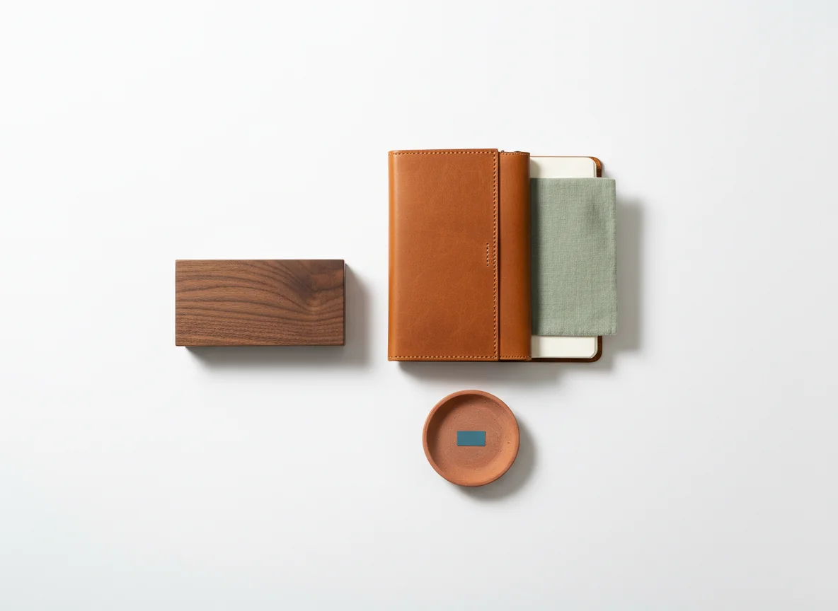
The mood reading is where the 2025–2026 generation of these models pulled ahead of earlier tools. The AI tags the overall feel of the photographed room — calm, energetic, formal, casual, warm, cool, traditional, modern — by looking at the existing furnishings and the way light falls. This becomes the soft constraint. A formal living room with traditional moldings doesn’t get a Memphis-design palette suggested. A loft with industrial windows doesn’t get country florals.
The output of all three layers is a small set of palettes, ranked. You pick one. The model has already filtered out the thousands of palettes that would have clashed before you ever saw them.
Six things a good palette generator captures from one photo
In our testing, the strong models reliably extract:
- Floor undertone (warm yellow, neutral, cool grey) and weight the wall against it.
- Existing fabric undertones in any sofa or curtain visible in frame.
- Window light direction, which sets the palette’s warm/cool bias.
- Trim color — usually pre-existing white — and what whites actually pair with it.
- Metal finish of visible hardware, which constrains the accent color.
- Wood tone variance, since cool walnut and warm walnut want different walls.
If the AI misses one of these, the resulting palette feels off in a way that’s hard to articulate. Usually it’s the floor. Most “wrong” palettes are wrong because the wall color fights the floor.
Warm vs Cool Bias — Why It’s the First Decision
Every palette has a temperature bias, and the bias is the first thing the AI sets. This is the single biggest variable in whether a room feels right. People who get this wrong end up living in a room that feels vaguely uncomfortable and never quite figure out why.
A warm-biased palette uses warm whites, beiges, browns, and earth tones as its foundation, with warm accents (terracotta, mustard, ochre) and a single cool color as relief. A cool-biased palette uses cool whites, greys, and blues as its foundation, with cool accents (sage, dusty teal, slate) and a single warm color as relief. A balanced palette pulls roughly equally from both, which is the hardest to execute and the easiest to get wrong.
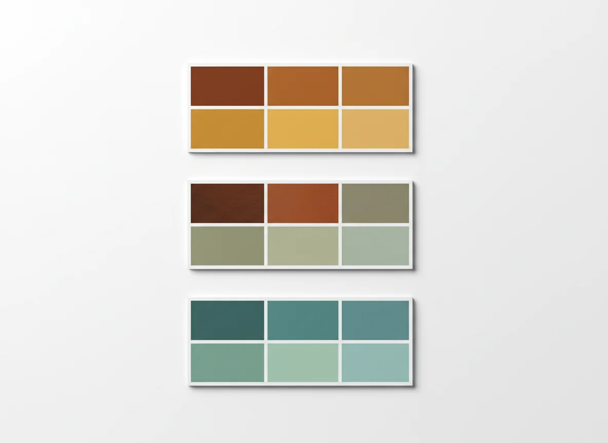
The AI sets the bias from two inputs. First, the room’s actual light: a north-facing room with cool natural light needs a warm-biased palette to feel hospitable; a south-facing room with warm natural light needs a cooler palette to avoid feeling claustrophobic. Second, the room’s purpose: bedrooms and dining rooms reward warm bias; home offices and bathrooms reward cool bias.
Where humans go wrong: chasing a Pinterest screenshot that shows a cool palette in a south-facing California living room and trying to apply it to a north-facing apartment in Berlin. The same colors will feel arctic in the second room. Designer photos look great because the room was shot in light that suits the palette. You’re going to live in the room in different light. The palette generator catches this; the human eye does not.
Three-Color, Five-Color, and Neutral-Anchored Palettes
Once the bias is set, the next question is structure. AI palette generators typically offer three structural options, each with a clear use case.
Three-color palettes
Three colors is the minimalist’s structure. One dominant (60% of the visual weight, usually the wall), one secondary (30%, usually large furniture or a feature wall), one accent (10%, smaller textiles and art). It’s the 60-30-10 rule designers have applied by hand for decades; the model just automates the math.
Three-color palettes work best in small rooms, monochromatic schemes, and rooms where you want the architecture or furniture to do the talking. They fail in large open-plan spaces, where three colors aren’t enough to define zones.
Five-color palettes
Five colors is the workhorse. One dominant, one secondary, one accent, plus two supporting tones — usually a deeper version of the dominant for grounding and a softer version for relief. This gives you enough range to handle a wall, trim, ceiling, and one or two accent moments without things feeling thin.
Five colors is what the AI defaults to for most living rooms, primary bedrooms, and any room you spend significant time in. It’s also the structure that works best for a home-wide palette plan, where you want adjacent rooms to harmonize without being identical.
Neutral-anchored palettes
A neutral-anchored palette is a five-color palette where one neutral takes the dominant slot and four supporting colors orbit it as accents. It’s the most flexible structure — easy to redecorate around, easy to live in long-term, easy to update one accent at a time.
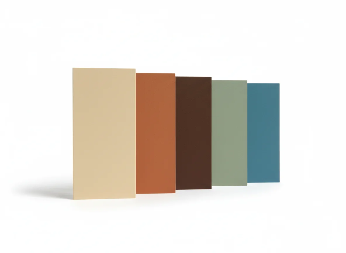
The AI defaults to a neutral-anchored palette when the room is either very small (the neutral expands the visual space) or very large (the neutral provides the connective tissue across zones). It’s also the structure to ask for if you change your mind frequently.
For deeper structural reading, our overview of color scheme types covers analogous, complementary, and triadic schemes — all of which an AI palette generator can produce on request.
A condensed decision table:
| Room situation | Suggested structure | Why |
|---|---|---|
| Small bedroom, 1–2 windows | 3-color | Avoid visual clutter; keep the room calm |
| Standard living room | 5-color | Enough range for sofa, walls, art, accents |
| Open-plan kitchen + dining + living | Neutral-anchored 5-color | Connective neutral binds the zones |
| Statement room (library, dining, powder) | 3-color, dramatic | Lean into the architecture |
| Rental you’ll redecorate often | Neutral-anchored | Swap accents without repainting |
| Whole-home plan across 5+ rooms | Neutral-anchored 5-color | One palette, room-by-room reweighting |
The AI will surface the structure it thinks fits, but you can override. Most generators expose the structure as a single setting at the top of the result.
Testing a Palette Across Multiple Rooms
The last test of a generated palette is whether it survives transit. A palette that works in the living room photo you uploaded should still hold up when you carry it into the adjacent dining room and the hallway leading to the bedrooms. This is where most homeowner-built palettes break.
The test is mechanical: re-upload photos of the adjacent rooms (or the next-room view from the same photo) and ask the model to apply the same palette without re-generating. The model re-weights — different rooms get different proportions of the same colors — but the colors don’t change. If a color in the palette has nowhere to land in the next room, the palette is too narrow. Drop or replace that color before you commit.
A well-extended palette behaves like a chord progression. The same notes show up in every room, but the emphasis shifts — the dominant in the living room becomes the secondary in the dining room, the accent becomes the dominant in the powder room. The whole house reads as one composition without any single room feeling repetitive.
Three signals a palette has extended well across rooms:
- You can describe the home in the same three colors when you walk through it, even if no two rooms are the same.
- No room contains a color that doesn’t appear at least once in an adjacent room — sometimes as paint, sometimes as a small textile.
- The trim is one color, top to bottom, and the AI either confirmed your existing trim works with the palette or recommended a single replacement color.
Trim is the easiest place to break the spell. If you have warm-white trim and a cool-biased palette, the trim will start looking yellow as soon as the new walls go up. The AI flags this. People who skip the AI find it out two coats in.
If you want to push toward a single-color extreme — black-white-grey only — our achromatic color scheme guide is a useful counterpoint to the warm-palette default. A good generator can produce achromatic palettes too; you just have to ask for them.
The honest test: if the AI proposes three palettes and they all feel generic, your photo is the problem. Re-shoot in mid-morning daylight, with the keepers visible and the discardables hidden, and run it again. The model is downstream of what you give it.
Frequently Asked Questions
How accurate is an AI color palette generator from a single photo?
Accuracy depends almost entirely on the photo. A well-lit daylight photo with the major fixed surfaces visible — floor, walls, trim, a representative piece of furniture — produces a palette that holds up in the real room within a margin most people can’t see. A poorly lit or cluttered photo produces a palette that looks fine on screen and wrong on the wall. Treat the photo as a measurement, not a snapshot. Mid-morning, blinds open, lens roughly chest height, full wall in frame.
Can I use the generated palette with any paint brand?
Yes. Modern AI palette generators output the colors in standard formats — hex, RGB, sometimes LAB or HSL — and most tools also map each color to the closest matches in the major paint brands like Benjamin Moore, Sherwin-Williams, Farrow & Ball, and Behr. The mapping is approximate; the brand version will be within a shade or two of the AI’s color. Always sample the brand version in your actual room before committing.
How is this different from picking colors on Pinterest?
Pinterest gives you a palette that worked in someone else’s room, in someone else’s light, with someone else’s existing furniture. It is rarely transferable. An AI palette generator builds a palette for the constraints of your room — your floor undertone, your light, your trim, your keepers. The Pinterest palette is the dream. The AI palette is the version of the dream that survives contact with your actual space.
Can the AI handle bold colors, or does it default to safe neutrals?
Modern generators handle bold palettes well, but you usually have to ask. The default tends toward neutral-anchored because that’s what most homes can support. If you want a saturated palette — deep emerald walls, a navy library, a powder room in burgundy — say so. Most tools expose a “boldness” slider or accept a prompt like “high-saturation maximalist palette,” and the model still respects the room’s light and existing constraints.
Should I use a palette generator if I’m only painting one room?
Yes, even more so. Single-room repaints are where most color regret happens, because the wall color is being chosen against existing floors, trim, and adjacent rooms that aren’t getting touched. The palette generator’s job is exactly this — making sure the new wall color works with everything you’re not changing. If you skip the generator and pick a wall color in isolation, you have roughly the same odds as throwing a dart at the swatch wall.
What if the AI’s palette doesn’t match my taste?
Two options. Regenerate with explicit constraints — “warmer,” “more saturated,” “include a deep green,” “no pink” — since most generators accept this kind of natural-language steering. Or take the structure but swap one color. The math is what makes the palette work; the specific colors inside the math are negotiable, and replacing one with a closely related shade rarely breaks the palette as long as temperature and saturation match.
Generate a Palette in Seconds, Test It on Your Walls
Stop buying sample pots one at a time. Hand RoomGenius a photo of the room. The AI reads the light, the floor, the trim, and the keepers — and proposes a palette built for that exact room, not a generic Pinterest palette borrowed from somewhere else. Pick the palette, preview the wall color from inside it on your actual walls, and order one sample instead of twelve.
RoomGenius runs the same AI color palette generation passes described here and renders the result back into your room photo so you can see it before you commit to anything. Try it on iPhone or Android. One photo, one palette, one paint trip.