Your Ultimate Guide to an Achromatic Color Scheme
When you hear “achromatic color scheme,” what comes to mind? For many, it’s the timeless elegance of a black-and-white film. It’s a design palette built entirely from black, white, and the full spectrum of grays in between—no other colors allowed.
This approach strips away hue, forcing the focus onto other, often overlooked, design heroes: form, texture, light, and shadow. It’s all about creating drama and sophistication through contrast.
Decoding the Achromatic Color Scheme
At its core, working with an achromatic scheme is like designing in grayscale. But don’t mistake “colorless” for “boring.” It’s actually a powerful tool. When you remove the distraction of color, the fundamental elements of a room—the shape of a chair, the weave of a rug, the way light hits a wall—suddenly take center stage.
This classic palette is the secret behind so many sophisticated and enduring interiors. It’s incredibly versatile, too. You can craft a space that feels calm and minimalist or one that’s bold, dramatic, and full of contrast. The magic is all in how you balance the key ingredients.
The Core Components Explained
An achromatic palette might seem limited at first glance, but its strength lies in the strategic use of its three core components. To see how this fits into the bigger picture, our guide on how to choose color schemes for your home offers great context on different design approaches.
Let’s break down the role each player has in creating a stunning achromatic space.
The table below outlines the basic building blocks of an achromatic design and how they’re typically used to create a balanced and visually interesting room.
The Building Blocks of an Achromatic Palette
| Component | Primary Role | Common Uses |
|---|---|---|
| White | The Foundation / Space Enhancer | Walls, ceilings, large furniture pieces, and trim to create a bright, airy canvas |
| Black | The Anchor / Accent | Statement furniture, frames, light fixtures, and small decor to add depth and drama |
| Gray | The Bridge / Nuance-Builder | Textiles, rugs, accent walls, and cabinetry to add softness and complexity |
As you can see, each element has a distinct job to do. White opens things up, black grounds the design, and gray provides the subtle complexity that makes the entire scheme work.
An achromatic color scheme isn’t about the absence of personality; it’s about expressing it through texture, form, and contrast instead of color. It’s a deliberate choice that celebrates simplicity and timeless style.
By mastering these “non-colors,” you can create a layered, visually rich environment that feels both refreshingly modern and built to last. The success of an achromatic room isn’t about what’s missing—it’s about celebrating and elevating what’s there.
The Science Behind a World Without Color
The power of an achromatic color scheme goes far beyond just personal taste; it’s deeply connected to how our eyes and brains process the world. When you remove hue—the reds, blues, and yellows—you’re not left with nothing. Instead, you’re left with the most fundamental elements of art and design: light, shadow, and pure form.
This forces a shift in focus to value, which is simply the lightness or darkness of a tone. Think about turning a vibrant color photo into black-and-white. Suddenly, you’re not looking at the color of a flower, but the delicate way light hits its petals and the deep shadows it casts. In design, value becomes your most powerful tool for creating depth, drama, and structure. A sharp contrast between black and white feels architectural and bold, while a gentle mix of grays can feel soothing and layered.
From Pigments to Principles
This deliberate use of neutrals wasn’t an accident; it grew out of centuries of studying color. A major breakthrough came with Charles Munsell’s color system in 1912, which organized colors based on hue, value, and chroma (intensity). His work helped turn color from a purely emotional choice into a measurable system, giving designers a language to talk about concepts like value as a distinct and critical element. To see how these early ideas shaped everything we do today, check out this great overview of color theory evolution.
This is precisely why achromatic rooms often feel so timeless and sophisticated. Our brains are naturally wired to notice contrast—it signals importance and tells us where to look.
An achromatic palette taps directly into this instinct. It uses the pure, unadulterated contrast between light and dark to carve out shapes, define lines, and guide your eye through a space. It’s visual communication in its most direct form.
The Psychology of Neutrals
Beyond the visual mechanics, a neutral palette has a powerful psychological effect. With no stimulating colors to process, the mind can feel a sense of calm, clarity, and order. We often associate white with purity and openness, while black can bring a feeling of strength and elegance. Grays, sitting perfectly in the middle, offer balance and sophistication.
To really dig into this, exploring the wider field of color psychology in interior design shows just how much our moods are influenced, even by the absence of color. It’s not that these spaces are emotionless. Instead, they provide a quiet canvas that allows the room’s textures and architectural details to do the talking.
That’s the real magic of an achromatic scheme. It works by taking something away. By removing color, it dials up the volume on everything else—form, texture, and the dance of light itself—creating a space that is both beautifully simple and incredibly rich.
Bringing the Achromatic Scheme to Life in Your Home
Moving from design theory to actually decorating your space is where the fun really begins. This is your chance to take those concepts of light, shadow, and contrast and turn them into real choices that will define how a room feels. For most people, the first big decision is the walls—they’re the backdrop for everything else.
Choosing a shade of white, for example, is deceptively tricky. Cool whites have subtle blue or gray undertones that create a crisp, modern vibe. Warm whites, on the other hand, have hints of yellow or red, making a space feel much cozier and inviting. The same goes for the darker end of the spectrum. A bold, dramatic black sets a very different tone than a room filled with sophisticated, layered grays.
To avoid the classic mistake of painting a whole room only to hate the color, a modern paint color visualizer can be a lifesaver. It lets you see how different shades will actually look with your home’s unique lighting before you ever pick up a brush.
The Secret Ingredient: Texture
Here’s the thing that many people miss: the real magic of a stunning achromatic design isn’t about the “colors” at all. It’s all about texture.
A room that’s just flat black, white, and gray will almost always feel sterile and one-dimensional. Texture is what breathes life, depth, and a surprising amount of warmth into a neutral palette. Think of it like adding sensory details to a story. A smooth, matte black wall has a completely different presence than a polished black marble countertop. A crisp white linen curtain plays with sunlight in a way a plush white wool rug never could.
By layering different materials, you create a rich, tactile experience that keeps the eye moving and makes the space feel thoughtfully put together.
Below is a simple breakdown of the core elements you’ll be working with. Once you remove hue (color), your entire design relies on mastering the interplay between value (lightness/darkness) and contrast.

This visual shows exactly how your focus shifts from the color wheel to the grayscale spectrum, where the relationship between light and dark becomes your primary tool.
Mastering Light and Material
Lighting is the final, critical piece that ties your entire achromatic design together. The kind of light you use—and where you put it—can completely change the feel of your neutral palette.
Bright, cool-toned natural light, for instance, will amplify the starkness of a black and white design, making it feel expansive and architectural. On the flip side, warm-toned artificial light (look for bulbs around 2700K) can make a room full of soft grays feel incredibly cozy and intimate. Strategic lighting, like a spotlight on a textured wall or a soft lamp next to a bouclé armchair, creates pools of light and shadow that add yet another layer of visual interest.
A well-executed achromatic scheme is a masterclass in subtlety. It proves that a space doesn’t need vibrant color to be captivating; it needs thoughtful layers of texture, purposeful lighting, and a clear understanding of contrast.
To help you get started, this table breaks down how different materials and textures can be paired to achieve specific effects in your design.
Achromatic Texture and Material Pairing Guide
| Material | Visual Effect | Best Used For |
|---|---|---|
| Plush Fabrics (Velvet, Wool) | Adds softness, absorbs light, creates coziness. | Rugs, throw pillows, heavy curtains, accent chairs. |
| Natural Wood (Light Oak, Ash) | Introduces warmth and organic texture. | Flooring, furniture (coffee tables, sideboards), decorative bowls. |
| Polished Metals (Chrome, Steel) | Reflects light, adds a sleek, modern edge. | Light fixtures, furniture legs, cabinet hardware, mirror frames. |
| Rough Linen & Burlap | Provides a raw, earthy, and casual feel. | Sofas, curtains, tablecloths, lampshades. |
| Leather (Smooth or Suede) | Creates a sense of luxury and sophistication. | Armchairs, sofas, ottomans, headboards. |
| Stone & Marble | Adds natural pattern and a cool, solid feel. | Countertops, flooring, fireplace surrounds, decorative objects. |
| Glass & Lucite | Creates an illusion of space, reflects light. | Coffee tables, shelving, decorative vases. |
By focusing on these practical elements—the right neutral base, a rich mix of textures, and intentional lighting—you can build an achromatic space that feels anything but plain. It will be a calm, sophisticated, and deeply personal environment.
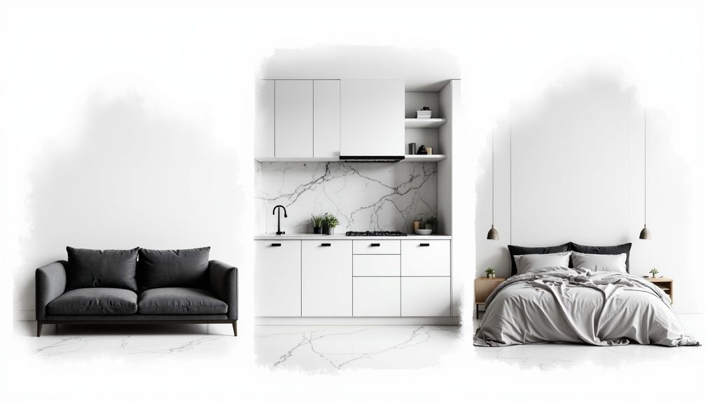
Achromatic Design Inspiration for Every Room
Theory is great, but seeing a concept in action is where it really clicks. Let’s walk through a home, room by room, to see how an achromatic color scheme can shape a space. You’ll notice how this simple palette of black, white, and gray can create totally different vibes while keeping the entire home feeling connected and intentionally designed.
It’s a design philosophy that’s gaining traction everywhere, not just in our homes. Take a look at the automotive world, for example. The most popular car colors globally are white, black, and gray, with drivers leaning more and more into darker, dramatic shades. This preference for sophisticated neutrals on the road is the same impulse driving these clean, bold looks in interior design.
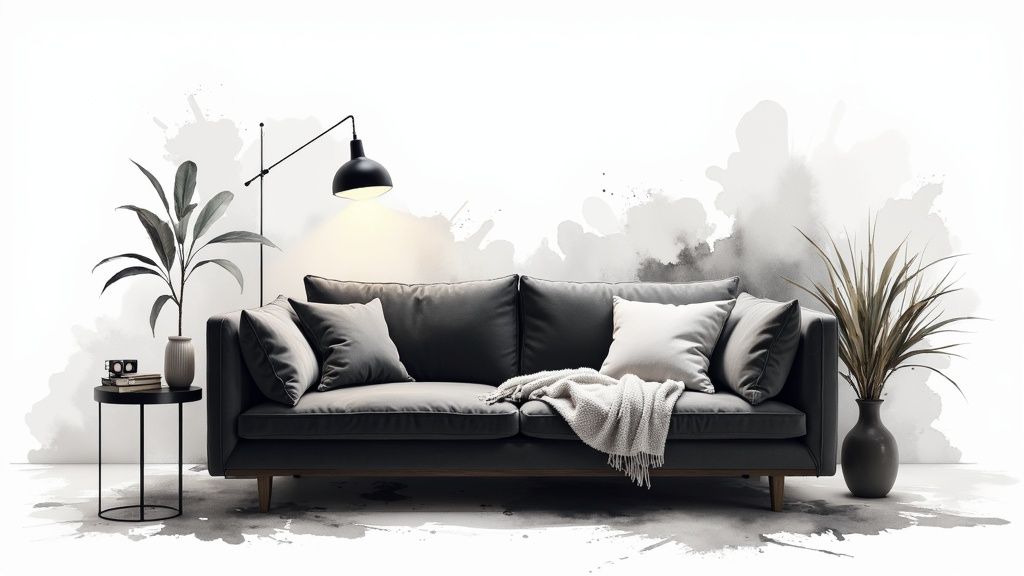
The Living Room: A Study in Contrast
The living room needs to be two things at once: welcoming and impressive. An achromatic palette nails this balance. Think of it like a gallery—crisp white walls create a bright, expansive canvas.
Against that backdrop, a deep charcoal gray sofa doesn’t just sit there; it anchors the entire room. Contrast its soft, cozy fabric with the hard, clean lines of a matte black coffee table or a metallic floor lamp. Throw a plush, light-gray area rug on the floor, and you’ve instantly softened the high-contrast look, adding another layer of texture. The result is a space that feels curated, modern, and genuinely inviting.
The Kitchen: Timeless and Functional
Achromatic schemes are practically made for kitchens, where a clean, timeless look is always in style. Picture classic white shaker cabinets reflecting light around the room, making it feel bright and spacious. Now, add matte black hardware—handles, knobs, and a sleek faucet—for a sharp, graphic pop.
To connect the black and white, a marble backsplash with gray veining adds a touch of natural pattern and movement. Stainless steel appliances fit right in, bringing a neutral metallic finish that complements everything without stealing the show. It’s a look that just works, and it will never feel dated.
An achromatic kitchen lets the materials do the talking. When the color palette is this simple, you really notice the quality of the stone, the finish on the metal, and the form of the cabinetry. It’s a recipe for enduring elegance.
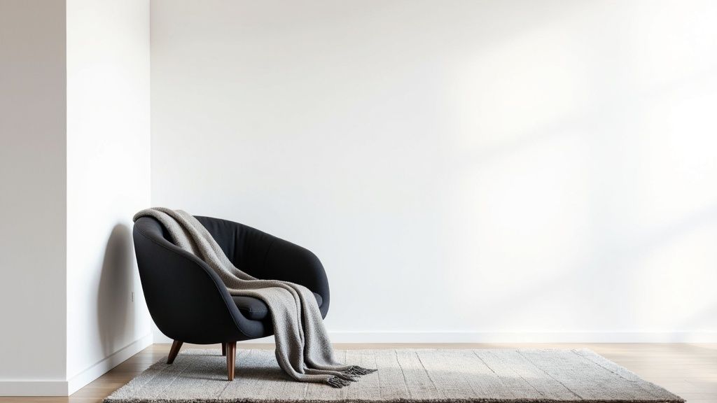
The Bedroom: A Serene and Layered Retreat
In the bedroom, the goal is pure tranquility. An achromatic palette gets you there by focusing on soft layers and textures. Start by painting the walls in a gentle dove gray; it feels like a warm hug and sets a soothing tone.
The magic is in the layering. A bed with a dark gray upholstered headboard becomes a soft focal point. Dress it with lighter gray linens, a chunky white knit blanket, and maybe a few charcoal-colored pillows. The different shades and textures create so much visual interest that you don’t even miss color. Add some black-framed art and sheer white curtains to diffuse the morning light, and you’ve got a peaceful, ethereal sanctuary.
If you’re thinking about creating a real showstopper behind the bed, learning how to design a feature wall can elevate the entire room.
The Bathroom: A Bold and Graphic Statement
The bathroom is the perfect place to go bold. You can make a huge impact in a small space with a strong achromatic design. Think graphic black-and-white patterned floor tiles—anything from a timeless checkerboard to an intricate modern design. It instantly injects energy and personality.
With such a statement floor, keep the walls a clean, simple white to avoid overwhelming the space. A minimalist black vanity with a crisp white countertop carries the theme, while chrome or matte black fixtures add that final, polished touch. It’s a high-contrast move that turns a utilitarian room into a design feature.
Common Mistakes to Avoid With Neutral Palettes
An achromatic color scheme looks simple, but that simplicity is exactly what makes it so tricky to get right. It’s easy to end up with a space that feels flat or sterile instead of sophisticated and chic. Let’s walk through a few common pitfalls so you can steer clear of them.
The single biggest mistake I see is a lack of texture. When you strip away color, texture has to do all the heavy lifting. A room filled with nothing but smooth, matte surfaces in white, black, and gray will feel cold and one-dimensional, almost like an unfinished blueprint. Without a mix of materials, there’s nothing for your eye to grab onto.
Creating a Lifeless Space
This isn’t just an aesthetic issue; it genuinely affects the feel of a room. Minimalism is popular, but some studies have shown that purely neutral spaces can sometimes be perceived as less pleasant. That’s why it’s so important to balance an achromatic scheme with varied surfaces and smart lighting. You can read the full research on how color affects perception in office environments to see just how deep this goes.
So, how do you fix it? You have to be deliberate about layering textures.
- Bring in Softness: Think about a chunky knit throw, a velvet armchair, or a high-pile wool rug.
- Add Some Sheen: A polished chrome lamp, a glass coffee table, or a lacquered black console will bounce light around beautifully.
- Incorporate Rawness: Natural wood grain, rough linen curtains, or a stone fireplace surround adds an essential organic touch.
This mix is what creates visual interest and makes a simple palette feel rich and complete.
Mismanaging Light and Undertones
Another easy mistake is getting the lighting wrong. The wrong light bulb can kill the mood instantly. Cool, blue-toned light will make a gorgeous gray paint look gloomy, while harsh overhead lighting can make an all-white room feel like a hospital. The goal should always be layered, warm-toned light—look for bulbs around 2700K to create a cozy, inviting glow.
Finally, there’s the subtle but critical issue of clashing undertones. You have to remember that not all grays (or whites, or blacks) are the same. Some grays lean cool with blue or purple undertones, while others are warm with hints of yellow or brown. If you pair a cool-toned gray wall with a warm-toned gray floor, something will just feel “off.”
Quick Tip: Before you ever commit to a paint color, get samples. Paint large swatches on the wall right next to your flooring, sofa, or cabinets. Watch how they look together throughout the day as the natural light changes. This simple step will save you from a world of regret.
It’s also crucial to know the difference between true achromatic neutrals and colors that just feel neutral, like beige or taupe. For a closer look at this, check out our guide on what muted colors are and see how they differ from a true achromatic palette. Avoid these common traps, and your neutral space will look intentional, dynamic, and anything but boring.
Your Questions About Achromatic Design, Answered
Even when you’ve got the basics down, going achromatic can bring up some real-world questions. It’s a simple palette, but that simplicity can sometimes be deceptive. To help you nail the look, I’ve rounded up the most common questions I hear from clients and fellow designers.
Let’s clear up the confusion so you can move forward with confidence.
Can I Add a Pop of Color?
This is, without a doubt, the number one question. The short answer is yes, but with a catch. The moment you introduce a true color—say, a pop of red or a splash of green—it’s technically no longer an achromatic scheme. It becomes what we call an accented neutral design.
And you know what? It’s an incredibly effective and popular strategy. Think about it: a single red cushion on a charcoal sofa, a vibrant green fiddle-leaf fig in a white corner, or a deep blue vase on a black console table. That one burst of color creates a stunning focal point. It instantly draws the eye without overwhelming the calm, sophisticated foundation you’ve already built.
Are Beige and Cream Achromatic?
Nope. Colors like beige, cream, taupe, and ivory aren’t truly achromatic. They fall into a category called near-neutrals because they have subtle color undertones—usually a hint of yellow, brown, or red. That little bit of color is what gives them a distinct warmth that pure neutrals just don’t have.
A pure achromatic palette is built strictly from black, white, and the grays in between, none of which have any discernible hue. That said, near-neutrals are often used right alongside them to soften the look, adding a touch of earthy warmth that blends beautifully with the starker elements.
An achromatic scheme is defined by its lack of color. Adding a single hue or a near-neutral is a fantastic design choice, but it technically shifts the palette into a new category, like an accented neutral or warm neutral scheme.
Knowing this distinction helps you make more intentional choices in your design.
How Do I Make an All-White Room Feel Cozy?
An all-white room can easily feel cold, clinical, or sterile. The secret to warming it up isn’t color—it’s all about texture and lighting. You have to be deliberate about layering different materials to create visual interest and a sense of physical comfort.
To build an inviting, warm all-white space, focus on these details:
- Mix Your Textiles: Don’t stick to one fabric. Combine a chunky knit throw, smooth linen curtains, a soft sheepskin rug, and maybe a textured bouclé armchair. Each material adds a different layer of depth.
- Bring in Natural Elements: Introduce organic texture with light-colored wood. An oak side table, a woven basket for storage, or a rattan light fixture can make a huge difference.
- Get the Lighting Right: This is crucial. Use warm-temperature light bulbs (look for around 2700K) to cast a soft, golden glow. Ditch the harsh overhead light and instead create gentle pools of illumination with table lamps, floor lamps, and sconces.
By focusing on these layers, your all-white room transforms from a sterile gallery into a serene, comfortable retreat. It’s the perfect example of how texture and light can create warmth where color is absent.
Ready to see how an achromatic color scheme could look in your own home? With RoomGenius, you can upload a photo of your room and see it redesigned in various styles in seconds. Stop guessing and start visualizing. Try RoomGenius today and bring your design ideas to life!